Stripe Inspired Design System
Stripe's design system as a DESIGN.md file.
About Stripe Inspired DESIGN.md
Curated by Dov AzencotUpdated Source stripe.com
- Fintech & Crypto
- Banking & Payments
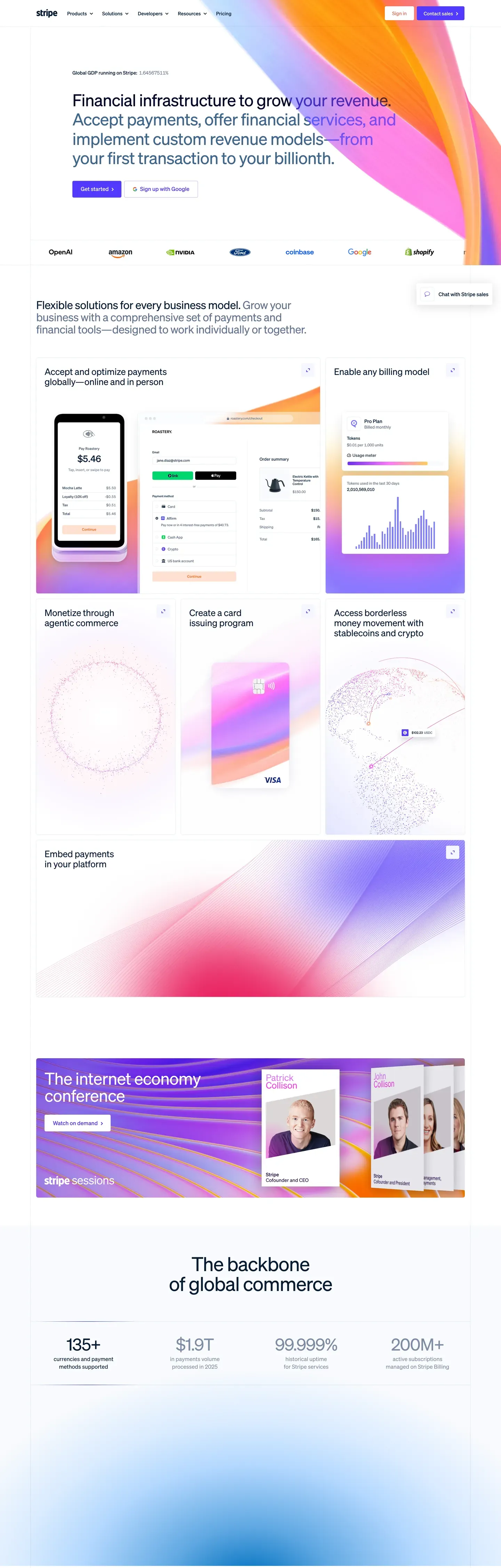
Stripe's design language is the modern reference for fintech marketing. One brand voltage (indigo #533afd). One proprietary typeface (Sohne at weight 300). One atmospheric gradient mesh — cream, sherbet orange, lavender, indigo, and ruby pink — washed across the upper third of nearly every marketing page. Deep navy ink #0d253d does all the body work, never pure black. Pill-shaped CTAs with tight 8x16px padding sit one-per-band, never two filled buttons competing in the same hero.
This page packages the full system into a single DESIGN.md file. Inside: 22 colors, 16 type tokens, 6 corner radii, 8 spacing values, and 21 components — buttons, dashboard mockup chrome, pricing card variants, the gradient mesh backdrop, and the tabular-figure body type that quietly signals the brand's financial DNA. Every hex is quoted; every token name is reproducible.
Feed the file to Claude, Cursor, or GitHub Copilot. The AI writes React components and Tailwind classes that match Stripe's editorial air — single-indigo CTA hierarchy, Sohne thin display tier, negative letter-spacing, dark-app dashboard composites — instead of a generic fintech theme. Inter at weight 300 with `font-feature-settings: "ss01"` substitutes for Sohne if you need an open-source path.
What makes it distinct
- Single voltage CTAindigo #533afd is the only filled button on marketing surfaces, one per band
- Sohne thin weight (300) display tiernegative tracking from -1.4px at 56px down to -0.2px at 20px
- Tabular figures via tnumevery money and numeric cell carries the brand's quiet financial-data signal
- Gradient mesh herocream, sherbet orange, lavender, indigo, and ruby pink washed across the upper third
- Dark-app dashboard trackdeep navy #1c1e54 mockups composited above the white canvas
Live at stripe.com
A snapshot of the brand in production. Hover the frame to scroll the page; click to visit.
 stripe.com
Explore Stripe Inspired
Pick what you want to see — mockups, colors, typography, layout, or the full component list.
Brand & Accent
Sparing, CTA-only voltage.
Surface
Page and card backgrounds.
Text
Headlines, body, captions, muted.
Borders & Hairlines
Dividers, outlines, structural rules.
Other
Specialty colors.
Stripe Inspired design system FAQ
Common questions about Stripe Inspired's tokens, components, and how to use this DESIGN.md in your project.
Related reading
Specs, directories, and component libraries that pair with this design system.
The DESIGN.md specification
Google Labs' open spec for machine-readable design system files — the format this page is built on.
Browse all design systems
The full directory of DESIGN.md files on shadcn.io, with live mockups for each.
Pricing blocks for shadcn/ui
Production-ready React pricing sections — including dark-featured-tier patterns inspired by Stripe.