Linear Design System
Linear's craft look: the deepest near-black canvas, light gray text, one lavender-blue accent and Linear's own display sans. For React and AI tools.
- Primary color
- #5e6ad2
- Typeface
- Linear Display
- Shape
- Mixed
- Base radius
- 8px
- Colors
- 23
- Type tokens
- 13
- Components
- 21
- Spacing values
- 8
About Linear DESIGN.md
Curated by Dov Azencot, updated May 12, 2026. Source linear.app (opens in a new tab).
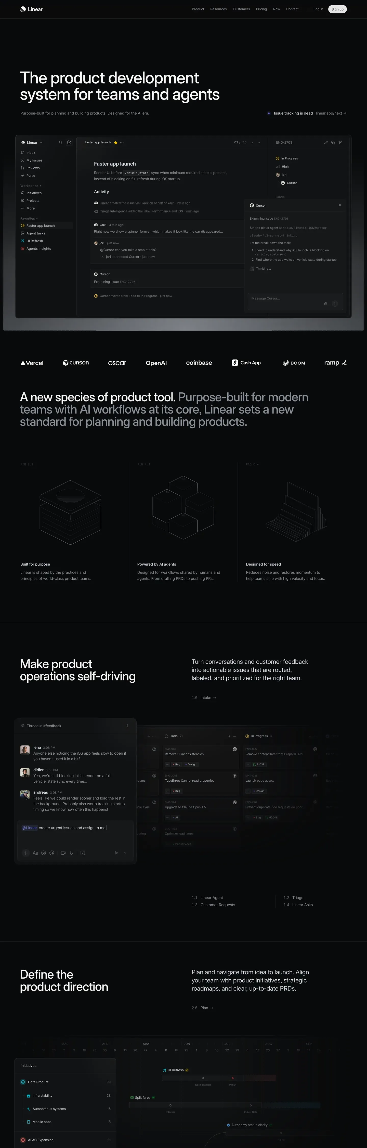
Linear's marketing site is the strictest dark-canvas system in this directory. The page floor is "#010102" — essentially pure black with a faint blue cast, never the unfortunate "#000000" true black that most dark sites default to. On top sits a four-step surface ladder: charcoal panels at "#0f1011", "#141516", "#18191a", and "#191a1b" carrying every card, hovered tile, and lifted dropdown. Hairlines run from "#23252a" up through "#34343a" and "#3e3e44". The single chromatic accent is Linear's lavender-blue "#5e6ad2", deployed scarcely on the brand mark, focus rings, and one primary CTA per section. There is no second chromatic color, no atmospheric gradient, no spotlight card. Linear trusts surface lift and hairline borders to carry every bit of hierarchy.
This page packages the entire spec into one DESIGN.md file written to the Google Labs spec. Inside: 23 colors tokens grouped into brand, surface, hairline, text, and semantic families; 13 type tokens running Linear Display, Linear Text, and Linear Mono with negative tracking scaling from -3.0px at 80px down to 0 at body; an 8-step rounded scale (4px through 24px plus pill and full); a 9-step spacing scale on a 4px base unit ending at 96px section padding; and 21 components definitions covering buttons, pricing cards, product screenshot panels, testimonial cards, changelog rows, and the dark top-nav and footer.
Feed the file to Claude, Cursor, or GitHub Copilot and the agent reproduces Linear's discipline — dark canvas, single lavender accent, surface ladder over shadows — rather than a generic dark theme. Or reference the tokens directly: every hex, font, radius, and spacing value is a quoted scalar you can paste into Tailwind config, CSS variables, or your component library. Linear is worth studying because it proves how far restraint scales: a single accent color, one negative-tracking display family, and four surface lifts produce a marketing page that reads as software-craft documentation.
What makes it distinct
5 highlights
- Deepest dark canvas in the directory#010102 with a faint blue tint, never pure #000000 true black
- Single chromatic accentLavender-blue #5e6ad2 reserved for brand mark, focus ring, and primary CTA only
- Four-step surface ladder carries hierarchy without drop shadowsCanvas to surface-4 with hairline borders
- Aggressive negative letter-spacing on display-3.0px at 80px, scaling to -0.05px at 16px body
- Product UI screenshots are the protagonistMarketing chrome is a dark frame for high-fidelity app captures
Live at linear.app
Linear in production, as captured. Scroll the window to see the whole page.
23 colors
Linear's system runs on #5e6ad2 as its primary voltage, used in 1 of 21 components. Type is set in Linear Display across 13 tokens from 12px to 80px, weights 400–600. Shape language is mixed across 21 components, blending pills, soft rounds, and squarer corners.
Brand & Accent
Sparing, CTA-only voltage · 4
Surface
Page and card backgrounds · 5
Text
Headlines, body, captions · 6
Borders & Hairlines
Dividers, outlines, rules · 3
Semantic
Status, errors, success, links · 1
Other
Specialty colors · 4
13 type tokens
Set in Linear Display across 13 tokens, from 12px to 80px, weights 400–600. Shown in its own stack: where the font isn't installed, the fallback the file names stands in.
- display-xl80px · weight 600 · lh 1.05 · tracking -3.0pxThe quick brown fox jumps over the lazy dog
- display-lg56px · weight 600 · lh 1.1 · tracking -1.8pxThe quick brown fox jumps over the lazy dog
- display-md40px · weight 600 · lh 1.15 · tracking -1.0pxThe quick brown fox jumps over the lazy dog
- headline28px · weight 600 · lh 1.2 · tracking -0.6pxThe quick brown fox jumps over the lazy dog
- card-title22px · weight 500 · lh 1.25 · tracking -0.4pxThe quick brown fox jumps over the lazy dog
- subhead20px · weight 400 · lh 1.4 · tracking -0.2pxThe quick brown fox jumps over the lazy dog
- body-lg18px · weight 400 · lh 1.5 · tracking -0.1pxThe quick brown fox jumps over the lazy dog
- body16px · weight 400 · lh 1.5 · tracking -0.05pxThe quick brown fox jumps over the lazy dog
- body-sm14px · weight 400 · lh 1.5The quick brown fox jumps over the lazy dog
- caption12px · weight 400 · lh 1.4The quick brown fox jumps over the lazy dog
- button14px · weight 500 · lh 1.2The quick brown fox jumps over the lazy dog
- eyebrow13px · weight 500 · lh 1.3 · tracking 0.4pxThe quick brown fox jumps over the lazy dog
- mono13px · weight 400 · lh 1.5The quick brown fox jumps over the lazy dog
Radii and spacing
8 corner radii and 8 spacing values. Shape language: mixed, on a 8px base radius.
Radii8
- xs4px
- sm6px
- md8px
- lg12px
- xl16px
- xxl24px
- pill9999px
- full9999px
Spacing8
- xxs4px
- xs8px
- sm12px
- md16px
- lg24px
- xl32px
- xxl48px
- section96px
21 components
Each rendered from its tokens (color, type, radius, padding) on Linear's own canvas.
- Button PrimaryButton Primarybutton-primary
- Button Primary PressedButton Primary Pressedbutton-primary-pressed
- Button Primary HoverButton Primary Hoverbutton-primary-hover
- Button SecondaryButton Secondarybutton-secondary
- Button TertiaryButton Tertiarybutton-tertiary
- Button InverseButton Inversebutton-inverse
- Pricing CardPricing Cardpricing-card
- Pricing Card FeaturedPricing Card Featuredpricing-card-featured
- Feature CardFeature Cardfeature-card
- Product Screenshot CardProduct Screenshot Cardproduct-screenshot-card
- Testimonial CardTestimonial Cardtestimonial-card
- Customer Logo TileCustomer Logo Tilecustomer-logo-tile
- Type here…Text Inputtext-input
- Type here…Text Input Focusedtext-input-focused
- Pricing Tab DefaultPricing Tab Defaultpricing-tab-default
- Pricing Tab SelectedPricing Tab Selectedpricing-tab-selected
- Cta BannerCta Bannercta-banner
- Changelog RowChangelog Rowchangelog-row
- Status BadgeStatus Badgestatus-badge
- Top NavTop Navtop-nav
- FooterFooterfooter
The system, in use
Linear's tokens on the kind of product it builds.
Plan, build and ship in one place
Bring your team's work together, from the first idea to the final release.
Linear design system FAQ
Linear's tokens, its components and how to use this DESIGN.md in your project.
Linear's DESIGN.md has 23 color tokens: primary (#5e6ad2), on-primary (#ffffff), primary-hover (#828fff), primary-focus (#5e69d1), ink (#f7f8f8), ink-muted (#d0d6e0) and 17 more. Every value is a quoted hex you can copy.
The color token `primary` is #5e6ad2, used by 1 component. The surface behind it is `canvas` (#010102).
Map the tokens to your CSS variables: `primary` (#5e6ad2) to `--primary`, `canvas` (#010102) to `--background`, `ink` (#f7f8f8) to `--foreground`. shadcn/ui's Tailwind setup maps them to classes such as `bg-primary` and `text-foreground`, so they then use Linear's palette.
Linear's brand color is lavender-blue at "#5e6ad2" — a desaturated blue-violet sitting between Slack purple and Discord blurple. The hover state lightens to "#828fff" and the focus tint settles at "#5e69d1". Linear uses lavender scarcely: brand mark, primary CTA, focus ring, and link emphasis only. It never fills cards, never appears as a section background, and never pairs with a second chromatic accent.
Linear's DESIGN.md sets its type in Linear Display, Linear Text and Linear Mono. The first family is the one most tokens use.
13 type tokens, such as `display-xl`, from 12px to 80px, in weights 400 to 600. Each token carries its family, size, weight, line height and letter spacing.
Linear Display is Linear's main family and may be proprietary or need its own license. Keep the sizes, weights, line heights and letter spacing from the file and swap the family for an open font of similar proportions, such as a font from Google Fonts, set in `--font-sans`.
Linear runs three custom typefaces: Linear Display for headlines, Linear Text for body, and Linear Mono for code. The fallback stack documents SF Pro Display on macOS. None of these are publicly distributed. Inter at weights 500 / 600 / 700 is the closest free substitute, with Geist Sans as another viable option. For mono, JetBrains Mono or Geist Mono at weight 400 closely approximates Linear Mono. The display scale runs from 80px down to 12px with negative letter-spacing scaling aggressively at the top end.
The display scale pulls tracking to -3.0px at 80px, -1.8px at 56px, -1.0px at 40px, and -0.6px at 28px — roughly 4% of font size at the top of the ramp. This compresses headlines optically and gives Linear's voice a precise, mechanical feel that matches the product's keyboard-shortcut-driven UI. Body tracking holds at -0.05px and eyebrow labels use positive tracking (+0.4px) to mark them as taxonomy rather than display.
21 components, among them `button-primary`, `button-primary-pressed`, `button-primary-hover`, `button-secondary` and `button-tertiary`. Each lists properties such as its background, text color, type token and corner radius as references to the other tokens.
8 corner radii: xs (4px), sm (6px), md (8px), lg (12px), xl (16px) and 3 more. 8 spacing values: xxs (4px), xs (8px), sm (12px), md (16px), lg (24px) and 3 more. The file reads as a mix of pills, soft rounds and squarer corners.
Copy the color and radius tokens into your `globals.css`: Linear's `primary` (#5e6ad2) becomes `--primary`, and `md` (8px) becomes `--radius`. The shadcn/ui components read those variables, so they change with the file.
Download Linear's DESIGN.md (or copy it as Markdown) and put it in your project, or paste it into the chat. Then ask Claude Code, Cursor or another agent to build a page "in the style of the Linear DESIGN.md": it reads the tokens and writes matching components.
Yes. The file is free to download or copy, with no account, from the buttons at the top and bottom of this page. The raw Markdown is also at `/design/linear/raw`.
Linear's page describes the look of its public website (linear.app), curated from what is visible there: the colors, type and components. It is an interpretation.
No. The Linear DESIGN.md describes the look of a public website. It is not official, and Linear has not endorsed or reviewed it. The name and logo belong to Linear.
No — the marketing site is dark-only. Canvas is "#010102" (essentially pure black with a faint blue tint), with a four-step surface ladder running through "#0f1011", "#141516", "#18191a", and "#191a1b" for lifted panels. The spec documents three inverse tokens ("#ffffff" canvas, "#f5f6f6" and "#f6f7f7" surfaces) used only on the rare white pill CTA over a dark section opener. Linear's product UI ships a light theme, but it is not represented in this DESIGN.md.
Yes — the file is designed to be fed into Claude, Cursor, or any AI tool that reads structured design tokens. The agent will reproduce Linear's restraint: dark canvas, single lavender accent, surface ladder over shadows. Reference the tokens directly inside Tailwind config or CSS variables — every color, type style, radius, and spacing value is a quoted scalar. The 21 components definitions cover buttons, pricing cards, product screenshot panels, testimonial cards, and the changelog row used on "/build".
A handful of things, documented in the Known Gaps section: form-field error and validation styling is not visible on the inspected pages; light mode is not documented because Linear's marketing site does not ship a light theme; and Linear's actual product UI uses a richer color-tag palette (red, orange, yellow, green, blue, purple) for issue priorities and project labels that lives inside the in-product surfaces shown in mockups. The four-step surface ladder values are extracted directly from Linear's canonical CSS variables.
Related reading
Specs, directories and component libraries that pair with this design system.
- Browse all design systemsThe full directory of DESIGN.md files on shadcn.io, with live mockups for each.shadcn.io
- Linear brand guidelinesLinear's official brand site — wordmark, color usage, and the lavender accent token in context.linear.app (opens in a new tab)
- The DESIGN.md specificationGoogle Labs' open spec for machine-readable design system files — the format this page is built on.github.com (opens in a new tab)
Use Linear in your project
One machine-readable file. Drop it into Claude Code, Cursor, VS Code or any AI tool that reads DESIGN.md.
Download the DESIGN.md
One machine-readable file: every color, type, radius, spacing, and component token of Linear.
Feed it to your AI tool
Drop it into Claude, Cursor, or GitHub Copilot. The agent writes React components and Tailwind classes that match Linear's visual language.
Reference the tokens directly
Or paste the values into your Tailwind config, CSS variables, or component library: every color, size and radius is a quoted, ready-to-copy value.
Read the full DESIGN.md overview, rationale, do’s and don’ts
Overview
Linear's marketing canvas is the deepest dark surface in this collection — {colors.canvas} is "#010102", essentially pure black with a faint blue tint. On top sits a four-step surface ladder ({colors.surface-1} through {colors.surface-4}) for cards, panels, and lifted tiles, with hairline borders running from {colors.hairline} ("#23252a") up through {colors.hairline-strong} and {colors.hairline-tertiary}. Light gray text ({colors.ink} "#f7f8f8") carries the body and headlines.
The single chromatic accent is Linear lavender-blue {colors.primary} ("#5e6ad2") — used on the brand mark, focus rings, and the primary CTA button. A lighter hover state ({colors.primary-hover} "#828fff") and a focus-tinted variant ({colors.primary-focus} "#5e69d1") extend the same hue. Linear avoids saturated greens, oranges, reds, etc. on the marketing canvas — the only semantic color is {colors.semantic-success} ("#27a644") for status pills and the rare success indicator.
Display type runs Linear's custom sans (with SF Pro Display fallback) at weight 500-700 with negative letter-spacing scaling from -3.0px at 80px down to 0 at body. The body family is Linear's text cut, and a Linear Mono is reserved for code snippets in product screenshots.
The page rhythm is dense product screenshots — Linear's marketing leads with high-fidelity captures of the product UI (issue list, project view, dashboard) framed in {colors.surface-1} panels with {rounded.xl} 16px corners. The chrome is intentionally minimal so the app screenshots can do the heavy lifting.
Key Characteristics:
- Dark-canvas marketing system —
{colors.canvas}("#010102") is the deepest dark in this collection. - Lavender-blue brand accent (
{colors.primary}"#5e6ad2") — used scarcely on brand mark, focus, and the primary CTA. - Four-step surface ladder (canvas → surface-1 → surface-2 → surface-3 → surface-4) carries hierarchy without shadow.
- Display tracking pulls aggressively negative (-3.0px at 80px); body holds at -0.05px.
- Cards use
{rounded.lg}12px corners with 1px hairline borders — never pill, rarely 16px. - Product UI screenshots dominate the page. The marketing chrome is a dark frame for the app.
- No second chromatic color. No atmospheric gradients. No spotlight cards.
Known Gaps
- The four-step surface ladder values are extracted directly from Linear's
--color-bg-level-3,--color-line-tint, etc. CSS variables; they are Linear's canonical surface spec. - Form-field error and validation styling is not visible on the inspected pages.
- Light mode is not documented because the marketing site does not ship a light theme.
- Linear's actual product UI uses a richer color-tag palette (red, orange, yellow, green, blue, purple) for issue priorities and project labels — those colors live in the in-product surfaces shown in mockups.
- The custom display, text, and mono families are proprietary; an open-source substitute is acceptable.
More systems like this
Asana, Atlassian, ClickUp and 5 more in Project Management: each brand's colors, type and components in one file your AI agent builds from.
Build it with Pro
The DESIGN.md files are free. Pro adds 6,000+ blocks, premium templates and the MCP server, so your AI editor builds in your system for you.
4.9/5 out of 5 · 150+ reviewsfrom 150+ founders and developers.
- Secure checkout via Stripe
- Code lives in your repo
- Keep what you've shipped if you cancel
- License terms
4.9 out of 5 from 150+ developers


Your system, built for you
Every block, template and icon, installed by your AI agent in your design system. The DESIGN.md files stay free.
Get Pro