Footer blocks for every framework.
100 footer sections for React, Vue, Svelte and Solid, ready to paste into a page. Footers that close a page: link columns, newsletter sign-up, language and theme controls, status, legal rows and sitemaps. Try each one right here.
Every footer block
100 blocks.
 Accessibility Statement FooterTrust and complianceA footer for a lesson reader with a conformance statement at the start (a drawn seal, the standard, the level and the review cadence, and a report-a-barrier link) and three link columns at the end.
 Accordion FooterLink gridsA footer where an accordion holds the links at every width: a brand half with the copyright, and four groups as rows between hairlines in the other half, one open at a time.
 Animated Links FooterLink gridsA link footer for a project planner: three columns of six links under ruled headings, each link sliding an arrow in from its start on hover and focus, and a foot band with the brand and legal links.
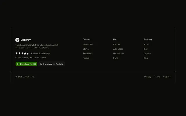 App Rating Download FooterCalls to actionA footer for a grocery-list app with a star rating, the phone versions it supports, and two store links in the brand column, beside three groups of links.
 Audit Table FooterTrust and complianceA footer for a backup vault with an audit table in a framed figure (the programme, its scope, how often it is audited and a link to request the report) beneath the brand and three link columns.
 Availability Portfolio FooterBrand-ledA centred one-person footer for a freelance designer: an avatar with initials, the name, a one-line bio, an availability line with a status dot, four social links with names and a row with the nav and the copyright.
 Award Shelf FooterSocial proofA footer for a design-system tool with a shelf of four award cells, each a greyscale laurel drawn around a glyph with the award's name, category and year, above the legal band.
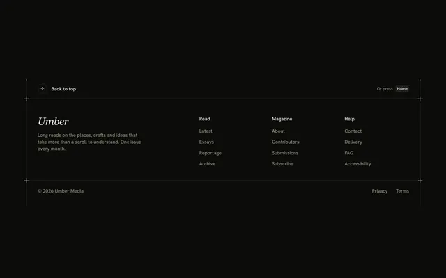 Back to Top FooterSitemaps and trailsA footer for a long-read magazine that opens with a full-width back-to-top link band, then the brand, three link groups and a legal band.
 Blog FooterContent and updatesA blog footer for a data-engineering blog: topic pills with post counts, the two latest posts and an RSS link on one side, two link groups on the other.
 Brand Split FooterBrand-ledA brand-first split footer for a design tool: a display wordmark, a tagline and the Shine Button on one half, three link columns and the legal row on the other.
 Breadcrumb FooterSitemaps and trailsA breadcrumb footer for a CI service's docs: a trail band ending on the current page, three link groups in hairline columns and a foot band with the wordmark and policies.
 Build Info FooterTrust and complianceA footer for a docs host with a data list of the running build (version, hash, environment, region, deploy time) and a button that copies it for a bug report.
Or describe it. With Pro, your AI agent picks the block you describe and installs it on your stack.
Get ProPricing
Every footer block, one prompt away, with Pro
Your AI agent installs any of the 100 footer blocks, and every component, example and icon, with every Pro plan.
4.9/5 out of 5 · 150+ reviewsfrom 150+ founders and developers.
- Secure checkout via Stripe
- Code lives in your repo
- Keep what you've shipped if you cancel
- License terms
FAQ
Frequently asked questions
Answers on the 100 footer blocks: what they are, how to customize and install them, the license and your AI agent.
The 100 footer blocks close a page: link columns, newsletter sign-up, language and theme controls, status rows, legal rows and sitemaps. Most draw no closing rule of their own, since the footer ends the page.
They are sorted into 13 groups: Link grids, Sitemaps and trails, Slim and minimal, Brand-led, Trust and compliance, Social proof, and more. Some are plain link grids, others add a newsletter, trust and compliance notes, preferences, calls to action or live estimates.
Link Columns Footer is the classic brand column with four link groups. One Row Footer is the slim single line. Accordion Footer folds the groups into rows at every width. Digest Chooser Newsletter Footer carries a sign-up, and Giant Wordmark Footer leads with the brand.
A comment describes the footer, then typed arrays hold the link groups (a label and an href each) and the legal text, and the component renders them in a nav labelled Footer. The hrefs are # placeholders and the brand is a made-up one.
Edit the link-group array: each group has a title and a list of links with an href and a label. The footer maps over it into a nav, so adding a link or a group is a data change. Replace the # hrefs with your routes or, in Next.js, switch the anchors to Link.
The newsletter footers check the address on submit, show errors under the fields and then swap in a confirmation. A comment marks the spot where you send the email to your mailing-list provider, and the demo only waits there. Digest Chooser Newsletter Footer also sends which digests were ticked.
Language Selector Footer rewrites the footer's words from one typed dictionary and marks each rewritten part with its lang attribute. Replace the dictionary with your i18n messages and have the control switch your locale route instead of local state.
Theme Toggle Footer cycles light, dark and system and really switches the page by toggling the dark class on html. If you use next-themes, the file's own comment says to call its setTheme in the apply function and read theme for the button.
Cookie Consent Footer is an entry point, not a banner: a Cookie settings button opens a dialog with one switch per category (essential is locked on), and Save choices shows the result in the legal row. It keeps the choice in state only, so write it to a cookie or your consent tool where it saves.
This page lists 100 of the category's 100 footer blocks for React on Base UI. The category comes in React (Base UI, React Aria, Ark UI and Radix UI), Vue, Svelte and Solid; the framework and UI library pickers at the top of any block's page switch between them.
The footer blocks here are written on Base UI primitives; the layout, the copy and the theme tokens are the same on every base, and the install path follows it (/r/footer-accessibility.json). The other bases are one picker away from /footer-block.
Each block is TypeScript and Tailwind CSS v4, styled with your theme's tokens, and imports our components (installed with it) on Base UI. Icons come from lucide-react.
Open a block, copy its command and run it: `npx shadcn@latest add` with the block's registry URL, such as /r/footer-accessibility.json for Accessibility Statement Footer. The code is copied into your project and it's yours to edit.
The block's file and the components it imports: Accessibility Statement Footer brings Data List and Guides, installed before it. Nothing else changes in your project.
Use the filters above the grid: 13 kinds of footer block, led by trust and compliance (13), link grids (11), company and places (10) and social proof (9), and sort by popular or name. A good first look: Accessibility Statement Footer, Accordion Footer and Oversized Email Footer. Each card opens the block's live page.
Every block draws the same page column and side rails with a top rule only (the Guides component), so a footer block lines up with the one above and below it. Stack one per section and the rails read as a single drawing; pick across the layout, what it shows and actions kinds.
Open its page and use the full-screen viewer (/view/footer/accessibility) or the device-width previews. Every preview is free for everyone; only the code needs Pro.
Each footer block uses semantic HTML: one heading level, real lists and labelled controls. Interactive parts sit on Base UI, a headless library that follows the WAI-ARIA patterns, and the layouts use logical properties so they hold in right-to-left languages.
Yes. They use semantic tokens only (bg-card, text-muted-foreground), never palette colors, so they follow your preset, radius and dark mode. The primary color marks one action per block and is never a background.
No animation library: the footer blocks' motion is CSS (transitions, entrance animations and SVG), and it stands still under prefers-reduced-motion.
The previews are free for everyone. The code of all 100 footer blocks is Pro, as is every block: Pro unlocks the code, the install command and the MCP.
Only with a Team or Organization license: client work, SaaS products and anything your users pay for. The Individual license is for personal, non-commercial projects. See the license page for the full terms.
You keep using what you installed in your existing projects, but get no new downloads or updates, and the MCP stops answering. A Lifetime license includes all future updates.
No. You can use them in your own End Products, but not redistribute the code or designs on their own, or in a UI library, kit, template or website builder.
With Pro, yes: the MCP server (22 tools, one personal URL from /dashboard/mcp) lets your agent search_blocks for a footer block, read it with get_block and install it on your React on Base UI stack.
Pass `category: "footer"` to search_blocks to search only the 100 footer blocks, or to list_blocks for the 13 groups with their blocks. get_block then returns one with its install command.
plan_page plans a page as a stack of blocks for a brief. Pass `sections` with category ids, such as ["hero", "footer", "footer"], to force the order; each section gets a pick and two alternatives, and get_block installs the stack.
4.9 out of 5 from 150+ developers


Every footer block. One prompt away.
100 footer blocks with Pro, the previews free to try. With Pro, your AI agent installs them from a prompt.
Get Pro