shadcn.io is an independent project built on shadcn/ui
Installation
Usage
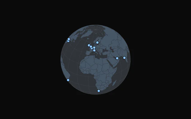
import { ChartGlobeLoading } from "@/components/charts/chart-globe-loading";<ChartGlobeLoading />API Reference
GlobeChart
data?readonly SpatialRow[]
The places to mark on the globe: one row per marker, with a longitude and a latitude.
geography?FeatureCollection<Geometry, Readonly<Record<string, unknown>> | null>
The countries to draw (GeoJSON; GlobeLand styles them), such as the kit's worldCountries.
- Type
FeatureCollection<Geometry, Readonly<Record<string, unknown>> | null>
center?readonly [number, number]
The point that faces the reader, [longitude, latitude] in degrees.
- Default
[10, 20]
draggable?boolean
Rotate the globe by dragging it (mouse, pen or touch).
- Default
true
longitudeKey?string
Key of each row's longitude, in degrees.
- Default
"longitude"
latitudeKey?string
Key of each row's latitude, in degrees.
- Default
"latitude"
nameKey?string
Key of each row's name, the tooltip's title.
- Default
"name"
aspectRatio?string
Aspect ratio of the chart as "width / height".
- Default
"4 / 3"
margin?Partial<SpatialMargin>
Space around the plot in pixels. Any side you omit keeps its default.
- Type
Partial<SpatialMargin>
animate?boolean
Play the entrance animation.
- Default
true
animationDuration?number
Length of the entrance sweep in milliseconds: the time from the first mark starting to the last one.
- Default
900
revealSignature?string
Changing this value replays the entrance animation.
status?ChartStatus
"loading" draws a pulsing skeleton of the chart's shape in place of its marks (the axes, grid and land stay) and ignores the pointer; switching to "ready" plays the entrance.
- Default
"ready"
loadingLabel?string
Text shown centered over the chart, with a shimmer, while status is "loading". Nothing is shown when it is unset or empty.
className?string
Additional class name for the chart container.
children?ReactNode
The chart's carriers: its layers, axes, grid, tooltip and legend.
ariaLabel?string
Accessible label of the chart.
ariaDescription?string
Longer accessible description of the chart.
GlobeSphere
fill?string
Fill of the ocean.
- Default
"var(--chart-scale-01)"
stroke?string
Color of the rim.
- Default
"var(--border)"
GlobeGraticule
step?readonly [number, number]
Degrees between the lines, [longitude, latitude].
- Default
[20, 20]
stroke?string
Color of the lines.
- Default
"var(--chart-graticule)"
strokeWidth?number
Width of the lines, in pixels.
- Default
0.5
GlobeLand
fill?string
Fill of the land.
- Default
"var(--muted)"
stroke?string
Color of the borders between countries.
- Default
"var(--chart-background)"
strokeWidth?number
Width of the borders, in pixels.
- Default
0.5
GlobeMarkers
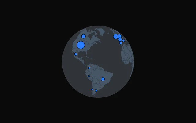
dataKey?string
Key of each row's value: a marker's area. Without it every marker takes radius.
radius?number
Radius of the markers (the largest, with dataKey), in pixels.
- Default
5
color?string
Fill of the markers.
- Default
"var(--chart-1)"
fadeOnHover?boolean
Dim the layer's other marks while one is hovered or focused.
- Default
true
inactiveOpacity?number
Opacity of the other marks while one is hovered or focused.
- Default
0.35
GlobeTooltip
content?(args: GlobeTooltipArgs) => ReactNode
Custom tooltip content. Replaces the default title and rows, inside the same panel.
- Type
(args: GlobeTooltipArgs) => ReactNode
formatValue?(value: number) => string
Formats the value row of the default content.
- Type
(value: number) => string- Default
the number with thousands separators
valueLabel?string
The label of the value row of the default content.
className?string
Additional class name for the tooltip panel.
panelStyle?CSSProperties
Inline styles merged onto the tooltip panel.
backgroundColor?string
Background color of the tooltip panel. Overrides the theme's popover color.