shadcn.io is an independent project built on shadcn/ui
Installation
Usage
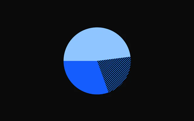
import { ChartPiePatternPresets } from "@/components/charts/chart-pie-pattern-presets";<ChartPiePatternPresets />API Reference
PieChart
dataPieData[]
The slices to draw, in order. Each item's value sets its share of the total, and its label is shown in the centre while the slice is hovered.
size?number
Chart width and height in pixels. Omit to fill the width of the parent element; the chart stays square.
innerRadius?number
Inner radius in pixels. 0 draws a solid pie; a positive value draws a donut and leaves room for PieCenter.
- Default
0
padAngle?number
Gap between neighbouring slices, in radians.
- Default
0
cornerRadius?number
Corner radius of each slice, in pixels.
- Default
0
startAngle?number
Angle where the first slice starts, in radians, clockwise from 12 o'clock (d3's convention): the default -Math.PI / 2 is 9 o'clock. bklit-ui's own comment calls the default "top", but its d3 arcs start at 9 o'clock too.
- Default
-Math.PI / 2
endAngle?number
Angle where the last slice ends, in radians. Together with startAngle this sets the sweep; the default is a full circle.
- Default
(3 * Math.PI) / 2
className?string
Extra class name for the chart container.
style?CSSProperties
Inline styles for the chart container, merged over the default sizing.
hoveredIndex?number | null
Index of the hovered slice, for controlled hover. Pass null for no hover; leave it undefined to let the chart manage hover itself.
- Type
number | null
onHoverChange?(index: number | null) => void
Called with the index of the hovered or keyboard-focused slice, or null when hover ends.
- Type
(index: number | null) => void
hoverOffset?number
Distance in pixels a hovered slice moves out (or grows by). The pie also reserves this much padding around its edge so a hovered slice is never clipped. A PieSlice can override it for its own slice.
- Default
10
childrenReactNode
PieSlice elements to configure individual slices, an optional PieCenter, and any pattern or gradient definitions that slices reference through fill.
enterTransition?PieEnterTransition
Transition for the slice entrance sweep, in the shape used by the motion library (type, duration in seconds, ease, and spring values). Defaults to a 1.1 second tween on the shared reveal curve.
enterStaggerScale?number
Multiplier for the delay between one slice's entrance and the next. 0 starts all slices together.
- Default
1
geometryScrubbing?boolean
Turns off hover effects, PieSlice overrides and the hover readout in PieCenter. Meant for live editors that redraw the geometry while a control is dragged; leave it off otherwise.
- Default
false
ariaLabel?string
Accessible name of the chart.
- Default
"Pie chart"
ariaDescription?string
Longer accessible description of the chart.
PatternPreset
idstring
Id of the pattern: point a fill at it with fill="url(#id)".
preset?PatternPresetId
The preset to draw (see PATTERN_PRESET_IDS; the legacy ids still work).
- Default
"diagonal-up"
color?string
Colour of the pattern (its currentColor).
- Default
"var(--chart-1)"
scale?number
Multiplies the tile size; the line width scales with it. 2 doubles it.
- Default
1
strokeWidth?number
Line width of the line presets, in tile units (multiplied by scale).
- Default
1
opacity?number
Opacity of the pattern, not of the tile background.
- Default
1
tileBackground?string
Solid colour painted under the pattern in each tile.
radius?number
Deprecated: No effect: only the earlier circle presets read it..
complement?boolean
Deprecated: No effect: only the earlier circle presets read it..
fill?string
Deprecated: No effect: only the earlier circle presets read it..
dotFill?boolean
Deprecated: No effect: only the earlier dot preset read it..
PieSlice
indexnumber
Index of the slice this element configures, matching its position in the data array.
color?string
Colour of this slice's hover glow (showGlow). Defaults to the data item's color, then the palette. To paint the slice itself, set color on the PieData item, or use fill.
fill?string
Paint override for this slice, for example url(#patternId) for a pattern or gradient defined as a child of the chart. Takes precedence over the data item's color and fill.
animate?boolean
Play the entrance animation for this slice. Set false to draw it without animating.
- Default
true
showGlow?boolean
Glow while the slice is hovered or keyboard-focused: a 12 px drop shadow in the slice's color.
- Default
false
hoverEffect?PieSliceHoverEffect
How the slice reacts when hovered: "translate" moves it outward, "grow" extends its outer radius, "none" leaves it in place.
- Default
"translate"
hoverOffset?number
Distance in pixels for the hover effect. Defaults to the chart's hoverOffset.
- Default
the chart's `hoverOffset`
className?string
Accepted for bklit-ui compatibility; has no effect.