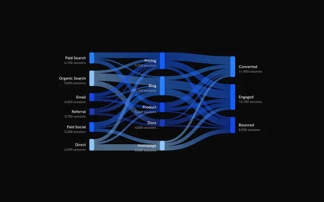
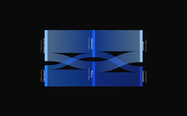
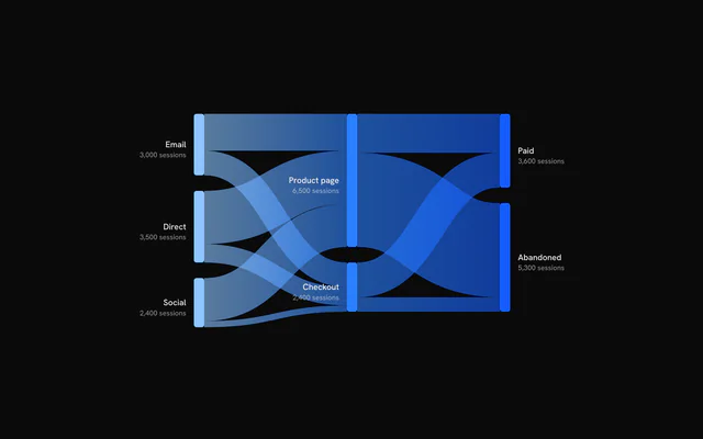
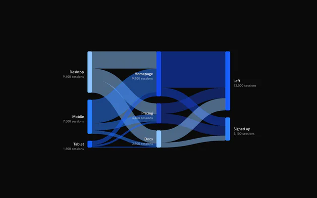
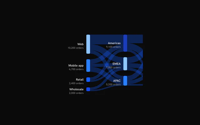
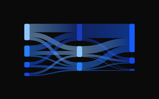
shadcn.io is an independent project built on shadcn/ui
Installation
Usage
import { ChartSankeyPatternLines } from "@/components/charts/chart-sankey-pattern-lines";<ChartSankeyPatternLines />API Reference
SankeyChart
dataSankeyData
Nodes and links to draw. Links reference nodes by index; links with a non-positive or non-finite value are ignored, and the chart is empty when no positive link remains.
margin?Partial<Margin>
Chart margins in pixels. Any side you omit keeps its default; the wide left and right defaults leave room for node labels.
- Type
Partial<Margin>- Default
{ top: 40, right: 180, bottom: 40, left: 180 }
animationDuration?number
Duration of the enter animation in milliseconds.
- Default
1100
enterTransition?Transition
Enter transition (a spring or a cubic-bezier tween), in seconds. Overrides animationDuration when it sets a duration.
- Default
a 1.1s tween on the reveal curve
revealSignature?string
Changing this value replays the enter animation.
- Default
""
aspectRatio?string
Aspect ratio of the chart as "width / height".
- Default
"2 / 1"
nodeWidth?number
Width of the node bars in pixels.
- Default
16
nodePadding?number
Vertical gap between nodes of the same column in pixels.
- Default
24
className?string
Additional class name for the chart container.
children?ReactNode
SankeyNode, SankeyLink and SankeyTooltip to configure the chart, plus any elements that call useSankey().
hoveredNodeIndex?number | null
Controlled hovered node index, for example from a legend. Overrides hover from the chart surface; null clears it.
- Type
number | null
onNodeHoverChange?(index: number | null) => void
Called with the hovered node index (or null) when hover changes on the chart surface.
- Type
(index: number | null) => void
ariaLabel?string
Accessible label of the chart.
- Default
"Sankey chart"
ariaDescription?string
Longer accessible description of the chart.
SankeyLink
stroke?string
Solid color for all links. Overrides the gradient.
strokeOpacity?number
Opacity of the links.
- Default
0.5
fadedOpacity?number
Opacity of links not connected to the hovered node or link.
- Default
0.1
useGradient?boolean
Paint each link with a gradient from its source color to its target color.
- Default
true
getNodeColor?(node: SankeyPropNode, index: number) => string
Returns the color of a node, used for the gradient ends.
- Type
(node: SankeyPropNode, index: number) => string
getLinkColor?(link: SankeyPropLink, index: number) => string
Returns a solid color per link. Overrides the gradient.
- Type
(link: SankeyPropLink, index: number) => string
patterns?ReactNode
Pattern definitions (SVG <pattern> elements) that links can reference by id through getLinkPattern.
getLinkPattern?(link: SankeyPropLink, index: number) => string | null | undefined
Returns the id of a pattern to fill a link with, or null/undefined to use the gradient or solid color. A pattern wins over stroke and getLinkColor.
- Type
(link: SankeyPropLink, index: number) => string | null | undefined
PatternLines
idstring
Id of the pattern, referenced as url(#id) in a fill.
widthnumber
Width of the pattern tile in px.
heightnumber
Height of the pattern tile in px.
className?string
Class name added to the drawn shapes.
background?string
Background color of the tile. No background is drawn when omitted.
stroke?string
Stroke color of the shapes.
strokeWidth?number | string
Stroke width of the shapes.
- Type
number | string
strokeDasharray?string | number
SVG dash pattern of the stroke.
- Type
string | number
strokeLinecap?PatternLinecap
Line cap of the stroke: "square", "butt", "round" or "inherit".
- Default
"square"
shapeRendering?string | number
SVG shape-rendering of the shapes.
- Type
string | number- Default
"auto"
orientation?PatternOrientationType[]
Directions of the lines: any of "vertical", "horizontal", "diagonal" and "diagonalRightToLeft".
- Default
["vertical"]
SankeyNode
fill?string
Fill color of the nodes.
- Default
the theme chart colors, by node
lineCap?number
Corner radius of the nodes in pixels.
- Default
4
fadedOpacity?number
Opacity of nodes not connected to the hovered node or link.
- Default
0.4
showLabels?boolean
Show node names.
- Default
true
showValueLabels?boolean
Show node values under the names.
- Default
true
formatValue?(value: number) => string
Formats the value shown under a node's name. A node's value is the larger of its inflow and outflow.
- Type
(value: number) => string- Default
the value as an integer followed by " sessions"
labelOrientation?SankeyLabelOrientation
Reading direction of the labels outside the nodes.
- Default
"horizontal"
getNodeColor?(node: SankeyPropNode, index: number) => string
Returns the color of a node. Overrides fill.
- Type
(node: SankeyPropNode, index: number) => string
SankeyTooltip
nodeContent?(props: { node: SankeyPropNode; index: number }) => ReactNode
Custom tooltip content for a node. Receives the node and its index.
- Type
(props: { node: SankeyPropNode; index: number }) => ReactNode
linkContent?(props: { link: SankeyPropLink; index: number }) => ReactNode
Custom tooltip content for a link. Receives the link and its index.
- Type
(props: { link: SankeyPropLink; index: number }) => ReactNode
formatValue?(value: number) => string
Formats the values in the default tooltip.
- Type
(value: number) => string- Default
integer formatting
valueLabel?string
Label of the value row in the default node tooltip.
- Default
"Sessions"
className?string
Additional class name for the tooltip.
panelStyle?CSSProperties
Inline styles merged onto the tooltip panel, for example a background or a backdrop blur. A number is in pixels where CSS needs a unit.
exit?boolean
Fade the panel out when the hover ends (over the hover profile); false hides it at once.
- Default
true