shadcn.io is an independent project built on shadcn/ui
Installation
Usage
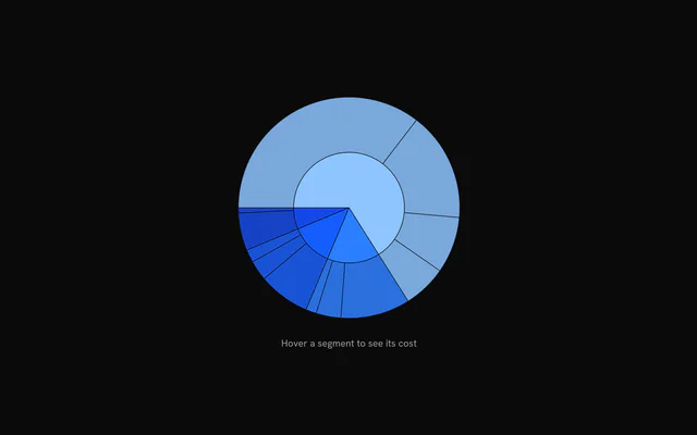
import { ChartSunburstPatterns } from "@/components/charts/chart-sunburst-patterns";<ChartSunburstPatterns />API Reference
SunburstChart
dataSunburstNode
Hierarchical data tree. Parent values are summed from their children.
size?number
Chart diameter in pixels. The chart shrinks to fit narrower containers.
- Default
520
playKey?number
Change this number to replay the enter animation.
- Default
0
className?string
Additional class name for the chart wrapper.
focusId?string
Controlled drill-down focus: the id of the focused node (names from the root joined with " / "). Omit for uncontrolled drill-down.
onFocusChange?(focusId: string) => void
Called with the new node id when the focus changes through a segment click, the center hub, a keyboard zoom or a breadcrumb.
- Type
(focusId: string) => void
hoveredIndex?number | null
Controlled hover: the index of the hovered arc in the arcs array returned by buildArcs, or null for none.
- Type
number | null
onHoverChange?(index: number | null) => void
Called with the arc index (or null) when the hovered arc changes.
- Type
(index: number | null) => void
hoverPop?number
How far in pixels the hovered segment grows outward.
- Default
8
padding?number
Inset in pixels reserved inside the chart for hover growth, relative to size.
- Default
derived from the tree depth, `size` and `hoverPop`
enterTransition?SunburstEnterTransition
Overrides the enter animation: a tween's duration (in seconds) and ease (a cubic-bezier as 4 numbers, or an easing function), or a spring.
- Default
{ duration: 1.1, ease: [0.85, 0, 0.15, 1] }
enterStaggerScale?number
Scales the stagger between rings and segments during the enter animation.
- Default
1
ariaLabel?string
Accessible label of the chart.
- Default
"Sunburst chart of " followed by the root's `name`
ariaDescription?string
Longer accessible description of the chart.
- Default
the keyboard instructions: arrow keys to inspect, Enter or Space to zoom in, Escape or the center disc to zoom out
childrenReactNode
SunburstSegment, SunburstCenter, SunburstLabels, SunburstBreadcrumb and SunburstHint children, and the patterns (PatternLines…) and gradients (LinearGradient, RadialGradient) a segment's fill references. Render one SunburstSegment per arc index to customize individual segments.
PatternLines
idstring
Id of the pattern, referenced as url(#id) in a fill.
widthnumber
Width of the pattern tile in px.
heightnumber
Height of the pattern tile in px.
className?string
Class name added to the drawn shapes.
background?string
Background color of the tile. No background is drawn when omitted.
stroke?string
Stroke color of the shapes.
strokeWidth?number | string
Stroke width of the shapes.
- Type
number | string
strokeDasharray?string | number
SVG dash pattern of the stroke.
- Type
string | number
strokeLinecap?PatternLinecap
Line cap of the stroke: "square", "butt", "round" or "inherit".
- Default
"square"
shapeRendering?string | number
SVG shape-rendering of the shapes.
- Type
string | number- Default
"auto"
orientation?PatternOrientationType[]
Directions of the lines: any of "vertical", "horizontal", "diagonal" and "diagonalRightToLeft".
- Default
["vertical"]
SunburstSegment
indexnumber
Arc index to customize, from the arcs array returned by buildArcs.
color?string
Color override for this segment.
fill?string
Fill override: a color, or a pattern or gradient as url(#id) (a PatternLines… or LinearGradient child of the chart, ids scoped to it). Overrides color.
fillOpacity?number
Fill opacity override (0 to 1).
- Default
1 for the innermost visible ring, then fading with depth down to 0.45
SunburstCenter
className?string
Class name of the center hub's group.
SunburstHint
className?string
Class name of the hint element.
children?ReactNode | ((context: SunburstHintContext) => ReactNode)
Custom hint content, or a function receiving the hint context. Defaults to the hovered path or zoom instructions.
- Type
ReactNode | ((context: SunburstHintContext) => ReactNode)