shadcn.io is an independent project built on shadcn/ui
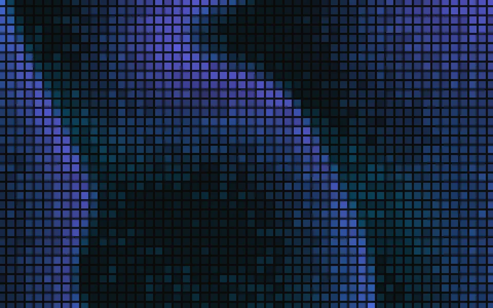
Pixels draws a wall of chunky squares, like a low-resolution aurora: a smooth field of slow waves is sampled once per pixel, so each wave crosses the grid as a stepped front with a tail of color behind it. Every pixel is a little off its neighbors and twinkles at its own pace. It's a GLSL scene on WebGL2 with no dependency. The pixels glow on a dark surface and are flat tints on a light one, and the ones near the pointer light up.
Use it behind a hero for a product about screens, media or data, or as a colored ground for a card. For cells that flicker at random instead of in waves, use Flickering Grid; for the same light as smooth curtains, Aurora; for a 1-bit look in two colors, Dither. With reduced motion it holds one still frame of the wall.
Installation
Usage
import { Pixels } from "@/components/ui/pixels";<Pixels className="flex min-h-[32rem] flex-col items-center justify-center gap-4">
<h1 className="text-5xl font-semibold">One timeline for every screen</h1>
<p className="text-foreground/80">Video walls, lobby signs and menu boards.</p>
</Pixels>Pixels is a container: whatever you put inside sits on top of the wall, in normal flow. It fills its own box, so give it a height or content. For a backdrop behind the whole page, render it empty with className="fixed inset-0 -z-10".
Presets
<Pixels /><Pixels
colors={["#f59e0b", "#ef4444", "#d946ef"]}
gap={6}
intensity={1.4}
shape="round"
size={8}
/><Pixels
colors={["var(--foreground)", "var(--muted-foreground)"]}
gap={5}
levels={4}
shape="round"
size={5}
/><Pixels
colors={["#14b8a6", "#0ea5e9", "#6366f1"]}
gap={2}
glow={1}
levels={16}
scale={0.6}
size={28}
/><Pixels
colors={["#fb7185", "#f43f5e"]}
contrast={2}
gap={3}
intensity={1.5}
levels={5}
scale={2.2}
size={8}
speed={1.4}
/><Pixels
angle={90}
gap={1}
levels={16}
scale={1.6}
shimmer={0}
size={12}
/><Pixels
colors={["#22c55e", "#16a34a"]}
contrast={1.6}
gap={2}
levels={3}
shimmer={0.6}
size={6}
/>Each preset is a set of props, so copy one and keep tuning. Wall is the default. Led turns the squares into round dots on a wide pitch in amber, red and magenta, Terminal uses 6px green pixels with three steps of brightness, Mosaic lays 28px tiles under long waves, and Mono draws a dot matrix in your theme's foreground color.
Examples
Hero
The demo sets no props. At intensity={1} the scene holds its brightest pixel to a level that keeps the foreground color readable on top, so a centered headline, a line of copy and two buttons read anywhere on the wall. The chip and the second button have a translucent ground of their own.
LED wall
shape="round" draws each pixel as a dot, here 8px wide on a 14px pitch (size={8}, gap={6}) on a dark surface, with colors running from amber at the front of each wave through red to magenta along its tail. intensity={1.4} lets the dots shine past the level kept for copy.
In a card
Larger pixels suit a small box: size={20} with gap={3}. fade="bottom" thins the wall out toward the copy at the bottom of the card.
Customization
colors takes two to eight CSS colors, from the front of each wave back along its tail, mixed in OKLab. A theme variable works and follows a theme switch. size and gap are in pixels and shape is square or round. scale sets how wide the waves are and angle where they travel, levels the steps of brightness, contrast how far the lit pixels stand out, and shimmer how much each pixel differs from its neighbors.
The surface is the root's own background, bg-background by default. Give the root another (bg-zinc-950, a brand color) and the wall adapts: the pixels add light to a dark surface and tint a light one, and glow sets the soft light in the gaps between them. fade masks an edge, opacity turns the whole wall down, and grain adds film grain.
<Pixels
  className="min-h-[32rem]"
  colors={["var(--chart-1)", "var(--chart-2)", "var(--chart-3)"]}
  fade="radial"
  gap={2}
  size={10}
/>
Performance
It's one WebGL2 canvas and one fragment shader with no texture. Each pixel of the screen takes two readings of the wave field, one for the cell it's in and one for the soft light between cells, at three samples of simplex noise each; the grid itself is a few divisions. It draws only while it's on screen and the tab is visible, shares one frame loop with every other background on the page, and lowers its own resolution if frames run long. quality sets the render scale yourself, and paused holds the frame.
Accessibility
The wall is decoration: it's hidden from assistive tech and lets every click through to your content. With reduced motion it draws one still frame and ignores the pointer and presses. Nothing flashes: a wave takes about 25 seconds to cross its own length, and a pixel eases from one step of brightness to the next.
At intensity={1} the scene limits how bright a pixel gets on a dark surface and how deep it gets on a light one, whatever the palette. With the default colors text-foreground keeps 4.7:1 over the brightest pixel on a dark surface and 8.3:1 over the deepest on a light one. Above intensity={1} that limit is gone, so keep copy on a ground of its own.
FAQ
How do I change the colors?
Pass two to eight CSS colors to colors. The first is the front of each wave, where the pixels are brightest, and the last is the end of its tail. Hex, oklch() and theme variables such as var(--chart-1) all work, and a variable follows your theme when it changes. Mid-tone colors read best on both a light and a dark surface.
Why do yellow and orange look dull on a dark background?
At intensity={1} the scene holds every pixel under the brightness that keeps white text readable on top. Blues and violets fit under that limit at full strength, but yellow, orange and cyan are much brighter hues, so they're dimmed to reach it. If no copy sits on the wall, raise intensity to about 1.4 and the colors come back.
Does it work on a light page?
Yes, with no prop to set. The scene reads the color behind it: on a dark surface the pixels add light like LEDs, and on a light one they're flat tints of the same palette, at most about 60% strong, so the wall reads as a pastel mosaic. Set the surface with a class on the component, such as bg-zinc-950.
How do I make the pixels bigger or rounder?
size is the side of a pixel and gap the space between two, both in CSS pixels, from 3 to 48 and 0 to 16. shape="round" turns each square into a dot. The wall is laid out on whole device pixels at any screen ratio, so every pixel is drawn the same and the grid doesn't shimmer as the waves pass.
How do I put it behind the whole page?
Render it empty with className="fixed inset-0 -z-10". It still follows the pointer there, since it listens on the window. To put it behind one section, wrap that section's content in it and give it a height, such as min-h-svh. The pixels keep their size, so a larger box shows more of them.
Will it slow my page down?
It's a light shader: six noise samples a pixel, on the GPU, and nothing at all while it's off screen or the tab is hidden. If a device can't keep up, it renders fewer pixels by itself. glow={0} drops the light between the cells and with it half of the samples.
What do the pointer and a press do?
The pixels within radius of the pointer come up toward full brightness, more the closer they are. A press sends a ring of light through the wall that fades in about two seconds. Presses on links, buttons and fields over the background are left alone, touch never moves it, and interactive={false} turns both off.
Does it work with Next.js and server components?
Yes. Import it into a server component and it renders its box and your content on the server; the canvas starts in the browser and fades in over the surface. It needs WebGL2, which every current browser has. Without it the box keeps its background, or the fallback you pass.
API Reference
Pixels
data-slot="pixels"
angle?number
The direction the waves travel, in degrees: 0 moves them to the right, 90 upward.
- Default
25
colors?string[]
Two to eight CSS colors, from the front of each wave back along its
tail. Mid-tone colors read on a light surface and a dark one; theme
variables such as var(--chart-1) follow your theme.
- Default
["#6366f1", "#3b82f6", "#0ea5e9"]
contrast?number
How far apart the dim and the lit pixels are: 0 lights every pixel the same, 2 leaves only the crests of the waves.
- Default
1
fade?"none" | "radial" | "top" | "bottom" | "left" | "right"
Which edges fade out to the surface: radial keeps the middle, the
others name the side that fades.
- Type
"none" | "radial" | "top" | "bottom" | "left" | "right"- Default
"none"
fallback?string
What shows until the first frame and in browsers without WebGL2: a CSS
background value that looks like the scene.
gap?number
The space between two pixels, in CSS pixels.
- Default
4
glow?number
How strong the soft light under the pixels is, from 0 (bare pixels) to 1.
- Default
0.5
grain?number
Film grain over the scene, from 0 to 1.
- Default
0
intensity?number
How strongly the pixels show over the surface. At 1 the brightest one is held to a level that keeps copy on top readable.
- Default
1
interactive?boolean
Whether the scene follows the pointer and answers a press. Touch never moves it, so scrolling a page on a phone isn't disturbed.
- Default
true
levels?number
How many steps of brightness a pixel has, from 2 (on or off) to 16 (close to smooth).
- Default
6
opacity?number
How strongly the scene shows over the surface, from 0 to 1.
- Default
1
paused?boolean
Holds the current frame.
- Default
false
quality?number
Render scale, from 0.25 to 1, of the screen's pixels (capped at 2×). Lower is cheaper and softer.
- Default
1
radius?number
How far the pointer's light reaches, in CSS pixels.
- Default
140
scale?number
The size of the waves: higher packs more, narrower waves across the box.
- Default
1
seed?number
Another layout of the same look, from 0 to 20.
- Default
0
shape?"square" | "round"
What a pixel is: a square, or a round dot like an LED.
- Type
"square" | "round"- Default
"square"
shimmer?number
How much each pixel differs from its neighbors in brightness and hue, and twinkles on its own, from 0 (a clean gradient) to 1.
- Default
0.35
size?number
The side of a pixel, in CSS pixels.
- Default
14
speed?number
Animation speed: 1 is normal, 0 holds the frame.
- Default
1
time?number
A fixed moment, in seconds: draws it and doesn't animate.