shadcn.io is an independent project built on shadcn/ui
Orb Background for Svelte
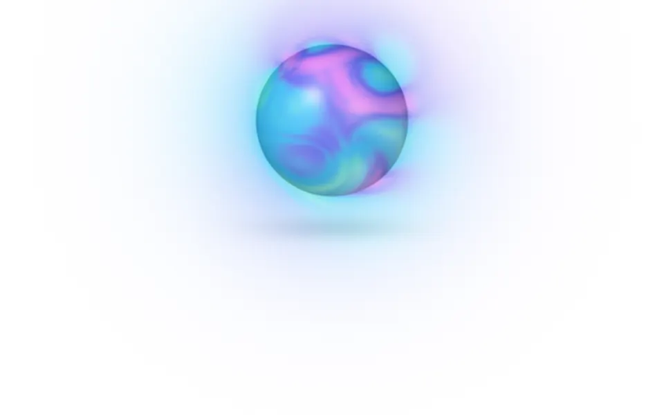
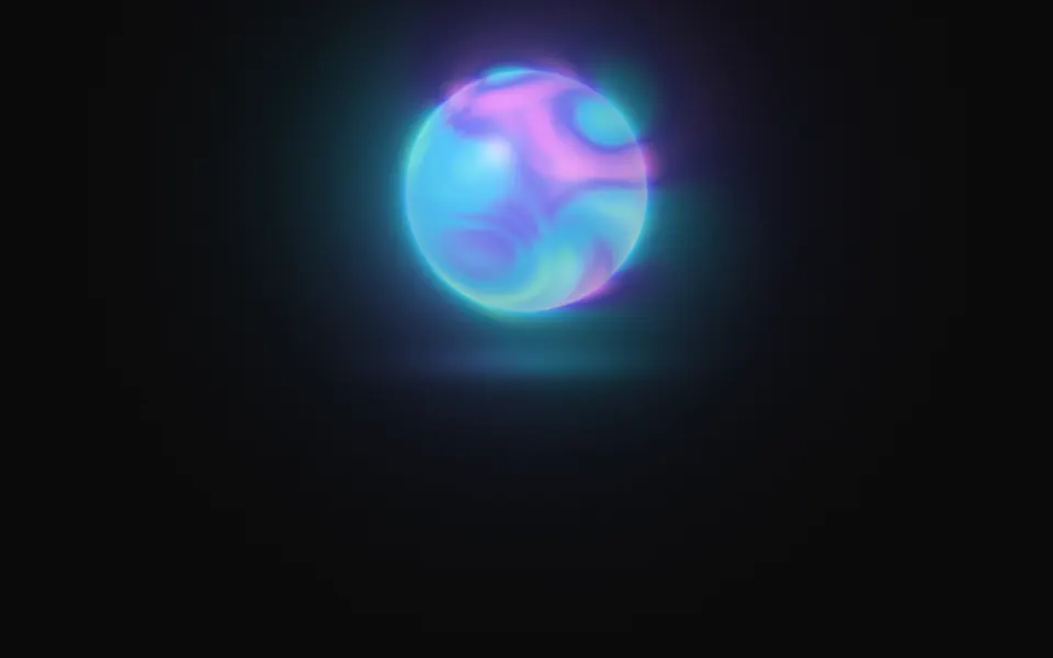
A glass sphere of flowing color with a soft halo, like an assistant waiting. For Svelte with Ark UI, when an AI product needs a presence.
A glowing sphere hangs in the box with color flowing slowly inside it and a soft halo around it. It's a GLSL scene on WebGL2 with no dependency: the colors fold through each other on warped noise, on a face that bulges like a lens, and the ball is shaded as glass, with a bright edge and a highlight. The halo takes the color nearest the edge. On a dark surface it throws a pool of light under itself; on a light one it's a tinted ball with a soft shadow. It breathes, turns toward the pointer and swells a little, and a press sends a ring out through the halo.
Use it as the presence of an assistant, a voice mode or a loading state the size of a hero. For a soft light with no shape, behind the copy, use Glow; for a globe of dots that turns, Sphere; for the same flowing color across the whole box, Mesh Gradient. With reduced motion it holds one still frame.
Installation
Usage
<script lang="ts">
import { Orb } from "@/components/ui/orb";
</script>
<Orb class="flex min-h-[36rem] flex-col items-center justify-end pb-14">
  <h1 class="text-5xl font-semibold">Ask out loud, get an answer back</h1>
</Orb>
Orb is a container: whatever you put inside sits on top of it, in normal flow. It fills its own box, so give it a height or content. By default the orb sits in the upper half, so put the copy in the lower half, or move the orb with placement. For a backdrop behind the whole page, render it empty with className="fixed inset-0 -z-10".
Presets
<Orb /><Orb
breath={0.2}
colors={["#38bdf8", "#6366f1"]}
contrast={0.4}
detail={0}
gloss={0.4}
halo={0.5}
placement="center"
size={1.4}
speed={0.5}
swirl={0.3}
/><Orb
colors={["#fde047", "#fb923c", "#f43f5e", "#a21caf"]}
contrast={1.2}
placement="center"
size={1.4}
swirl={1.4}
/><Orb
colors={["var(--foreground)", "var(--muted-foreground)", "var(--border)"]}
gloss={0.8}
halo={0.5}
placement="center"
size={1.4}
/><Orb
colors={["#e0f2fe", "#c7d2fe", "#fbcfe8"]}
contrast={0.5}
detail={0.1}
gloss={1}
halo={0.6}
placement="center"
size={1.4}
swirl={0.5}
/><Orb halo={1.4} placement="bottom" size={2.2} /><Orb
colors={["#22d3ee", "#a855f7", "#f43f5e"]}
contrast={1.3}
detail={0.6}
gloss={0.3}
halo={1.6}
placement="center"
scale={1.2}
size={1.4}
swirl={1.8}
/>Each preset is a set of props, so copy one and keep tuning. Aura is the default. Pearl is a pale, glossy ball with almost no swirl, Calm is two blues that barely move, and Storm winds three strong colors into a tight whirl. Rise sets a large orb low, so the bottom edge crops it like a horizon, and Mono takes its colors from your theme.
Examples
Hero
The default orb sits in the upper half of the box and the copy is aligned to the bottom, under the pool of light or the shadow the orb throws. It uses no props.
Colors
colors flow inside the orb in order: here yellow, orange, rose and plum on a dark surface, with placement="center", size={1.5}, a tighter whirl (swirl={1.4}) and contrast={1.2}.
In a card
A pale palette with contrast={0.5} and swirl={0.5} gives a pearl: the colors barely separate, and gloss={1} makes the highlight and the edge carry the shape. The text sits at the bottom of the card, clear of the orb.
Customization
colors takes two to five CSS colors, mixed in OKLab. A theme variable works and follows a theme switch. placement and size put the orb in the box; swirl, scale, detail and contrast shape the flow inside it; gloss sets how glassy the surface is, halo how far the glow reaches, ground the pool or the shadow under it, and breath how much it swells by itself.
The surface is the root's own background, bg-background by default. Give the root another (bg-slate-950, an image, a gradient) and the orb adapts: on a dark surface its edge brightens and its halo adds light, on a light one the edge deepens and the halo is a tint. fade masks an edge, opacity turns the whole effect down, and grain adds film grain.
<Orb
  class="min-h-[32rem] bg-zinc-950"
  colors={["var(--chart-1)", "var(--chart-2)", "var(--chart-4)"]}
  grain={0.15}
  placement="right"
  size={1.4}
/>
Performance
It's one WebGL2 canvas and one fragment shader: five samples of simplex noise a pixel for the flow, a few powers for the glass, and two short loops over the four presses it remembers. Nothing is marched. It draws only while it's on screen and the tab is visible, shares one frame loop with every other background on the page, and lowers its own resolution if frames run long. quality sets the render scale yourself, and paused holds the frame.
Accessibility
The orb is decoration: it's hidden from assistive tech and lets every click through to your content. With reduced motion it draws one still frame and ignores the pointer. Nothing flashes: a press makes it swell by 6% and sends one soft ring outward, and both fade within two seconds.
Don't put text on the orb itself: it's opaque and bright on any surface. With the default placement="top" and size={1} it stays in the upper half of the box, and copy under it sits on a nearly plain surface: the headline in the hero demo measures about 11:1 on dark and 18:1 on light.
FAQ
How do I change the colors of the orb?
Pass two to five CSS colors to colors. They flow inside the orb in the order you give them, so neighbors in the list meet most often, and the halo takes whichever color is nearest the edge. Hex, oklch() and theme variables such as var(--primary) all work, and a variable follows your theme when it changes.
Does the orb work on a white page?
Yes, with no prop to set. The scene reads the color behind it. On a dark surface the orb's edge is bright, its halo adds light and it throws a pool of light under itself. On a light one a glow would vanish, so the edge deepens for definition, the halo becomes a soft tint and the pool becomes a shadow.
How do I move or resize it?
placement takes top, center, bottom, left or right, and size scales it: at 1 its diameter is 37% of the box's shorter side. placement="right" with left-aligned copy suits a wide hero; placement="bottom" with size={2.2} crops a large orb at the bottom edge.
Can it show states such as listening or thinking?
It's one component with props, so change them as your state changes: the running scene updates in place. Raise speed and swirl while the assistant is thinking, raise intensity or size while it speaks, and lower breath and speed at rest. The values jump, they don't ease, so change them in small steps or animate the number yourself.
How do I put it behind the whole page?
Render it empty with className="fixed inset-0 -z-10". It still follows the pointer there, since it listens on the window. To use it in one section, wrap that section's content in it and give it a height, such as min-h-[36rem].
Does it work with Next.js and server components?
Yes. Import it into a server component and it renders its box and your content on the server; the canvas starts in the browser, and the orb grows to its size as it fades in. It needs WebGL2, which every current browser has. Without it the box keeps its background, or the fallback you pass.
Will it slow my page down?
It's a light shader: five noise samples a pixel, on the GPU, and nothing at all while it's off screen or the tab is hidden. If a device can't keep up, it renders fewer pixels by itself. For a phone-first page, quality={0.75} draws a little over half the pixels; the orb's edge gets slightly softer.
API Reference
Orb
data-slot="orb"
breath?number
How much the orb breathes, swelling and settling by itself, from 0 (still) to 1.
- Default
0.5
colors?string[]
Two to five CSS colors that flow inside the orb; its halo takes the
color nearest its edge. Theme variables such as var(--primary) follow
your theme.
- Default
["#5eead4", "#38bdf8", "#6366f1", "#e879f9"]
contrast?number
How far apart the colors inside pull: 0 is one soft blend, 2 is clear bands of each color.
- Default
1
detail?number
How much finer folds the flow has inside its broad ones, from 0 to 1.
- Default
0.5
fade?"none" | "radial" | "top" | "bottom" | "left" | "right"
Which edges fade out to the surface: radial keeps the middle, the
others name the side that fades.
- Type
"none" | "radial" | "top" | "bottom" | "left" | "right"- Default
"none"
fallback?string
What shows until the first frame and in browsers without WebGL2: a CSS
background value that looks like the scene.
gloss?number
How glassy the surface is: the highlight, the bright edge and the light gathered on the far side, from 0 (a matte ball) to 1.
- Default
0.6
grain?number
Film grain over the scene, from 0 to 1.
- Default
0
ground?number
How strongly the orb shows on the ground under it: a pool of light on a dark surface, a soft shadow on a light one. From 0 (none) to 1.
- Default
0.5
halo?number
How far the halo around the orb reaches, from 0 (none) to 2.
- Default
1
intensity?number
How bright the orb and its halo are.
- Default
1
interactive?boolean
Whether the scene follows the pointer and answers a press. Touch never moves it, so scrolling a page on a phone isn't disturbed.
- Default
true
opacity?number
How strongly the scene shows over the surface, from 0 to 1.
- Default
1
paused?boolean
Holds the current frame.
- Default
false
placement?"top" | "center" | "bottom" | "left" | "right"
Where the orb sits in the box. top leaves the lower half free for
copy; left and right leave the other side.
- Type
"top" | "center" | "bottom" | "left" | "right"- Default
"top"
quality?number
Render scale, from 0.25 to 1, of the screen's pixels (capped at 2×). Lower is cheaper and softer.
- Default
1
scale?number
The size of the shapes that flow inside: higher packs more, smaller ones. From 0.5 to 2.
- Default
1
seed?number
Another arrangement of the flow: an integer from 0 to 20.
- Default
0
size?number
The orb's size: at 1 its diameter is 37% of the box's shorter side.
- Default
1
speed?number
Animation speed: 1 is normal, 0 holds the frame.
- Default
1
swirl?number
How much the flow inside twists and folds, from 0 (soft drifting patches) to 2 (a tight whirl).
- Default
1
time?number
A fixed moment, in seconds: draws it and doesn't animate.