Aman Design System
Quiet luxury in tokens: charcoal ink on warm linen, Lyon Text serif headings, WhitneySSm navigation, no radius and no brand color. For React and AI tools.
- Primary color
- #404040
- Typeface
- WhitneySSm
- Shape
- Sharp
- Base radius
- 0px
- Colors
- 8
- Type tokens
- 11
- Components
- 15
- Spacing values
- 8
About Aman DESIGN.md
Curated by Dov Azencot, updated May 19, 2026. Source aman.com (opens in a new tab).
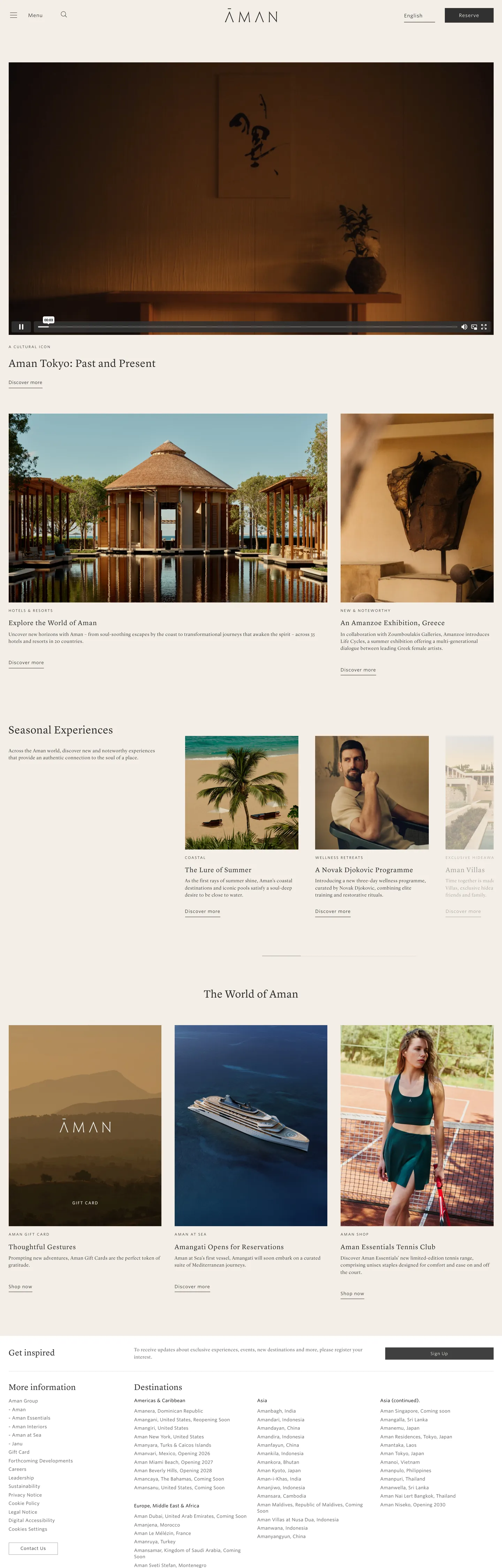
Aman's marketing site operates at a remove from every design-system convention. There is no primary brand color. There is no border radius. There is almost no UI chrome. The page is a sequence of full-bleed resort photographs — thatched pavilions over turquoise water, a tatami room in Tokyo, a courtyard at dusk — separated by narrow editorial headings in a weight-400 serif and small-caps WhitneySSm labels. Where Four Seasons uses deep green as a brand anchor, and Rosewood uses a restrained gold pairing, Aman removes the brand-chrome layer entirely. The page's chromatic voice comes from the photographs; the system's job is to ensure no token competes with them.
The DESIGN.md file packages the system into a machine-readable spec for React and AI coding tools. Inside: 8 colors tokens running from charcoal ink (#313131) through a graduated gray family to warm linen (#f3eee7) — no hue anywhere in the palette except the linen's faint warmth; 11 typography tokens spanning Lyon Text Web and WhitneySSm, both at weight 400, with hierarchy delivered through size (from 10px small-caps labels to 31px h2) and letter-spacing (from 0.3px on navigation to 2px on uppercase labels); zero border-radius tokens (the spec uses a single `none: "0px"` value); 8 spacing tokens on a 7px-anchored modular scale; and 15 components definitions covering the sharp-edged reserve button, the whisper-weight nav, the full-bleed editorial section layout, and the photography-led media grid.
Feed this file to Claude or Cursor and it will reproduce Aman's specific register: charcoal over linen instead of black over white, Lyon Text Web only for h2 and h3 editorial moments, WhitneySSm for every functional surface, no rounding anywhere, and letter-spacing doing the work that weight would do in any other luxury system. The move worth borrowing — only if your product has genuinely extraordinary photography — is the willingness to leave the brand-chrome layer empty and let the images do the identity work. Without exceptional photographs, this system reads as an unfinished page.
What makes it distinct
5 highlights
- Zero border radiusNot a single rounded corner appears across the entire captured site; every surface is rectilinear, including the primary CTA button
- Two-serif typographic systemLyon Text Web for editorial headings, WhitneySSm for navigation and labels; both families are weight 400, hierarchy comes from size and letter-spacing alone
- Charcoal not blackThe primary ink is #313131 rather than pure black, a choice that removes visual aggression and keeps the type in harmony with linen tones
- Fractional spacing scaleThe page uses 5.6px, 4.2px, and 14px as primary rhythm tokens, suggesting a modular scale anchored on 7px rather than a conventional 4px or 8px grid
- Linen canvas as themeColor#f3eee7, declared in the page meta themeColor, appears as the button text and select background surface — warmer than cream, closer to undyed linen
Live at aman.com
Aman in production, as captured. Scroll the window to see the whole page.
8 colors
Aman's system anchors on #404040 (ink-mid) as its primary color. Type is set in WhitneySSm across 11 tokens from 10.108px to 31.08px, weights 400–400. Shape language is sharp — components average 0px corner radius, favoring crisp rectangles.
Surface
Page and card backgrounds · 1
Text
Headlines, body, captions · 4
Borders & Hairlines
Dividers, outlines, rules · 1
Other
Specialty colors · 2
11 type tokens
Set in WhitneySSm across 11 tokens, from 10.108px to 31.08px, weights 400–400. Shown in its own stack: where the font isn't installed, the fallback the file names stands in.
- display-lg31.08px · weight 400 · lh 45.066px · tracking 0.5pxThe quick brown fox jumps over the lazy dog
- display-md24.108px · weight 400 · lh 34.9566px · tracking 0.5pxThe quick brown fox jumps over the lazy dog
- heading-sm19.6px · weight 400 · lh 28.42px · tracking 0.98pxThe quick brown fox jumps over the lazy dog
- body-md14px · weight 400 · lh 20.3px · tracking 0.8pxThe quick brown fox jumps over the lazy dog
- nav-link13px · weight 400 · lh 18.85px · tracking 0.42pxThe quick brown fox jumps over the lazy dog
- label-md13px · weight 400 · lh 18.85px · tracking 0.8pxThe quick brown fox jumps over the lazy dog
- label-sm12.95px · weight 400 · lh 18.7775px · tracking 0.3pxThe quick brown fox jumps over the lazy dog
- label-xs12.32px · weight 400 · lh 17.864px · tracking 0.7pxThe quick brown fox jumps over the lazy dog
- button-md14px · weight 400 · lh 20.3px · tracking 0.7pxThe quick brown fox jumps over the lazy dog
- small-caps10.108px · weight 400 · lh 14.6566px · tracking 2pxThe quick brown fox jumps over the lazy dog
- caption14px · weight 400 · lh 16.1px · tracking 0.7pxThe quick brown fox jumps over the lazy dog
Radii and spacing
1 corner radii and 8 spacing values. Shape language: sharp, on a 0px base radius.
Radii1
- none0px
Spacing8
- xxs4.2px
- xs5.6px
- sm7px
- base14px
- lg16px
- xl20px
- 2xl25.7964px
- 3xl65px
15 components
Each rendered from its tokens (color, type, radius, padding) on Aman's own canvas.
- Button PrimaryButton Primarybutton-primary
- Button SecondaryButton Secondarybutton-secondary
- Top NavTop Navtop-nav
- Nav LinkNav Linknav-link
- Hero SectionHero Sectionhero-section
- Hero HeadingHero Headinghero-heading
- Section HeadingSection Headingsection-heading
- Body ParagraphBody Paragraphbody-paragraph
- Small Caps LabelSmall Caps Labelsmall-caps-label
- CardCardcard
- Photo TilePhoto Tilephoto-tile
- Editorial SectionEditorial Sectioneditorial-section
- Type here…Text Inputtext-input
- FooterFooterfooter
- Footer LinkFooter Linkfooter-link
The system, in use
Aman's tokens on the kind of product it builds.
Find your place anywhere in the world
Book flights, stays and experiences, with flexible plans and help around the clock.
Aman design system FAQ
Aman's tokens, its components and how to use this DESIGN.md in your project.
Related reading
Specs, directories and component libraries that pair with this design system.
- Browse all design systemsThe full directory of DESIGN.md files on shadcn.io, with live mockups for each.shadcn.io
- Aman — official siteAman's public marketing site — the source of truth for the live tokens captured in this file.aman.com (opens in a new tab)
- The DESIGN.md specificationGoogle Labs' open spec for machine-readable design system files — the format this page is built on.github.com (opens in a new tab)
Use Aman in your project
One machine-readable file. Drop it into Claude Code, Cursor, VS Code or any AI tool that reads DESIGN.md.
Download the DESIGN.md
One machine-readable file: every color, type, radius, spacing, and component token of Aman.
Feed it to your AI tool
Drop it into Claude, Cursor, or GitHub Copilot. The agent writes React components and Tailwind classes that match Aman's visual language.
Reference the tokens directly
Or paste the values into your Tailwind config, CSS variables, or component library: every color, size and radius is a quoted, ready-to-copy value.
Read the full DESIGN.md overview, rationale, do’s and don’ts
Overview
Aman's marketing site operates as an exercise in subtraction. Whispered authority: the system achieves recognition not through a brand accent or a typographic hierarchy of weights, but through what it withholds — no color accent, no rounding, no weight variation, no decorative chrome. Where Four Seasons declares brand identity with a deep green system and Rosewood with gold hairlines, Aman removes every brand-chrome layer and relies on the resort photographs to establish the difference between this and any other luxury site. The charcoal ink (#313131) is not pure black — it sits three steps lighter, removing the aggressive contrast of a true black-on-white page and placing the text in a quieter register that doesn't compete with photography.
Serif-sans dialogue at weight 400: Lyon Text Web carries every editorial heading — h2 section titles at 31px, h3 feature headings at 19.6px — and WhitneySSm covers every functional surface: navigation links at 13px with 0.42px tracking, small-caps category labels at 10.1px with 2px tracking, and the primary "Reserve" button at 14px / weight 400. Both families run at weight 400 across every tier. Hierarchy comes entirely from size and letter-spacing, never from weight. This is the inverse of how most luxury brands assert hierarchy — where LVMH properties might use weight 700 for their h1, Aman keeps everything at 400 and lets size and spacing do the sorting.
Key Characteristics:
- Zero border radius on every element — the extraction returned an empty radii array across 1459 scanned elements. Every surface is sharp-edged, including the CTA button.
- Charcoal ink (#313131) as the dominant text and border tone — 579 occurrences, 289 as text, 289 as border. Never pure black on the editorial surface.
- Medium gray (#585858) for navigation and secondary text — 310 occurrences, creating a two-step ink ladder that separates primary content from navigational chrome.
- Lyon Text Web for h2/h3 editorial headings; WhitneySSm for all functional chrome — both at weight 400.
- Linen canvas (#f3eee7) as the themeColor meta value and the primary button text color — not cream, not off-white: a warm undyed linen.
- 7px-anchored modular spacing scale: 5.6px (dominant), 14px (secondary), 4.2px, 7px — fractional multiples of a 7px root unit.
- Full-bleed photography at every editorial section; the system's role is to frame, not to compete.
- Small-caps uppercase labels at 10.1px with 2px letter-spacing — the single typographic texture move in an otherwise plain-weight system.
Colors
Ink
- Ink (
#313131): frequency 579. Used as text (289), border (289), background (1). The primary structural tone for every heading, paragraph, hairline rule, and content border. Not pure black — three lightness steps above true black, which removes the confrontational quality of a high-contrast page. - Ink Mid (
#404040): frequency 2 — used on one background and one border. A transitional tone between charcoal ink and the medium gray navigation family. - Ink Soft (
#585858): frequency 310. Used as text (155), border (155). The navigation and secondary text tone — nav links, breadcrumbs, section captions. Creates a two-step ink ladder without introducing a third typeface. - Ink Faint (
#aaa6a3): frequency 1, as a border. A warm stone gray that appears as a single hairline; closer to the linen tone than to the charcoal family. - Jet (
#000000): frequency 28 — used as text (14) and border (14). Pure black appears only sparingly, in small interface elements where the charcoal would lose contrast.
Surface
- Canvas (
#ffffff): frequency 1, as background — pure white is nearly absent from the page. The site sits on a near-white that the extraction did not capture as a distinct background; the page's base surface reads as very light rather than stark white. - Linen (
#f3eee7): frequency 4 — 2 as text (the "Reserve" button label on the charcoal button fill), 2 as background (a select field or dropdown surface). The warmest tone in the palette; declared as the page's themeColor. Closer to undyed linen or a hotel notepad than to the warm cream of Cloudflare or the parchment of Soho House.
Hairlines
- Hairline (
#313131): the charcoal ink family serves double duty as both text and border — 289 of the 579 charcoal occurrences are border uses. There is no dedicated mid-gray or light-gray hairline; the system uses 1px charcoal rules throughout, which reads warmer than a black hairline but darker than the near-white hairlines of consumer SaaS.
Typography
Font Families
The system runs two licensed families: Lyon Text Web (Commercial Type) for editorial serifs and Lyon Display Web / WhitneySSm (Hoefler&Co) for functional sans text. Lyon Text Web is a contemporary oldstyle serif with moderate stroke contrast — historically anchored without reading as archaic. WhitneySSm is a humanist sans with low-contrast strokes and large x-height; it works exceptionally at the 10-14px range where Aman uses it.
Both families share weight 400 as their only weight. Hierarchy comes from size and letter-spacing — a convention associated with luxury print (Monocle, T Magazine, Vogue) rather than with software UI.
Hierarchy
| Token | Family | Size | Weight | Line Height | Letter Spacing | Use |
|---|---|---|---|---|---|---|
{typography.display-lg} | Lyon Text Web | 31.08px | 400 | 45.066px | 0.5px | Section h2 headings ("Aman Tokyo: Past and Present") |
{typography.display-md} | Lyon Text Web | 24.108px | 400 | 34.9566px | 0.5px | Sub-section h2 / editorial lead paragraphs |
{typography.heading-sm} | Lyon Text Web | 19.6px | 400 | 28.42px | 0.98px | h3 feature headings in the editorial grid |
{typography.body-md} | Lyon Display Web | 14px | 400 | 20.3px | 0.8px | Body paragraph text in editorial sections |
{typography.nav-link} | WhitneySSm | 13px | 400 | 18.85px | 0.42px | Navigation link labels, breadcrumbs |
{typography.label-md} | WhitneySSm | 13px | 400 | 18.85px | 0.8px | Secondary labels, category identifiers |
{typography.label-sm} | WhitneySSm | 12.95px | 400 | 18.7775px | 0.3px | Footer links, tertiary metadata |
{typography.label-xs} | WhitneySSm | 12.32px | 400 | 17.864px | 0.7px | Fine-print labels and sub-captions |
{typography.button-md} | WhitneySSm | 14px | 400 | 20.3px | 0.7px | Primary button label ("Reserve") |
{typography.small-caps} | WhitneySSm | 10.108px | 400 | 14.6566px | 2px | Small-caps category labels ("Seasonal Experiences", "The World of Aman") |
{typography.caption} | WhitneySSm | 14px | 400 | 16.1px | 0.7px | Inline date/location captions under photographs |
Principles
Weight 400 everywhere — no bold tier, no semibold, no medium. The weight restraint is the system's single most unusual typographic decision; most luxury brands use at least weight 500-600 for CTAs or heading emphasis. Aman keeps weight flat and uses letter-spacing instead: the small-caps labels at 2px tracking are the typographic peak of the system, making a 10px element feel more authoritative than a bold 18px one would.
Note on Font Substitutes
Lyon Text Web is available through Commercial Type (licensed). The closest alternative: Freight Text Pro or Source Serif 4 at weight 400 — both have the oldstyle proportions and moderate stroke contrast. WhitneySSm (Hoefler&Co) has no direct free equivalent; Proxima Nova at weight 400 with slightly reduced tracking transfers well for navigation-scale use.
Layout
Spacing System
- Root module: 7px — the spacing scale is anchored on multiples of 7px rather than the conventional 4px or 8px grid.
- Tokens:
{spacing.xxs}4.2px ·{spacing.xs}5.6px ·{spacing.sm}7px ·{spacing.base}14px ·{spacing.lg}16px ·{spacing.xl}20px ·{spacing.2xl}25.8px ·{spacing.3xl}65px. - Section padding (vertical): 65px between major editorial bands — generous but not extravagant.
- Horizontal padding: 24.5px on the booking bar and navigation rail (half of 49px, the
--bn-col-gapCSS custom property). - Button padding: 10×15px on the primary "Reserve" button, producing a modest 42px height.
Grid & Container
- Max content width: ~1391px on the editorial h2 (the extraction captured a 1391px element width for the hero heading), suggesting a near-full-viewport layout.
- Editorial sections: full-width content with constrained text columns at approximately 320px — very narrow editorial column widths beside photography panels.
- Photography grid: 3-column mosaic of resort imagery (featured article tile on the left, two smaller tiles on the right) for the "Aman Tokyo" editorial feature.
- "Seasonal Experiences" section: 3-column equal grid of portrait-orientation photography with small-caps labels and Lyon serif headings beneath each photograph.
- "The World of Aman" section: a wider-spaced grid of landscape photography tiles including the Aman logo lockup, "Amanjiwo" property title, and "Aman at Sea" cruise offering.
Rhythm
The page holds a single vertical tempo — 65px between sections, with photography filling the horizontal space entirely. There is no alternation between dense and generous bands; the page maintains one consistent pace from the video hero through to the footer. The 7px root module creates fractional spacing that reads as carefully considered rather than approximate.
Elevation
The system has no elevation. There are no box-shadows, no drop shadows, and no tonal surface lifts. The captured page contains no shadow entries in the extraction. Where many luxury brands use subtle shadows to lift cards off a background — Rolex uses a faint box-shadow on its product cards, Four Seasons uses hairline-bordered cards with a very subtle lift — Aman keeps every surface flush. The photography provides all spatial depth; a shadow on a content card would compete with the spatial depth in the photographs above it.
Shapes
The system has no rounding. The extraction returned an empty radii array — every one of the 1459 scanned elements has either 0px or no border-radius declared. The primary "Reserve" CTA button is sharp-edged (borderRadius 0px). Navigation elements are sharp. Image tiles are sharp. Footer cells are sharp.
This radical rectilinearity is a position, not an omission. The properties Aman photographs — Aman Tokyo's rectilinear floor plates, Amanyara's angular pavilion roofs, Amangiri's sandstone geometry — are architecturally sharp-edged. Rounding the UI elements would create a soft consumer-app layer over a collection of architectural destinations. The 0px radius is the system's way of saying: this is a place, not an app.
Components
button-primary — The reservation CTA. Charcoal {colors.ink} fill with linen {colors.linen} text, weight 400 WhitneySSm at 14px / 0.7px tracking, 0px radius, 10×15px padding, 42px height, 1px charcoal border. "Reserve" is the canonical instance. This is the only element with a linen-colored text label; everything else in the linen family is a surface background.
button-secondary — Transparent fill, charcoal text, 1px charcoal border, same 0px radius and 10×15px padding. Used for tertiary actions throughout editorial sections.
top-nav — Transparent background (overlays the page content), medium-gray {colors.ink-soft} text at {typography.nav-link} (WhitneySSm, 13px), 88px height. The Aman wordmark sits centered in the nav; Destinations, Experiences, Properties, and Reserve links flank it. No bottom hairline on the transparent nav state.
nav-link — Transparent, medium-gray {colors.ink-soft} text, 5.6×14px padding. The tracking of 0.42px gives the small text a wider visual footprint than its 13px size would otherwise achieve.
hero-section — Full-bleed video or photography surface with a constrained editorial heading overlaid. No background token: the video/image IS the surface. The text overlay uses natural contrast from the photograph's composition.
hero-heading — Charcoal {colors.ink} text at {typography.display-lg} (Lyon Text Web, 31.08px / 400 / 45.066px). Used for editorial article headings such as "Aman Tokyo: Past and Present."
section-heading — Charcoal text at {typography.display-md} (Lyon Text Web, 24.108px / 400). Used for "Seasonal Experiences" and "The World of Aman" section titles.
body-paragraph — Charcoal text at {typography.body-md} (Lyon Display Web, 14px / 400 / 0.8px tracking). The 0.8px letter-spacing is wide for 14px body copy — it slows the reading tempo and signals deliberate luxury print pacing rather than UI scan-reading.
small-caps-label — Charcoal text at {typography.small-caps} (WhitneySSm, 10.1px / 400 / 2px tracking, uppercase). The typographic peak of the system in terms of letter-spacing. Used for category identifiers above editorial sections — "Seasonal Experiences", "The World of Aman". The 2px tracking at 10px is the widest proportional spacing in the file.
card — White {colors.canvas} surface, charcoal text, 0px radius, 19.6px internal padding. Content card for editorial descriptions beneath photography panels.
photo-tile — Dark {colors.ink} background (shows when image is not loaded), 0px radius, no padding (photography fills edge-to-edge). Used in the featured article mosaic and the property grid.
editorial-section — White canvas section at 65px vertical padding. Holds a small-caps label above, a Lyon serif heading, and a body paragraph with a secondary CTA.
text-input — White canvas, charcoal text and 1px charcoal border, 0px radius, 5.6×14px padding, 42px height. The booking bar search input and any form fields.
footer — Charcoal {colors.ink} fill, linen {colors.linen} text column headers, medium-gray {colors.ink-soft} link text at {typography.label-sm}, 20px vertical padding. A dense multi-column link directory.
footer-link — Medium-gray text at {typography.label-sm}, transparent background, 4.2px top padding for inter-link spacing.
Do's and Don'ts
Do use charcoal (#313131) rather than pure black for every text and border element. The restraint is the move — pure black on a near-white editorial page would snap the brand register from Aman to a print brochure. The charcoal's distance from true black matches the linen's distance from true white.
Do keep Lyon Text Web exclusively for h2 and h3 editorial headings and use WhitneySSm for all functional surfaces. The serif speaks; the sans serves. Running the Lyon serif at body scale or using it for navigation labels collapses the editorial register into a generic literary website.
Do apply small-caps uppercase treatment and 2px letter-spacing to section category labels at 10px. This single typographic texture move — WhitneySSm at 10px with 2px tracking and uppercase — does the work of a bold heading tier without breaking the weight-400 discipline.
Do keep the reservation button at 0px radius. The rectilinear CTA on an otherwise rectilinear page is architecturally consistent. Rounding the single interactive element to a pill or even 4px creates a visual dissonance with every sharp-edged photograph frame and content block around it.
Don't introduce a chromatic accent to "guide the eye" toward the reservation button. Adding a warm amber or a deep forest-green CTA would immediately shift the page into a conventional luxury-hospitality booking app register. The charcoal-on-linen button works because it is the only element with a linen-colored label; make it orange and the whole system becomes Four Seasons.
Don't use weight above 400 anywhere. The entire system is weight 400 — headings, buttons, labels, nav links. Introducing a weight 600 or 700 tier for a CTA label or a section heading would read as an intrusion from a different brand system; it violates the whispering restraint that the 400-weight discipline enforces across 1459 elements.
Don't add border-radius. Even 2px or 4px on the CTA button or image tiles introduces a consumer-app softness that pulls against the architectural nature of Aman's properties. The zero-radius discipline is the system's silent declaration that this is a place brand, not a product brand.
Don't put body copy in Lyon Text Web at sizes below 18px. At 31px the oldstyle serif reads as authoritative; at 14px and below the stroke contrast becomes a legibility problem on screen, and the weight-400 hairline strokes can feather at sub-pixel rendering. Use Lyon Display Web or WhitneySSm for body-scale text.
Known Gaps
- Authenticated booking surfaces: the reservation flow and member-specific pages likely carry additional form components, date-picker tokens, and property-specific color accents not exposed on the public marketing page.
- Mobile breakpoints: the extracted surface is desktop (1440px). The navigation collapses and the photography grid reflows at mobile breakpoints with a different padding scale not captured here.
- White canvas base: the page's actual background surface appears to be a very light near-white or the linen tone applied as the body background; the extraction did not capture this as a distinct token since it's set at the body level.
- Hover and focus states: nav link hover, button hover, and focus ring styles are not visible in the captured static surface and are not documented in this spec.
- Motion: the hero appears to include a video or crossfade sequence; no animation timing, easing, or transition tokens are included.
- Property-specific sub-brands: individual Aman properties (Amanjiwo, Amangiri, Aman Tokyo) may have property-specific identity markers — these are not exposed on the main marketing page.
- Dark-surface contexts: the footer uses a charcoal fill; the full token set for dark-surface UI (light hairlines, linen text) is only partially inferred from the footer component.
More systems like this
Airbnb, American Airlines, Delta Air Lines and 16 more in Travel & Hospitality: each brand's colors, type and components in one file your AI agent builds from.
Build it with Pro
The DESIGN.md files are free. Pro adds 6,000+ blocks, premium templates and the MCP server, so your AI editor builds in your system for you.
4.9/5 out of 5 · 150+ reviewsfrom 150+ founders and developers.
Billing
Billed once a year in USD. Cancel anytime.
- How many people can use the license.
- Client work, SaaS products and anything you charge for.
- Page sections in 56 categories, from heroes and pricing tables to dashboards and settings, on every framework and UI library, in your theme.
- Complete Next.js sites for startups, SaaS, agencies and portfolios, every page designed, ready to ship.
- Your AI agent searches, previews and installs any component, block, icon or DESIGN.md from a prompt: 22 tools in Claude Code, Cursor, VS Code and 35 more clients.
- Buttons with motion and states of their own, from an arrow that slides in to a burst of confetti.
- Typewriters, scrambles, counters and more, for headlines, labels and numbers.
- Animated backgrounds for heroes, sections and cards, from a soft aurora to a flock that flees the cursor. Most are pure CSS.
- WebGPU shaders, from a slow aurora to a black hole, each drawing only while it's on screen.
- One design and one theme on all four: the components, blocks and effects are built for each framework.
- React on Base UI, Radix UI, React Aria or Ark UI: install the version for the library your project already uses. Vue, Svelte and Solid run on Ark UI.
- From a button to a date picker, a color picker or a guided tour: accessible, typed in TypeScript, each with live demos.
- Real-world patterns built from the components, in 53 galleries: forms, tables, menus, dialogs and more.
- Area, bar, line, pie, radar and radial charts on TanStack Charts, on every framework. React also gets the Recharts originals.
- Debounce, local storage, media queries and more: each hook is one typed file you own.
- From 222 libraries, Lucide, Heroicons, Tabler and Material Symbols among them, as SVG or a React component in one command.
- Stripe, Linear, Apple and 497 more: a brand's colors, typography and components in one file your AI agent builds from.
- Restyle every component and block at once: 8 styles, 8 grays, 18 colors and 5 radii, shared as a shadcn preset code.
- Priority requests are answered first.
Individual
For personal projects & open source
$32instead of $49/mo
$389 billed yearly
- Seats: 1 seat
- Commercial use: Personal & open source only
- Blocks: All 6,181 blocks
- Templates: All 14 templates
- MCP server: 38 AI clients
- Animated buttons: All 35 buttons
- Text effects: All 97 effects
- Backgrounds: All 100 backgrounds
- Shaders: All 100 shaders
- Frameworks: React, Vue, Svelte, Solid
- UI libraries: Base UI, Radix, Aria, Ark
- Components: All 174 components
- Examples: All 1,103 examples
- Charts: All 70 charts
- React hooks: All 35 hooks
- Icons: 294k+ icons
- DESIGN.md files: All 500 brands
- Theme builder: 8 styles × 18 colors
- Support: Standard
Team
Most popularFor freelancers, agencies & startups
$66instead of $99/mo
$789 billed yearly · ≈ $13/dev/mo
- Seats: Up to 5 seats
- Commercial use: Included
- Blocks: All 6,181 blocks
- Templates: All 14 templates
- MCP server: 38 AI clients
- Animated buttons: All 35 buttons
- Text effects: All 97 effects
- Backgrounds: All 100 backgrounds
- Shaders: All 100 shaders
- Frameworks: React, Vue, Svelte, Solid
- UI libraries: Base UI, Radix, Aria, Ark
- Components: All 174 components
- Examples: All 1,103 examples
- Charts: All 70 charts
- React hooks: All 35 hooks
- Icons: 294k+ icons
- DESIGN.md files: All 500 brands
- Theme builder: 8 styles × 18 colors
- Support: Priority
Organization
For companies with larger teams
$132instead of $199/mo
$1,589 billed yearly
- Seats: Unlimited seats
- Commercial use: Included
- Blocks: All 6,181 blocks
- Templates: All 14 templates
- MCP server: 38 AI clients
- Animated buttons: All 35 buttons
- Text effects: All 97 effects
- Backgrounds: All 100 backgrounds
- Shaders: All 100 shaders
- Frameworks: React, Vue, Svelte, Solid
- UI libraries: Base UI, Radix, Aria, Ark
- Components: All 174 components
- Examples: All 1,103 examples
- Charts: All 70 charts
- React hooks: All 35 hooks
- Icons: 294k+ icons
- DESIGN.md files: All 500 brands
- Theme builder: 8 styles × 18 colors
- Support: Priority
Billed once a year in USD. Cancel anytime.
Individual
For personal projects & open source
$32instead of $49/mo
$389 billed yearly
- How many people can use the license.Seats: 1 seat
- Client work, SaaS products and anything you charge for.Commercial use: Personal & open source only
- Page sections in 56 categories, from heroes and pricing tables to dashboards and settings, on every framework and UI library, in your theme.Blocks: All 6,181 blocks
- Complete Next.js sites for startups, SaaS, agencies and portfolios, every page designed, ready to ship.Templates: All 14 templates
- Your AI agent searches, previews and installs any component, block, icon or DESIGN.md from a prompt: 22 tools in Claude Code, Cursor, VS Code and 35 more clients.MCP server: 38 AI clients
- Buttons with motion and states of their own, from an arrow that slides in to a burst of confetti.Animated buttons: All 35 buttons
- Typewriters, scrambles, counters and more, for headlines, labels and numbers.Text effects: All 97 effects
- Animated backgrounds for heroes, sections and cards, from a soft aurora to a flock that flees the cursor. Most are pure CSS.Backgrounds: All 100 backgrounds
- WebGPU shaders, from a slow aurora to a black hole, each drawing only while it's on screen.Shaders: All 100 shaders
- One design and one theme on all four: the components, blocks and effects are built for each framework.Frameworks: React, Vue, Svelte, Solid
- React on Base UI, Radix UI, React Aria or Ark UI: install the version for the library your project already uses. Vue, Svelte and Solid run on Ark UI.UI libraries: Base UI, Radix, Aria, Ark
- From a button to a date picker, a color picker or a guided tour: accessible, typed in TypeScript, each with live demos.Components: All 174 components
- Real-world patterns built from the components, in 53 galleries: forms, tables, menus, dialogs and more.Examples: All 1,103 examples
- Area, bar, line, pie, radar and radial charts on TanStack Charts, on every framework. React also gets the Recharts originals.Charts: All 70 charts
- Debounce, local storage, media queries and more: each hook is one typed file you own.React hooks: All 35 hooks
- From 222 libraries, Lucide, Heroicons, Tabler and Material Symbols among them, as SVG or a React component in one command.Icons: 294k+ icons
- Stripe, Linear, Apple and 497 more: a brand's colors, typography and components in one file your AI agent builds from.DESIGN.md files: All 500 brands
- Restyle every component and block at once: 8 styles, 8 grays, 18 colors and 5 radii, shared as a shadcn preset code.Theme builder: 8 styles × 18 colors
- Priority requests are answered first.Support: Standard
Team
Most popularFor freelancers, agencies & startups
$66instead of $99/mo
$789 billed yearly · ≈ $13/dev/mo
Everything in Individual, plus
- How many people can use the license.Seats: Up to 5 seats
- Client work, SaaS products and anything you charge for.Commercial use: Included
- Priority requests are answered first.Support: Priority
Organization
For companies with larger teams
$132instead of $199/mo
$1,589 billed yearly
Everything in Team, plus
- How many people can use the license.Seats: Unlimited seats
- Secure checkout via Stripe
- Code lives in your repo
- Keep what you've shipped if you cancel
- License terms
4.9 out of 5 from 150+ developers


Your system, built for you
Every block, template and icon, installed by your AI agent in your design system. The DESIGN.md files stay free.
- Cancel anytime
- Keep what you've shipped