Expo Design System
Expo's design system as a DESIGN.md file.
About Expo DESIGN.md
Curated by Dov AzencotUpdated Source expo.dev
- Developer Tools & IDEs
- Mobile Platforms
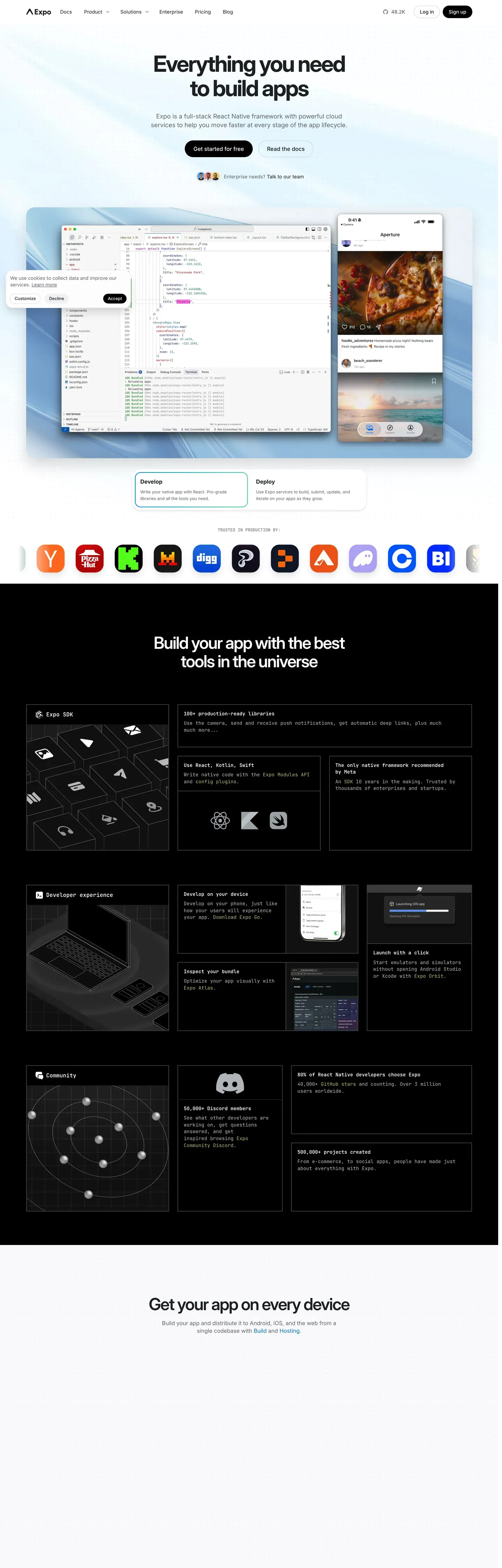
Expo's marketing site reads like a quietly-confident React Native developer platform. The canvas is pure white with a soft sky-blue gradient wash behind the hero band — the only atmospheric decoration on the page. Near-black ink at #171717 carries both display and body, and the single brand voltage is pure black at #000000, reserved for primary CTAs. A small blue text-link accent at #0d74ce shows up inside body copy, never on a button. The brand's strongest signature is the device-mockup hero: a centered MacBook plus iPhone composite showing real Expo dev surfaces — Expo Studio, the EAS Build dashboard, the Expo Go simulator — sitting over the sky gradient. The composite is the page chrome instead of an illustration, and it tells you what the product does without a single bullet point.
This page packages all of that into a single DESIGN.md file using the Google Labs spec format. Inside: 24 color tokens grouped into brand, surface, atmospheric, hairline, text, and semantic; 15 type styles all running Inter except for the JetBrains Mono code style; 9 corner radii from 4px hairlines to a 9999px pill reserved for badges only; a 4px-based spacing scale that tops out at a 96px section rhythm; and 24 component recipes covering top nav, three button tiers, hero band, device mockup, feature cards in light and dark, workflow steps, code blocks, IDE mockups, two pricing tiers, text input, badge pill, ecosystem tile, CTA band, and footer.
Feed the file to Claude, Cursor, or GitHub Copilot and the agent reproduces Expo's editorial restraint — pure black CTAs at 8px radius, Inter 600 for display, JetBrains Mono on every code surface — instead of inventing a saturated brand color the page doesn't have. Reference the tokens directly inside Tailwind config or CSS variables when you want a developer-tool surface that earns trust through neutrality rather than chrome. The discipline of refusing a saturated action color and trusting Inter at weight 600 is what makes this system worth studying.
What makes it distinct
- Single CTA voltagepure black #000000 on every primary button, never the blue inline link color
- Inter at 600 across display, JetBrains Mono on every code surfaceno custom typeface
- Device-mockup hero is the page chromeMacBook plus iPhone composite over a sky-blue gradient wash
- 8px CTA radius, 12px card radiuscompact developer-tool dialect, no pill geometry on actions
- 96px section rhythm with hairline borders and one soft drop shadowatmospheric depth only inside the hero
Live at expo.dev
A snapshot of the brand in production. Hover the frame to scroll the page; click to visit.
 expo.dev
Explore Expo
Pick what you want to see — mockups, colors, typography, layout, or the full component list.
Brand & Accent
Sparing, CTA-only voltage.
Surface
Page and card backgrounds.
Text
Headlines, body, captions, muted.
Borders & Hairlines
Dividers, outlines, structural rules.
Semantic
Status, errors, success, inline links.
Other
Specialty colors.
Expo design system FAQ
Common questions about Expo's tokens, components, and how to use this DESIGN.md in your project.
Related reading
Specs, directories, and component libraries that pair with this design system.
Browse all design systems
The full directory of DESIGN.md files on shadcn.io, with live mockups for each.
Expo — the React Native platform
Expo's marketing site — the source surface for this DESIGN.md spec, including Expo Studio and EAS.
The DESIGN.md specification
Google Labs' open spec for machine-readable design system files — the format this page is built on.