Sentri Inspired Design System
Sentri's observability design language as a DESIGN.md file.
About Sentri Inspired DESIGN.md
Curated by Dov AzencotUpdated Source sentry.io
- Developer Tools & IDEs
- Analytics & Data
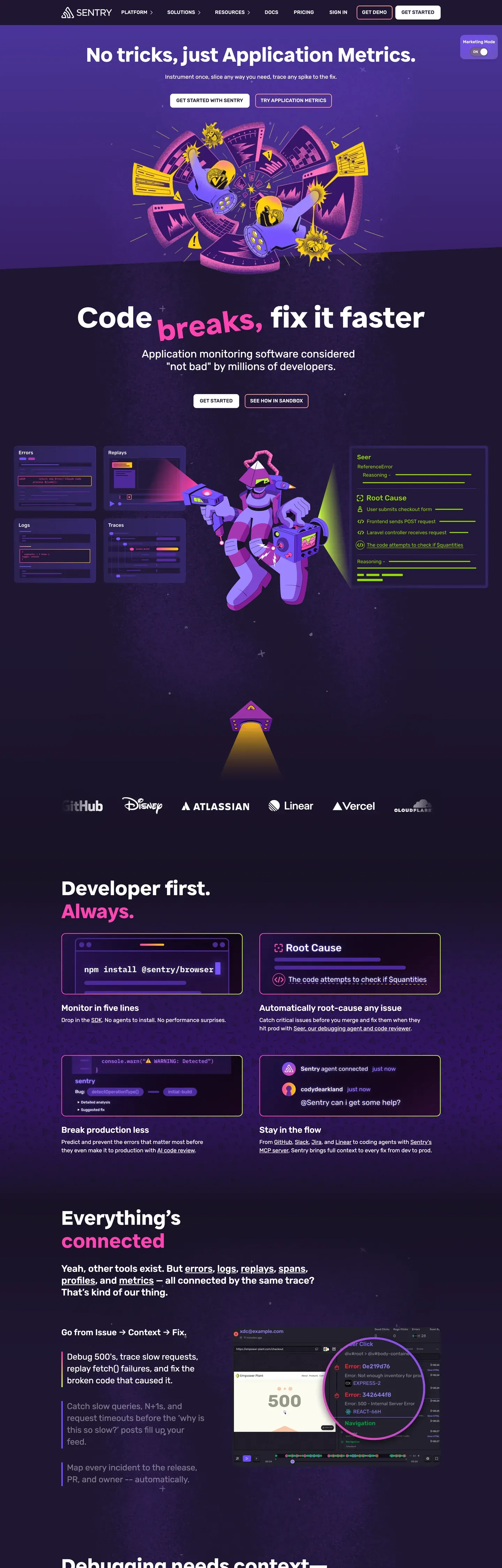
Sentri's design language reads like a debugging console wearing a leather jacket. The product surfaces sit on a near-black violet midnight (#150f23 and #1f1633), strewn with starfield textures and floating sticker-style mascots — astronauts, monsters, traffic cones — that puncture the seriousness of an observability product. Headlines run in a chunky proprietary display sans at 88px / 700, where the most important keywords get wrapped in lime-green highlight chips (#c2ef4e), as if a developer redlined their own console output. The palette is deliberately narrow: midnight as the dominant canvas, electric lime as the primary attention-grabber, hot pink (#fa7faa) as secondary punctuation, and a mid-violet (#79628c) for tag chips and hairlines. Pricing and contact pages flip to a pure white #ffffff canvas with the same near-black ink doing double duty as background on dark surfaces.
This page packages the system into a single DESIGN.md file built on the Google Labs spec. Inside: 21 color tokens spanning the violet-and-lime brand palette plus surface, hairline, text, and semantic groups; 16 typography tokens running across a proprietary display sans, Rubik for every UI role, and Monaco for code; 7 corner radii from a 4px badge corner to the 18px image container; 8 spacing tokens on an 8px base with a 96px section unit; and 22 component entries covering buttons, cards, code blocks, form inputs, the pill-shaped nav, the lime keyword chip, and the sticker mascot signature. Every component references its tokens by name rather than hardcoded hex.
Feed the file to Claude, Cursor, or GitHub Copilot and the AI produces React components that match Sentri's "developer console" cadence — uppercase button caps with 0.2px tracking, two-polarity canvases, dark-inverted featured pricing tiers, single-primary CTA hierarchy — rather than a generic shadcn theme. Reference the tokens directly in Tailwind config or CSS variables. The discipline of treating lime as a typographic glyph rather than a color swatch is what gives the system its identity, and it's worth studying any time you're tempted to add a second accent.
What makes it distinct
- Two-polarity canvas systemdeep violet #1f1633 for marketing, white #ffffff for pricing, with no half-measures between
- Lime keyword chip#c2ef4e wraps single words inside the 88px hero display as a syntax-highlight glyph, never a button
- Single-primary CTAnear-black #150f23 stays the dominant action whether the canvas is dark or light
- Sticker mascot layerillustrated astronauts and monsters break section boundaries instead of drop shadows carrying depth
- Three-family type stackproprietary display sans, Rubik for UI, Monaco for code, with 0.2px tracking on every button cap
Live at sentry.io
A snapshot of the brand in production. Hover the frame to scroll the page; click to visit.
 sentry.io
Explore Sentri Inspired
Pick what you want to see — mockups, colors, typography, layout, or the full component list.
Brand & Accent
Sparing, CTA-only voltage.
Surface
Page and card backgrounds.
Text
Headlines, body, captions, muted.
Borders & Hairlines
Dividers, outlines, structural rules.
Other
Specialty colors.
Sentri Inspired design system FAQ
Common questions about Sentri Inspired's tokens, components, and how to use this DESIGN.md in your project.
Related reading
Specs, directories, and component libraries that pair with this design system.
The DESIGN.md specification
Google Labs' open spec for machine-readable design system files — the format this page is built on.
Browse all design systems
The full directory of DESIGN.md files on shadcn.io, with live mockups for each.
React blocks for shadcn/ui
Production-ready hero, pricing, CTA, and dashboard sections built with the same Tailwind + shadcn primitives.