Vite Design System
A purple-tinted near-black canvas, lavender #b39aff brand color, APK Protocol headlines and KH Teka Mono labels: Vite's tokens for React and AI tools.
- Primary color
- #b39aff
- Typeface
- APK Protocol
- Shape
- Mixed
- Base radius
- 8px
- Colors
- 10
- Type tokens
- 11
- Components
- 13
- Spacing values
- 10
About Vite DESIGN.md
Curated by Dov Azencot, updated May 19, 2026. Source vitejs.dev (opens in a new tab).
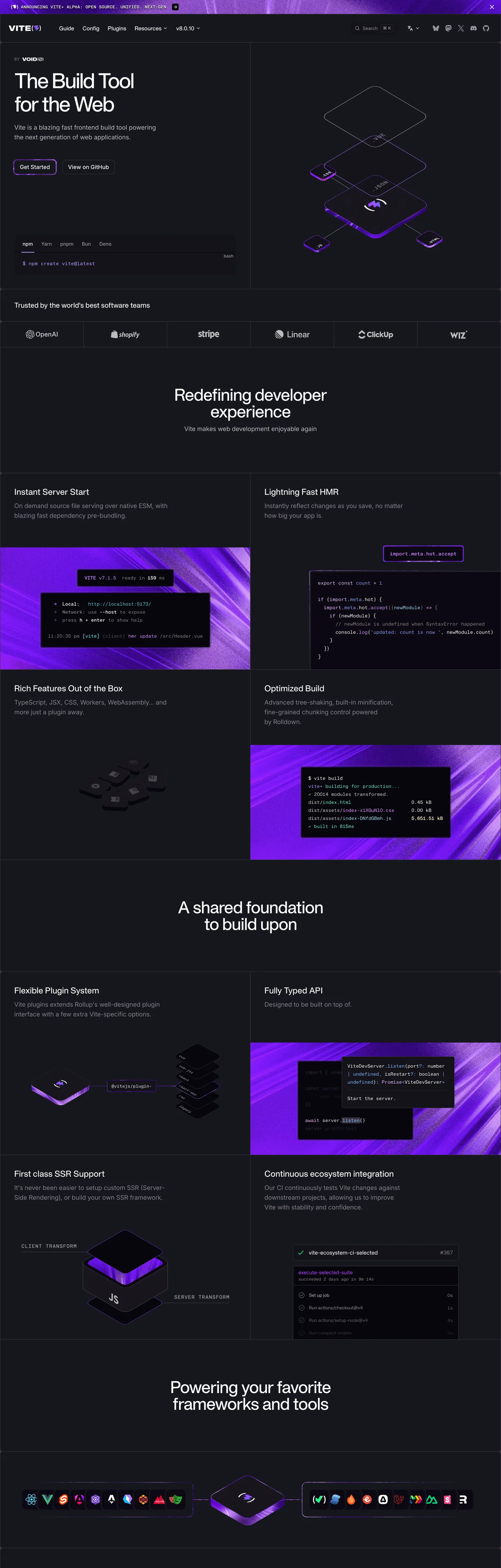
Vite's marketing site announces its personality through a typographic move most build tools skip. The hero headline — "The Build Tool for the Web" — renders in APK Protocol, a custom geometric display sans, at 60px with -3px letter-spacing so tight the letters nearly touch. Behind the type, an isometric 3D render of the Vite logo glows against the purple-tinted near-black canvas. The overall register is: dark, precise, and slightly theatrical — a tool that benchmarks faster than Webpack by orders of magnitude and is not shy about the flex.
The chromatic story is a lavender-on-dark tension. The brand voltage is `--color-brand` / `--color-vite` — a soft, desaturated violet-lavender — wired into 31 CSS custom properties and appearing as the primary button background, the hero name gradient, inline code link color, and search highlight. At #b39aff it is notably more muted than the electric purples that competing tools might deploy. Against the `--color-slate` (#16171d) canvas — which sits a step warmer and more violet than the blue-black Vercel uses — the lavender reads as a signature: quiet voltage, maximum heat. The feature section panels alternate between pure dark prose sections and purple-tinted wide bands with code screenshots, a cadence that keeps the lavender from feeling monotonous.
For React teams adopting Vite's aesthetic, the operative tokens are the canvas color and the typeface split. The near-black floor (#16171d) is distinctive — it shifts every surface toward cooler-warmer purple rather than neutral gray. APK Protocol is proprietary; the closest open substitute is Neue Haas Grotesk or Syne at tight negative tracking. KH Teka Mono for uppercase label caps is the system's most specific move — a mono font used not for code content but for section labels, which is unusual and worth preserving. The 8px radius is the correct default; stay away from the large-pill radii that consumer SaaS favors.
What makes it distinct
5 highlights
- APK Protocol as proprietary displayA geometric display sans at 60px / -3px tracking for the hero; no other build tool uses a custom display typeface
- Soft lavender brand voltageThe primary brand color (#b39aff) is a desaturated violet-lavender wired to 31 CSS custom properties including --vp-c-brand, --color-brand, --color-vite; unusually muted for a framework with lightning in its logo
- Purple-tinted near-black canvas#16171d as the page floor, one shade more violet than the blue-black that Vercel and Linear use; the entire system shifts color temperature toward the purple spectrum
- Three-family type stackAPK Protocol (display), Inter (body and UI), KH Teka Mono (code labels and uppercase caps); each scoped to a distinct surface type
- 8px dominant radiusA mid-tier rounding at 15 occurrences, with 4px for tight UI; avoids both the large-pill softness and the sharp zero-radius extremes
Live at vitejs.dev
Vite in production, as captured. Scroll the window to see the whole page.
10 colors
Vite's system runs on #b39aff as its primary voltage, used in 1 of 13 components. Type is set in APK Protocol across 11 tokens from 12px to 60px, weights 400–500. Shape language is mixed across 13 components, blending pills, soft rounds, and squarer corners.
Brand & Accent
Sparing, CTA-only voltage · 1
Surface
Page and card backgrounds · 3
Text
Headlines, body, captions · 3
Borders & Hairlines
Dividers, outlines, rules · 2
Other
Specialty colors · 1
11 type tokens
Set in APK Protocol across 11 tokens, from 12px to 60px, weights 400–500. Shown in its own stack: where the font isn't installed, the fallback the file names stands in.
- display-xl60px · weight 500 · lh 67.2px · tracking -3pxThe quick brown fox jumps over the lazy dog
- display-lg48px · weight 500 · lh 48px · tracking -1.2pxThe quick brown fox jumps over the lazy dog
- display-md40px · weight 500 · lh 53.3px · tracking -1pxThe quick brown fox jumps over the lazy dog
- heading-lg24px · weight 500 · lh 28pxThe quick brown fox jumps over the lazy dog
- heading-md20px · weight 500 · lh 28pxThe quick brown fox jumps over the lazy dog
- body-lg18px · weight 400 · lh 28pxThe quick brown fox jumps over the lazy dog
- body-md16px · weight 400 · lh 24pxThe quick brown fox jumps over the lazy dog
- body-sm14px · weight 400 · lh 20pxThe quick brown fox jumps over the lazy dog
- label-md16px · weight 500 · lh 22.4pxThe quick brown fox jumps over the lazy dog
- mono-label12px · weight 400 · lh 16px · tracking 0.3pxThe quick brown fox jumps over the lazy dog
- mono-md14px · weight 400 · lh 20pxThe quick brown fox jumps over the lazy dog
Radii and spacing
3 corner radii and 10 spacing values. Shape language: mixed, on a 8px base radius.
Radii3
- none0px
- sm4px
- md8px
Spacing10
- xs4px
- sm8px
- md12px
- base16px
- lg20px
- xl24px
- 2xl32px
- 3xl40px
- 4xl64px
- 5xl80px
13 components
Each rendered from its tokens (color, type, radius, padding) on Vite's own canvas.
- Button PrimaryButton Primarybutton-primary
- Button SecondaryButton Secondarybutton-secondary
- Top NavTop Navtop-nav
- Nav LinkNav Linknav-link
- Hero HeadingHero Headinghero-heading
- Section HeadingSection Headingsection-heading
- Body ParagraphBody Paragraphbody-paragraph
- Body Paragraph MutedBody Paragraph Mutedbody-paragraph-muted
- CardCardcard
- Type here…Text Inputtext-input
- Code BlockCode Blockcode-block
- Section LabelSection Labelsection-label
- FooterFooterfooter
The system, in use
Vite's tokens on the kind of product it builds.
The fastest way to build and ship software
Deploy from git in seconds, scale on demand and keep every environment in sync.
1import { createClient } from "./client";23const client = createClient({ region: "us-east", retries: 3 });45export async function deploy(app: string) {6 const build = await client.builds.create({ app });7 // Stream the logs until the build is live8 for await (const line of build.logs()) {9 console.log(line);10 }11 return build.url;12}
Vite design system FAQ
Vite's tokens, its components and how to use this DESIGN.md in your project.
Related reading
Specs, directories and component libraries that pair with this design system.
- Browse all design systemsThe full directory of DESIGN.md files on shadcn.io, with live mockups for each.shadcn.io
- Vite — official siteVite's public marketing site — the source of truth for the live tokens captured in this file.vitejs.dev (opens in a new tab)
- The DESIGN.md specificationGoogle Labs' open spec for machine-readable design system files — the format this page is built on.github.com (opens in a new tab)
Use Vite in your project
One machine-readable file. Drop it into Claude Code, Cursor, VS Code or any AI tool that reads DESIGN.md.
Download the DESIGN.md
One machine-readable file: every color, type, radius, spacing, and component token of Vite.
Feed it to your AI tool
Drop it into Claude, Cursor, or GitHub Copilot. The agent writes React components and Tailwind classes that match Vite's visual language.
Reference the tokens directly
Or paste the values into your Tailwind config, CSS variables, or component library: every color, size and radius is a quoted, ready-to-copy value.
Read the full DESIGN.md overview, rationale, do’s and don’ts
Overview
Vite's marketing site stakes out the darkest and most theatrically branded position in the build-tool category. Speed as Aesthetic. The 60px APK Protocol headline with -3px letter-spacing, the isometric 3D logo glowing faint lavender against the purple-tinted near-black canvas, the tightly tracked mono labels — every design decision translates "faster than everything" into a visual register. Where Webpack reads like documentation, Parcel reads like a side project, and esbuild has no marketing site at all, Vite presents itself as the category's designed product.
The three-family type architecture is the technical signature. APK Protocol handles the display tier with custom negative tracking; Inter handles all prose and UI labels; KH Teka Mono handles section category labels in uppercase small-caps — an unusual application of monospace that gives the feature sections an engineering-log precision. No other build tool in the measured space uses a custom display typeface with this degree of tracking specificity.
Key Characteristics:
- APK Protocol display type at 60px / -3px tracking — the tightest tracked headline in the developer tools category.
- Soft lavender brand voltage (
{colors.primary}— wired as--color-brand,--color-vite) against a purple-tinted near-black canvas. {colors.canvas}is #16171d — not neutral near-black but violet-shifted; every surface gets the temperature cast.- KH Teka Mono used for uppercase section labels (not just code blocks) — an editorial application of mono type in a marketing context.
- 8px dominant radius for cards and inputs; 4px for tighter chips; no pill radius anywhere.
- White text (
{colors.ink}) as the near-universal foreground; muted gray ({colors.ink-muted}) for secondary prose. - Feature sections alternate between pure dark text bands and purple-tinted accent-strip panels.
- Flat elevation: cards use surface color contrast against the canvas rather than shadows.
Colors
Brand
- Primary (
{colors.primary}— #b39aff): frequency 6. Used as border (3), text (3). The soft lavender brand voltage wired to --color-brand, --color-vite, --vp-c-brand-1, --vp-home-hero-name-color. Appears in hero name gradient, inline code links, and search highlights. Desaturated by design — full saturation would read as neon on the dark canvas. - Secondary (
{colors.secondary}— #370a7f): frequency 3. Used as background (3). Deep purple for gradient node backgrounds behind feature panels.
Text
- Ink (
{colors.ink}— #ffffff): frequency 553. Used as text (303), border (246), background (4). The dominant foreground across every tier; pure white on the near-black canvas. - Ink Muted (
{colors.ink-muted}— #98989f): frequency 40. Used as text (20), background (1), border (19). Secondary prose color for body paragraphs and code block annotations. - Ink Faint (
{colors.ink-faint}— #867e8e): frequency 75. Used as text (38), border (37). Muted violet-gray for section label text and lower-hierarchy prose.
Canvas & Surface
- Canvas (
{colors.canvas}— #16171d): frequency 11. Used as background (9). The page floor — a violet-shifted near-black, wired as --color-primary, --vp-c-bg, and --vp-nav-bg-color. - Surface-1 (
{colors.surface-1}— #14121a): frequency 11. Used as background (9). Slightly darker than canvas; code blocks, the sidebar, nav and search backgrounds. Wired as --color-slate, --vp-c-bg-elv. - Surface-2 (
{colors.surface-2}— #3b3440): frequency 57. Used as border (57). Secondary elevated surface for alt buttons and hover states. Wired as --color-nickel, --vp-button-alt-bg.
Hairlines
- Hairline (
{colors.hairline}— #3b3440): frequency 57 (border). The dominant border tone, a deep purple-gray. - Hairline Inner (
{colors.hairline-inner}— #2e2e32): frequency 1. Used as border (1). Tighter divider for code tabs and sidebar borders; wired as --vp-c-divider.
Typography
Font Families
Three dedicated families, each with a distinct role:
APK Protocol — custom geometric display sans. Used exclusively for headings (h1, h2, h3, h5, h6) with aggressive negative tracking at the large sizes (-3px at 60px, -1.2px at 48px, -1px at 40px).
Inter — open-source neutral grotesque. Used for all body copy, nav links, button text, form labels. Falls back to sans-serif. The stable, high-legibility reading voice.
KH Teka Mono — custom monospace. Used for two distinct purposes: (1) code annotation spans in the live code examples, and (2) section category labels in uppercase at 12px with 0.3px letter-spacing. The second use is rare and signals brand personality.
Hierarchy
| Token | Size | Weight | Line Height | Tracking | Use |
|---|---|---|---|---|---|
{typography.display-xl} | 60px | 500 | 67.2px | -3px | Hero h1 |
{typography.display-lg} | 48px | 500 | 48px | -1.2px | Section h2 |
{typography.display-md} | 40px | 500 | 53.3px | -1px | Sub-section h3 |
{typography.heading-lg} | 24px | 500 | 28px | 0 | h5 feature titles |
{typography.heading-md} | 20px | 500 | 28px | 0 | h6 minor titles |
{typography.body-lg} | 18px | 400 | 28px | 0 | Primary prose |
{typography.body-md} | 16px | 400 | 24px | 0 | UI labels, nav |
{typography.body-sm} | 14px | 400 | 20px | 0 | Secondary prose |
{typography.label-md} | 16px | 500 | 22.4px | 0 | Bold nav links |
{typography.mono-label} | 12px | 400 | 16px | 0.3px | Uppercase section labels |
{typography.mono-md} | 14px | 400 | 20px | 0 | Code content |
Substitutes
APK Protocol: substitute Neue Haas Grotesk Display or Syne, applying manual tracking of -0.05em at the 48-60px sizes. KH Teka Mono: substitute JetBrains Mono or IBM Plex Mono; apply the same uppercase transformation with letter-spacing 0.3px for section labels.
Layout
Spacing System
- Base unit: 4px.
- Section padding (vertical): 80px top and bottom for major sections; 112px for the hero band.
- Card padding: 28px vertical / 32px horizontal (
{spacing.2xl}×{spacing.3xl}). - Nav height: 82px, declared as --vp-nav-height.
- Layout max-width: 90rem (~1440px), declared as --vp-layout-max-width.
Grid & Container
- Hero: full-bleed dark canvas with the 3D Vite logo centered right and the headline + CTA stack left-aligned.
- Sponsor strip: horizontal scrolling logos (Nuxt, Svelte, Astro, Storybook, Nx, Cloudflare, Shopify, etc.) in white monochrome.
- Feature panels: alternating two-column layouts with code screenshots in dark surface tiles.
- Quote/testimonial row: single-column quotes from framework authors (Ryan Carniato, Fred K. Schott, Sebastien Chopin).
- Framework adoption row: logos of frameworks built on Vite at page bottom.
Rhythm
The page alternates between full-width dark text-and-prose bands ("Redefining developer experience," "A shared foundation to build upon") and narrower two-column feature panels with code screenshots. No band uses a tinted background — all editorial sections sit on the same canvas color. Accent strips use the secondary purple (#370a7f) behind specific feature code panels.
Elevation
Shadow-free. The dark canvas makes traditional drop shadows invisible — the system uses surface color contrast alone. {colors.surface-1} (#14121a) is slightly darker than {colors.canvas} (#16171d), so code blocks and the sidebar recede slightly rather than lifting. This is a reversed elevation model: instead of cards floating above the floor, code panels sink below it. Cards ({colors.surface-1}) at 28-32px padding sit on canvas, distinguished by surface contrast alone. The CSS shadow variables (--vp-shadow-1 through --vp-shadow-4) are declared but their oklch contrast against the near-black canvas is minimal.
Shapes
The radius scale is minimal and utilitarian:
{rounded.none}0px — hero text, editorial prose sections, most layout containers.{rounded.sm}4px — code block corners, compact badge chips, inner elements (10 occurrences).{rounded.md}8px — cards, search input, primary buttons, feature panels (15 occurrences — the dominant tier).
There is no 12px, 16px, or 24px tier. No pill. The system stays deliberately understated on corners to keep the engineering-grade signal intact.
Components
button-primary — Soft lavender {colors.primary} fill, dark canvas text ({colors.canvas}), {rounded.md} 8px radius, 8-16px padding. The search button on the nav is captured here; the hero CTA "Get Started" uses the same treatment.
button-secondary — {colors.surface-2} fill, white text, 8px radius. Used for the "Why Vite?" secondary CTA in the hero.
top-nav — Canvas (#16171d) fill, 82px height, 20-28px padding. Houses the Vite wordmark, nav links (Guide, Config, Plugins, Resources, Team, Blog), GitHub icon, and search button.
nav-link — Transparent, white text, APK Protocol 16px / weight 400, 8-12px padding. No hover background captured in the measured surface.
hero-heading — White text, APK Protocol 60px / weight 500, -3px letter-spacing. "The Build Tool for the Web."
section-heading — White text, APK Protocol 48px / weight 500, -1.2px tracking. "Redefining developer experience," "A shared foundation to build upon."
body-paragraph — White text, Inter 18px / weight 400. Hero sub-copy and feature prose.
body-paragraph-muted — Ink-muted (#98989f) text, Inter 16px / weight 400. Secondary prose in feature descriptions.
card — Surface-1 fill, white text, Inter 16px, 8px radius, 28-32px padding. Feature section cards and quote panels.
text-input — Surface-1 fill, ink-muted text, Inter 14px, 8px radius. The search input in the nav.
code-block — Surface-1 fill, white text, KH Teka Mono 14px, 4px radius, 20px padding. Feature code screenshots and inline snippets.
section-label — Ink-faint (#867e8e) text, KH Teka Mono 12px uppercase with 0.3px spacing. Used for category labels above feature panels like "PLUGIN SYSTEM" and "FULLY TYPED API."
footer — Surface-1 fill, ink-muted text, Inter 14px, 40-32px padding.
Do's and Don'ts
Do apply aggressive negative tracking to APK Protocol at large sizes. The -3px tracking on the 60px h1 is not accidental — it defines the tight, high-precision character of the display tier. At 60px without tracking, the headline reads as generic. The tracking is the brand.
Do use {colors.primary} (the soft lavender) at low frequency. It appears in 6 measured uses — the hero name gradient, inline code link text, and search highlight. Deploying it on card backgrounds or section fills would make it feel like a generic purple brand instead of a restrained voltage.
Do use KH Teka Mono (or its substitute) for uppercase section category labels. The application of mono type to non-code marketing labels is the system's most specific and unusual design move. It signals "this tool understands the terminal" without requiring you to put terminal UI on the marketing page.
Do keep the canvas at #16171d. The violet shift is the system's temperature — cooler than neutral, warmer than true black. Changing it to #000000 loses the amethyst warmth; changing it to a Catppuccin-dark near-black or a deeper violet-black makes the page feel like a theme instead of a product.
Don't add a pill radius. The system tops out at 8px ({rounded.md}). The decision to avoid capsule-shaped buttons distinguishes Vite from SolidJS (24px pill) and consumer products generally — it signals utility, not consumer-friendly softness.
Don't use the brand lavender as a background fill for sections. The {colors.primary} (#b39aff) reads correctly as a text accent and link color on dark; as a section fill it turns into a lavender gradient that reads as decorative rather than functional.
Don't introduce a warm-toned accent alongside the lavender. The entire palette is cool-purple-shifted — the canvas, the hairlines, the brand. Introducing amber, orange, or green would break the single-temperature identity and make the page look like a generic multi-color SaaS.
Don't use Inter for headings. APK Protocol is the display voice; Inter is the reading voice. Swapping them — even temporarily in a prototype — collapses the three-family tension that makes the page feel engineered rather than assembled.
Known Gaps
- Brand CTA button: the extracted primary button is the nav search control, not the hero "Get Started" CTA; the hero button tokens are inferred from CSS variables rather than a direct measurement.
- Hero gradient: the #370a7f accent strip backgrounds in feature panels suggest gradient values, but exact direction and stop positions are not captured.
- Logo glow effect: the Vite 3D logo above the fold appears to have a faint lavender glow/bloom; the glow radius, opacity, and animation timing are not in the extracted tokens.
- Light mode: Vite docs ship a light mode (white canvas, dark ink, lavender accent), but the marketing homepage is dark-only and that is what this file captures.
- Scroll animation: feature cards appear to animate in on scroll; timing and easing curves are not captured.
- Sponsor logos: the sponsor strip renders logos in white monochrome at varying sizes; the exact opacity and sizing rules are not extracted.
- Plugin ecosystem pages: the plugins directory at vitejs.dev/plugins uses a slightly distinct layout system not covered here.
More systems like this
Algolia, Astro, Biome and 67 more in Developer Tools & IDEs: each brand's colors, type and components in one file your AI agent builds from.
Build it with Pro
The DESIGN.md files are free. Pro adds 6,000+ blocks, premium templates and the MCP server, so your AI editor builds in your system for you.
4.9/5 out of 5 · 150+ reviewsfrom 150+ founders and developers.
Billing
Billed once a year in USD. Cancel anytime.
- How many people can use the license.
- Client work, SaaS products and anything you charge for.
- Page sections in 56 categories, from heroes and pricing tables to dashboards and settings, on every framework and UI library, in your theme.
- Complete Next.js sites for startups, SaaS, agencies and portfolios, every page designed, ready to ship.
- Your AI agent searches, previews and installs any component, block, icon or DESIGN.md from a prompt: 22 tools in Claude Code, Cursor, VS Code and 35 more clients.
- Buttons with motion and states of their own, from an arrow that slides in to a burst of confetti.
- Typewriters, scrambles, counters and more, for headlines, labels and numbers.
- Animated backgrounds for heroes, sections and cards, from a soft aurora to a flock that flees the cursor. Most are pure CSS.
- WebGPU shaders, from a slow aurora to a black hole, each drawing only while it's on screen.
- One design and one theme on all four: the components, blocks and effects are built for each framework.
- React on Base UI, Radix UI, React Aria or Ark UI: install the version for the library your project already uses. Vue, Svelte and Solid run on Ark UI.
- From a button to a date picker, a color picker or a guided tour: accessible, typed in TypeScript, each with live demos.
- Real-world patterns built from the components, in 53 galleries: forms, tables, menus, dialogs and more.
- Area, bar, line, pie, radar and radial charts on TanStack Charts, on every framework. React also gets the Recharts originals.
- Debounce, local storage, media queries and more: each hook is one typed file you own.
- From 222 libraries, Lucide, Heroicons, Tabler and Material Symbols among them, as SVG or a React component in one command.
- Stripe, Linear, Apple and 497 more: a brand's colors, typography and components in one file your AI agent builds from.
- Restyle every component and block at once: 8 styles, 8 grays, 18 colors and 5 radii, shared as a shadcn preset code.
- Priority requests are answered first.
Individual
For personal projects & open source
$32instead of $49/mo
$389 billed yearly
- Seats: 1 seat
- Commercial use: Personal & open source only
- Blocks: All 6,181 blocks
- Templates: All 14 templates
- MCP server: 38 AI clients
- Animated buttons: All 35 buttons
- Text effects: All 97 effects
- Backgrounds: All 100 backgrounds
- Shaders: All 100 shaders
- Frameworks: React, Vue, Svelte, Solid
- UI libraries: Base UI, Radix, Aria, Ark
- Components: All 174 components
- Examples: All 1,103 examples
- Charts: All 70 charts
- React hooks: All 35 hooks
- Icons: 294k+ icons
- DESIGN.md files: All 500 brands
- Theme builder: 8 styles × 18 colors
- Support: Standard
Team
Most popularFor freelancers, agencies & startups
$66instead of $99/mo
$789 billed yearly · ≈ $13/dev/mo
- Seats: Up to 5 seats
- Commercial use: Included
- Blocks: All 6,181 blocks
- Templates: All 14 templates
- MCP server: 38 AI clients
- Animated buttons: All 35 buttons
- Text effects: All 97 effects
- Backgrounds: All 100 backgrounds
- Shaders: All 100 shaders
- Frameworks: React, Vue, Svelte, Solid
- UI libraries: Base UI, Radix, Aria, Ark
- Components: All 174 components
- Examples: All 1,103 examples
- Charts: All 70 charts
- React hooks: All 35 hooks
- Icons: 294k+ icons
- DESIGN.md files: All 500 brands
- Theme builder: 8 styles × 18 colors
- Support: Priority
Organization
For companies with larger teams
$132instead of $199/mo
$1,589 billed yearly
- Seats: Unlimited seats
- Commercial use: Included
- Blocks: All 6,181 blocks
- Templates: All 14 templates
- MCP server: 38 AI clients
- Animated buttons: All 35 buttons
- Text effects: All 97 effects
- Backgrounds: All 100 backgrounds
- Shaders: All 100 shaders
- Frameworks: React, Vue, Svelte, Solid
- UI libraries: Base UI, Radix, Aria, Ark
- Components: All 174 components
- Examples: All 1,103 examples
- Charts: All 70 charts
- React hooks: All 35 hooks
- Icons: 294k+ icons
- DESIGN.md files: All 500 brands
- Theme builder: 8 styles × 18 colors
- Support: Priority
Billed once a year in USD. Cancel anytime.
Individual
For personal projects & open source
$32instead of $49/mo
$389 billed yearly
- How many people can use the license.Seats: 1 seat
- Client work, SaaS products and anything you charge for.Commercial use: Personal & open source only
- Page sections in 56 categories, from heroes and pricing tables to dashboards and settings, on every framework and UI library, in your theme.Blocks: All 6,181 blocks
- Complete Next.js sites for startups, SaaS, agencies and portfolios, every page designed, ready to ship.Templates: All 14 templates
- Your AI agent searches, previews and installs any component, block, icon or DESIGN.md from a prompt: 22 tools in Claude Code, Cursor, VS Code and 35 more clients.MCP server: 38 AI clients
- Buttons with motion and states of their own, from an arrow that slides in to a burst of confetti.Animated buttons: All 35 buttons
- Typewriters, scrambles, counters and more, for headlines, labels and numbers.Text effects: All 97 effects
- Animated backgrounds for heroes, sections and cards, from a soft aurora to a flock that flees the cursor. Most are pure CSS.Backgrounds: All 100 backgrounds
- WebGPU shaders, from a slow aurora to a black hole, each drawing only while it's on screen.Shaders: All 100 shaders
- One design and one theme on all four: the components, blocks and effects are built for each framework.Frameworks: React, Vue, Svelte, Solid
- React on Base UI, Radix UI, React Aria or Ark UI: install the version for the library your project already uses. Vue, Svelte and Solid run on Ark UI.UI libraries: Base UI, Radix, Aria, Ark
- From a button to a date picker, a color picker or a guided tour: accessible, typed in TypeScript, each with live demos.Components: All 174 components
- Real-world patterns built from the components, in 53 galleries: forms, tables, menus, dialogs and more.Examples: All 1,103 examples
- Area, bar, line, pie, radar and radial charts on TanStack Charts, on every framework. React also gets the Recharts originals.Charts: All 70 charts
- Debounce, local storage, media queries and more: each hook is one typed file you own.React hooks: All 35 hooks
- From 222 libraries, Lucide, Heroicons, Tabler and Material Symbols among them, as SVG or a React component in one command.Icons: 294k+ icons
- Stripe, Linear, Apple and 497 more: a brand's colors, typography and components in one file your AI agent builds from.DESIGN.md files: All 500 brands
- Restyle every component and block at once: 8 styles, 8 grays, 18 colors and 5 radii, shared as a shadcn preset code.Theme builder: 8 styles × 18 colors
- Priority requests are answered first.Support: Standard
Team
Most popularFor freelancers, agencies & startups
$66instead of $99/mo
$789 billed yearly · ≈ $13/dev/mo
Everything in Individual, plus
- How many people can use the license.Seats: Up to 5 seats
- Client work, SaaS products and anything you charge for.Commercial use: Included
- Priority requests are answered first.Support: Priority
Organization
For companies with larger teams
$132instead of $199/mo
$1,589 billed yearly
Everything in Team, plus
- How many people can use the license.Seats: Unlimited seats
- Secure checkout via Stripe
- Code lives in your repo
- Keep what you've shipped if you cancel
- License terms
4.9 out of 5 from 150+ developers


Your system, built for you
Every block, template and icon, installed by your AI agent in your design system. The DESIGN.md files stay free.
- Cancel anytime
- Keep what you've shipped