Warp Inspired Design System
Warp's agentic terminal design as a DESIGN.md file.
About Warp Inspired DESIGN.md
Curated by Dov AzencotUpdated Source warp.dev
- Developer Tools & IDEs
- AI & LLM Platforms
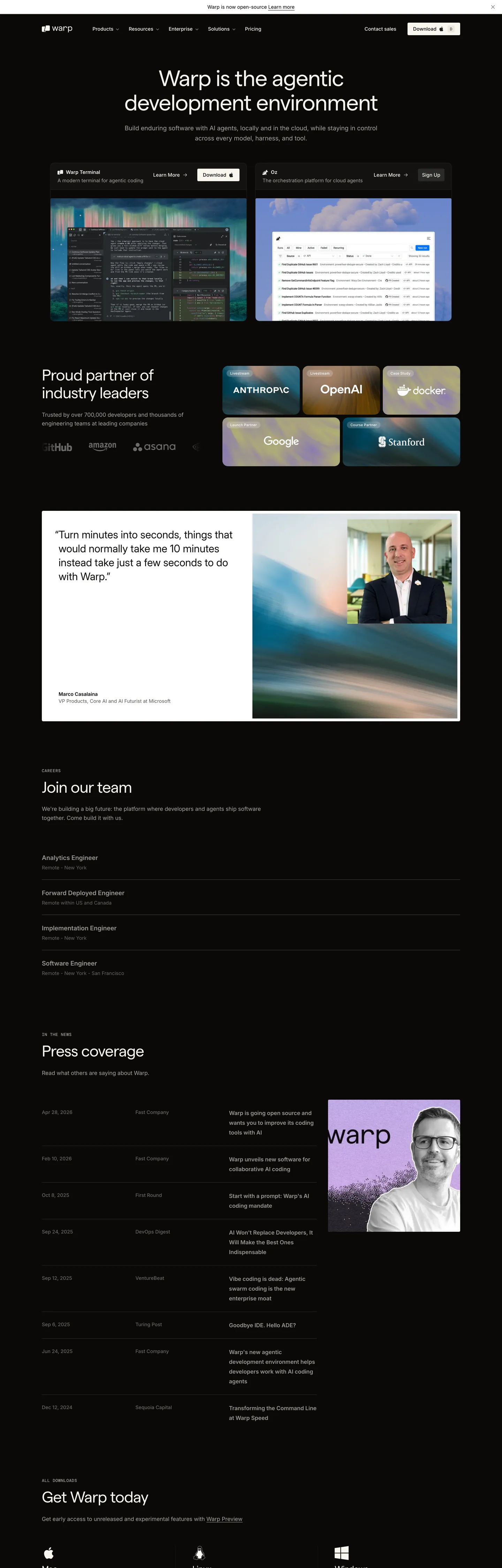
Warp is an agentic development environment — a terminal application that wraps an AI agent — and its marketing site mirrors the product. One dark band runs the full length of the page, warmer than pure black, set almost entirely in Inter at modest weights. Decoration is restrained: two terminal screenshots in the hero, a partner-logo strip (Anthropic, OpenAI, Google, Stanford), a single testimonial card, a press-coverage list, and download tiles for Mac, Linux, and Windows. No gradient, no atmospheric overlay, no illustration system. The page reads like a developer's reading-mode editor that happens to be a homepage, which is exactly the impression the brand wants its visitors to leave with.
This page captures all of that in a single DESIGN.md file. Inside: 9 color tokens grouped into surface, text, and a single off-white primary `#f7f5f0`; 14 type tokens across Inter, DM Mono, and Instrument Serif; 10 spacing values stepping from 2px to 96px; 7 corner radii topping out at a 6px medium card and a 9999px pill for icon containers only; and 26 components spanning navigation, buttons, cards, terminal mockups, partner tiles, press rows, and an example block kit. The format follows the Google Labs DESIGN.md specification, so every value is machine-readable.
Feed the file to Claude, Cursor, or GitHub Copilot and the agent will reproduce Warp's specific posture — warm canvas at `#2b2622`, off-white text and CTAs at `#f7f5f0`, tight 3–4px button radii, Inter at weight 400 with negative tracking — instead of generating a generic dark-mode dashboard. The discipline of leading with surface warmth and tight geometry, rather than a chromatic accent or a heavy display weight, is what makes this system worth studying.
What makes it distinct
- Single off-white voltage`#f7f5f0` carries every primary CTA, default text, and the wordmark; there is no chromatic accent anywhere
- Warm-dark canvas `#2b2622` (oklch 22.0% 0.004 84.6) instead of pure blackthe brown-beige tint IS the brand
- Tight 3–4px button radiithe brand never uses generous pill CTAs, only icon containers get `{rounded.full}`
- Hero display at 64px Inter weight 400 with -1.6px trackingrestrained, quietly confident, not billboard-loud
- Three-face stack: Inter for narrative, DM Mono for terminal mockups, Instrument Serif for rare editorial italics
Live at warp.dev
A snapshot of the brand in production. Hover the frame to scroll the page; click to visit.
 warp.dev
Explore Warp Inspired
Pick what you want to see — mockups, colors, typography, layout, or the full component list.
Brand & Accent
Sparing, CTA-only voltage.
Surface
Page and card backgrounds.
Text
Headlines, body, captions, muted.
Borders & Hairlines
Dividers, outlines, structural rules.
Other
Specialty colors.
Warp Inspired design system FAQ
Common questions about Warp Inspired's tokens, components, and how to use this DESIGN.md in your project.
Related reading
Specs, directories, and component libraries that pair with this design system.
The DESIGN.md specification
Google Labs' open spec for machine-readable design system files — the format this page is built on.
Browse all design systems
The full directory of DESIGN.md files on shadcn.io, with live mockups for each.
React blocks for shadcn/ui
Production-ready hero, pricing, CTA, and dashboard sections built with the same Tailwind + shadcn primitives.
Use Warp Inspired in your project
One machine-readable file. Drop it into Claude, Cursor, or any AI tool that reads DESIGN.md.