shadcn.io is an independent project built on shadcn/ui
The trigger says What's New. The title is New in Version 2.0. Three cards name Dark Mode, Improved Performance, and New Integrations. Awesome does not navigate.
Use cards when each item needs a title and a line. A one-line list can stay plain. A longer changelog fits a Dialog. In React, Ark UI does not record that they read it.
Installation
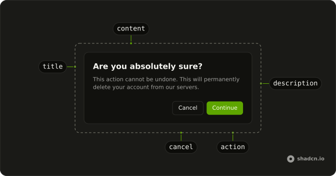
Anatomy
Usage
<AlertDialog>
<AlertDialogTrigger asChild>
<Button variant="outline">
<SparklesIcon aria-hidden="true" data-icon="inline-start" />
What's New
</Button>
</AlertDialogTrigger>
<AlertDialogContent>
<AlertDialogHeader>
<AlertDialogTitle>New in Version 2.0</AlertDialogTitle>
<AlertDialogDescription>
Check out the latest features and improvements:
</AlertDialogDescription>
</AlertDialogHeader>
<div className="flex flex-col gap-2">
{features.map((feature) => (
<div
className="rounded-lg border bg-muted/50 p-3"
key={feature.title}
>
<div className="font-medium text-sm">{feature.title}</div>
<p className="text-muted-foreground text-xs">
{feature.description}
</p>
</div>
))}
</div>
<AlertDialogFooter>
<AlertDialogClose asChild>
<AlertDialogAction>Awesome!</AlertDialogAction>
</AlertDialogClose>
{/* The rest of the file is under Installation. */}FAQ
Cards or a bulleted list?
Cards for three to five major features that deserve attention. A list for many small changes or bug fixes.
How much text goes in a card?
A two-to-four-word title and a short line. Link to the changelog for the rest.
How are the cards styled?
rounded-lg border bg-muted/50 p-3, with the title in font-medium text-sm and the line in text-muted-foreground text-xs. They're built from a static array at module scope.
API Reference
Alert Dialog
Sets asChild. The rest is on the Alert Dialog page.
Button
Sets variant="outline". The rest is on the Button page.