shadcn.io is an independent project built on shadcn/ui
A check icon sits beside Payment Successful. The text says $99.00 was processed and a receipt was emailed. Done is the only button. No payment ran.
Name the amount and what happens next. The check alone is not the receipt. A smaller confirm is a Toast. In React, Ark UI does not charge a card.
Installation
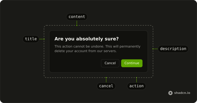
Anatomy
Usage
<AlertDialog>
  <AlertDialogTrigger asChild>
    <Button>Complete Action</Button>
  </AlertDialogTrigger>
  <AlertDialogContent>
    <AlertDialogHeader>
      <div className="flex items-center gap-2">
        <CircleCheckIcon aria-hidden="true" className="size-5 text-success" />
        <AlertDialogTitle>Payment Successful</AlertDialogTitle>
      </div>
      <AlertDialogDescription>
        Your payment of $99.00 has been processed successfully. A receipt has
        been sent to your email.
      </AlertDialogDescription>
    </AlertDialogHeader>
    <AlertDialogFooter>
      <AlertDialogClose asChild>
        <AlertDialogAction>Done</AlertDialogAction>
      </AlertDialogClose>
    </AlertDialogFooter>
  </AlertDialogContent>
</AlertDialog>
FAQ
Which icon for success?
A circled check is clear without being heavy. Keep playful icons for celebrations, not payments.
Should it always be green?
Use text-success, the theme's success color, which people read as done. It adapts to dark mode.
How specific should the description be?
Very: the amount, a reference, where the receipt went. Your payment of $99.00 has been processed successfully gives people proof.
API Reference
Alert Dialog
Sets asChild. The rest is on the Alert Dialog page.
Button
No extra props in this demo. The rest is on the Button page.