shadcn.io is an independent project built on shadcn/ui
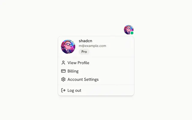
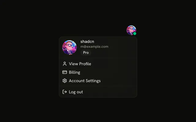
The button shows an avatar and the user's name. The menu repeats a larger avatar and the email, then Account and Billing groups, and a destructive Log out.
Use it when account and billing commands should stay off the page until asked. If signing out needs a confirm, use an Alert Dialog. In React, Ark UI does not end the session.
Installation
Anatomy
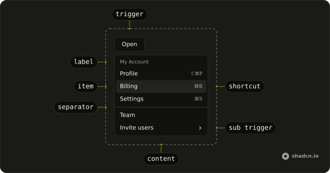
Usage
<DropdownMenu>
  <DropdownMenuTrigger asChild>
    <Button variant="outline">
      <Avatar className="size-6">
        <AvatarImage alt="@shadcn" src="https://github.com/shadcn.png" />
        <AvatarFallback>CN</AvatarFallback>
      </Avatar>
      shadcn
    </Button>
  </DropdownMenuTrigger>
  <DropdownMenuContent className="w-64">
    <DropdownMenuGroup>
      <DropdownMenuLabel className="font-normal">
        <div className="flex items-center gap-3 pb-2">
          <Avatar className="size-10">
            <AvatarImage alt="@shadcn" src="https://github.com/shadcn.png" />
            <AvatarFallback>CN</AvatarFallback>
          </Avatar>
          <div className="flex flex-col gap-1">
            <p className="font-medium text-foreground text-sm leading-none">
              shadcn
            </p>
            <p className="text-muted-foreground text-xs leading-none">
              m@example.com
            </p>
          </div>
        </div>
      </DropdownMenuLabel>
    </DropdownMenuGroup>
    <DropdownMenuSeparator />
    <DropdownMenuGroup>
{/* The rest of the file is under Installation. */}
FAQ
What does the account button show?
An outline Button with a size-6 Avatar and the name, shadcn. The menu is w-64 and lines up with the end of the button.
End alignment is DropdownMenu's default bottom-end placement.
What is the block at the top of the menu?
A DropdownMenuLabel with font-normal that holds a size-10 avatar, the name and m@example.com. It sits in its own DropdownMenuGroup, isn't focusable and can't be picked.
How are Account and Billing split?
Two DropdownMenuGroups, each starting with its DropdownMenuLabel, with a DropdownMenuSeparator between them. Account holds Profile Settings, Email Preferences, Notifications and Privacy & Security; Billing holds Payment Methods and Team Subscription.
Which icon goes with which row?
A user icon for Profile Settings, mail for Email Preferences, a bell for Notifications, a lock for Privacy & Security, a card for Payment Methods, people for Team Subscription and a log out arrow for Log out. All are aria-hidden.
API Reference
Dropdown Menu
Sets asChild, value="profile-settings", value="email-preferences", value="notifications", value="privacy-security" and value="payment-methods". The rest is on the Dropdown Menu page.
Button
Sets variant="outline". The rest is on the Button page.
Avatar
Sets alt="@shadcn" and src="https://github.com/shadcn.png". The rest is on the Avatar page.