shadcn.io is an independent project built on shadcn/ui
Support opens Documentation and Knowledge Base under Get Help, both with an external icon, then Contact Us. The rows do not open a page by themselves.
Use it in a header when help should be one click away. If Documentation should stay visible, use a Navigation Menu. In React, Ark UI does not leave the page.
Installation
Anatomy
Usage
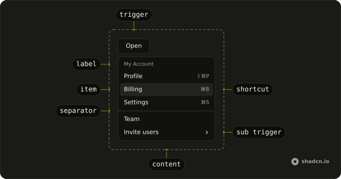
<DropdownMenu>
  <DropdownMenuTrigger asChild>
    <Button variant="outline">
      <CircleHelpIcon aria-hidden="true" data-icon="inline-start" />
      Support
    </Button>
  </DropdownMenuTrigger>
  <DropdownMenuContent className="w-56">
    <DropdownMenuGroup>
      <DropdownMenuLabel>Get Help</DropdownMenuLabel>
      <DropdownMenuSeparator />
      <DropdownMenuItem value="documentation">
        <BookIcon aria-hidden="true" />
        Documentation
        <ExternalLinkIcon aria-hidden="true" className="ms-auto size-3" />
      </DropdownMenuItem>
      <DropdownMenuItem value="knowledge-base">
        <MessagesSquareIcon aria-hidden="true" />
        Knowledge Base
        <ExternalLinkIcon aria-hidden="true" className="ms-auto size-3" />
      </DropdownMenuItem>
    </DropdownMenuGroup>
    <DropdownMenuSeparator />
    <DropdownMenuItem value="contact-us">
      <MailIcon aria-hidden="true" />
      Contact Us
    </DropdownMenuItem>
  </DropdownMenuContent>
</DropdownMenu>
FAQ
What is in the support menu?
A DropdownMenuGroup with the Get Help label, a separator, Documentation and Knowledge Base; then a separator and Contact Us. The menu is w-56.
Which rows show an external icon?
Documentation and Knowledge Base, with an external link icon at size-3 pushed to the end with ms-auto. Contact Us has none, since it stays in the app.
Does Documentation open a page by itself?
No. It's a plain item. Open the page from its handler, or make the row a link.
Use asChild on DropdownMenuItem with an a inside.
Is Get Help a choice?
No. It's the DropdownMenuLabel that names the group, and it can't be focused or picked.
API Reference
Dropdown Menu
Sets asChild, value="documentation", value="knowledge-base" and value="contact-us". The rest is on the Dropdown Menu page.
Button
Sets variant="outline". The rest is on the Button page.