shadcn.io is an independent project built on shadcn/ui
Personal Information is a larger, semibold label. It stands alone, with no input beside it.
Use a section label to head a group of fields, such as personal information. A Field legend does the same job as the group's name. Ark UI in React does not group the fields under it.
Installation
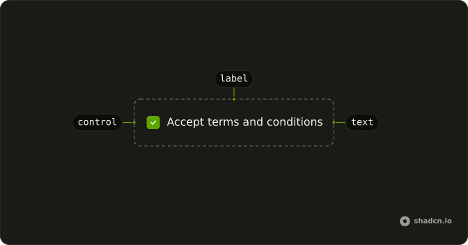
Anatomy
Usage
<Label className="font-semibold text-base">Personal Information</Label>FAQ
How is this section label styled?
className="font-semibold text-base" on Label. The default caption is text-sm and font-medium, so this one is larger and heavier. The text is Personal Information.
Is this label a heading?
No. Label renders a label element with data-slot="label". It looks like a section title because of the classes. A heading is what screen readers list when people jump by heading.
Does this label belong to a control?
Not in this file. Nothing pairs this caption with a control. It is only the styled caption.
When should I use Field instead?
When one control needs a caption, a description, or an error. Field associates those for you. This demo is a single larger label, with no fields under it.
API Reference
Label
No extra props in this demo. The rest is on the Label page.