shadcn.io is an independent project built on shadcn/ui
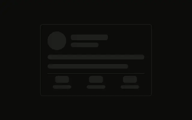
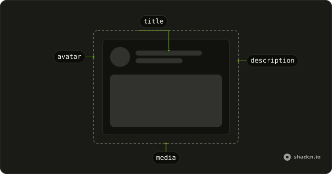
A large avatar sits beside three lines, then three bordered boxes for stats, then a button across the card. The border is on the box, not on the bar.
Use it when a profile leads with its counts. If one number is updating and the layout is already there, a Spinner in that box is enough. In React, Ark UI does not calculate the stats.
Installation
Anatomy
Usage
<div className="flex w-full max-w-md flex-col gap-6 rounded-md border p-6">
  <div className="flex items-start gap-4">
    <Skeleton className="size-20 shrink-0 rounded-full" />
    <div className="flex flex-1 flex-col gap-2">
      <Skeleton className="h-6 w-40" />
      <Skeleton className="h-4 w-32" />
      <Skeleton className="h-4 w-48" />
    </div>
  </div>
  <div className="grid grid-cols-3 gap-4">
    <div className="flex flex-col items-center gap-2 rounded-md border p-3">
      <Skeleton className="h-8 w-16" />
      <Skeleton className="h-3 w-12" />
    </div>
    <div className="flex flex-col items-center gap-2 rounded-md border p-3">
      <Skeleton className="h-8 w-16" />
      <Skeleton className="h-3 w-12" />
    </div>
    <div className="flex flex-col items-center gap-2 rounded-md border p-3">
      <Skeleton className="h-8 w-16" />
      <Skeleton className="h-3 w-12" />
    </div>
  </div>
  <Skeleton className="h-10 w-full" />
</div>
FAQ
What wraps this profile?
flex w-full max-w-md flex-col gap-6 rounded-md border p-6. A header, three stat boxes, then a button.
How is the header aligned?
flex items-start gap-4. The circle is size-20 shrink-0 rounded-full. Beside it, gap-2 stacks h-6 w-40, h-4 w-32 and h-4 w-48.
How are the stat boxes built?
grid grid-cols-3 gap-4. Each box is flex flex-col items-center gap-2 rounded-md border p-3, with h-8 w-16 over h-3 w-12.
API Reference
Skeleton
No extra props in this demo. The rest is on the Skeleton page.