shadcn.io is an independent project built on shadcn/ui
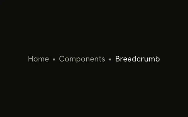
The first crumb is a home icon, named Home for screen readers. Bullets separate it from Components and from Breadcrumb, the current page. The last crumb is not a link.
Use it when the root is an icon and the separator should stay a simple mark. A slash reads more like a file path. A site menu is a Navigation Menu. In React, Base UI does not choose the separator.
Installation
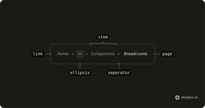
Anatomy
Usage
<Breadcrumb>
  <BreadcrumbList>
    <BreadcrumbItem>
      <BreadcrumbLink aria-label="Home" render={<Link href="/" />}>
        <HomeIcon aria-hidden="true" className="size-4" />
      </BreadcrumbLink>
    </BreadcrumbItem>
    <BreadcrumbSeparator>•</BreadcrumbSeparator>
    <BreadcrumbItem>
      <BreadcrumbLink render={<Link href="/components" />}>
        Components
      </BreadcrumbLink>
    </BreadcrumbItem>
    <BreadcrumbSeparator>•</BreadcrumbSeparator>
    <BreadcrumbItem>
      <BreadcrumbPage>Breadcrumb</BreadcrumbPage>
    </BreadcrumbItem>
  </BreadcrumbList>
</Breadcrumb>
FAQ
How is the bullet drawn?
The character • is the child of BreadcrumbSeparator, in place of the default chevron. The separator is hidden from assistive tech.
How is the home icon named?
The link to / holds only a HomeIcon at size-4, hidden from assistive tech, so the link carries aria-label="Home". Screen readers announce it as the Home link.
Where does the space around the bullet come from?
From the breadcrumb list's gap. The demo adds no spacing classes of its own, so the bullet sits where a chevron would.
Can I use another character?
Yes. Any text or icon works in its place, such as ·, | or a Lucide icon. Use one mark across the whole site.
API Reference
Breadcrumb
No extra props in this demo. The rest is on the Breadcrumb page.