shadcn.io is an independent project built on shadcn/ui
Installation
Usage
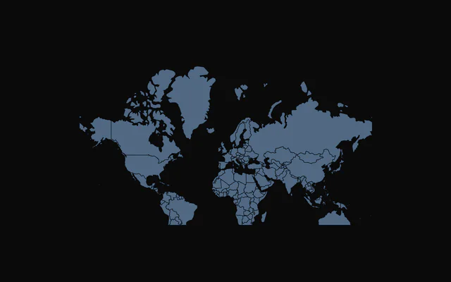
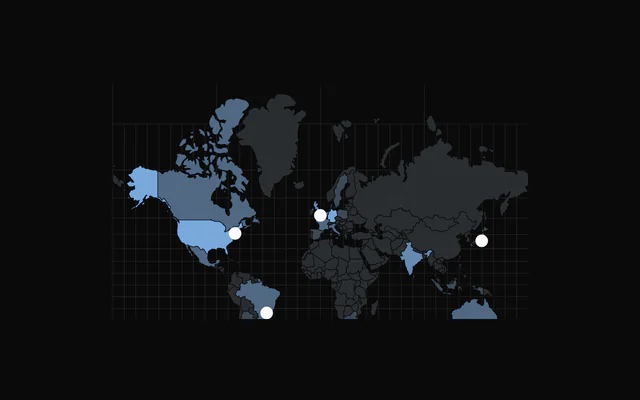
import { ChartChoroplethPointerCamera } from "@/components/charts/chart-choropleth-pointer-camera";<ChartChoroplethPointerCamera />API Reference
ChoroplethChart
dataFeatureCollection<Geometry, ChoroplethFeatureProperties>
GeoJSON FeatureCollection to draw, with one feature per region. Pass GeoJSON objects: TopoJSON is not read, so convert it first (for example with topojson-client's feature()).
- Type
FeatureCollection<Geometry, ChoroplethFeatureProperties>
margin?Partial<Margin>
Chart margins in pixels. Any side you omit keeps its default.
- Type
Partial<Margin>- Default
{ top: 0, right: 0, bottom: 0, left: 0 }
animationDuration?number
Duration of the enter animation in milliseconds.
- Default
800
enterTransition?EnterTransition
Enter transition (a spring or a cubic-bezier tween), in seconds.
- Default
a tween of `animationDuration` on the reveal curve
revealSignature?string
Changing this value replays the enter animation.
- Default
""
aspectRatio?string
Aspect ratio of the chart as "width / height".
- Default
"16 / 9"
scale?number
Projection scale of the Mercator projection. When omitted it follows the chart width.
center?[number, number]
Geographic center of the map as [longitude, latitude].
- Default
[0, 20]
translate?[number, number]
Pixel offset of the projection center as [x, y]. When omitted the map is centered in the chart.
zoomEnabled?boolean
Enable zoom and pan with the mouse wheel, pinch, and drag.
- Default
false
zoomMin?number
Minimum zoom scale.
- Default
0.5
zoomMax?number
Maximum zoom scale.
- Default
4
initialZoom?TransformMatrix
Initial zoom transform.
- Default
the identity transform (no zoom, no pan)
className?string
Additional class name for the chart container.
- Default
""
clickToZoom?boolean
Click a region or a marker to fly the camera to it; click it again, the empty map, or press Escape to fly back.
- Default
false
focusMaxZoom?number
Largest camera scale when it frames a region.
- Default
6
zoomTransition?ChoroplethZoomTransition
Duration and easing of the click-to-zoom flight and of the camera's angle changes.
- Default
{ duration: 700, ease: [0.83, 0, 0.17, 1] }
perspective?ChoroplethPerspective
A 3D camera: one view for the zoomed-out map and one for a focused region (for example flat, swinging to look from the east once you zoom in).
childrenReactNode
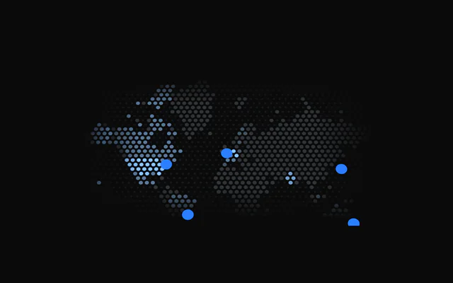
ChoroplethFeatureComponent or ChoroplethDotGrid, ChoroplethGraticule, ChoroplethMarker, ChoroplethBackground and ChoroplethTooltip to configure the map, plus any elements that call useChoropleth(), useChoroplethZoom() or useChoroplethCamera().
ariaLabel?string
Accessible label of the chart.
- Default
"Choropleth chart"
ariaDescription?string
Longer accessible description of the chart.
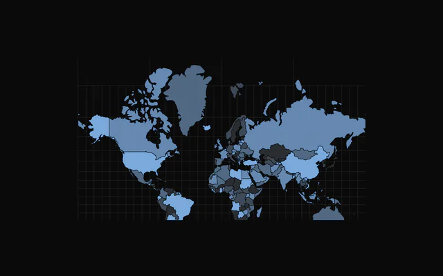
ChoroplethBackground
pattern?PatternPresetId
Pattern preset. "none" draws nothing.
- Default
"diagonal"
color?string
Color of the pattern strokes.
- Default
"var(--chart-grid)"
showFill?boolean
Draw the pattern.
- Default
true
opacity?number
Opacity of the pattern.
- Default
1
fadeHorizontal?boolean
Fade the pattern out at the left and right edges.
- Default
true
fadeVertical?boolean
Fade the pattern out at the top and bottom edges.
- Default
true
fadeHorizontalLength?number
Width of the horizontal fade zone, as a percent of the chart's width per edge (0 to 45).
- Default
10
fadeVerticalLength?number
Height of the vertical fade zone, as a percent of the chart's height per edge (0 to 45).
- Default
10
hideOnFocus?boolean
Fade the pattern out while the camera is focused.
- Default
false
scale?number
Multiplies the tile size; the line width scales with it. 2 doubles it.
- Default
1
strokeWidth?number
Line width of the line presets, in tile units (multiplied by scale).
- Default
1
tileBackground?string
Solid colour painted under the pattern in each tile.
radius?number
Deprecated: No effect: only the earlier circle presets read it..
complement?boolean
Deprecated: No effect: only the earlier circle presets read it..
fill?string
Deprecated: No effect: only the earlier circle presets read it..
dotFill?boolean
Deprecated: No effect: only the earlier dot preset read it..
ChoroplethFeatureComponent
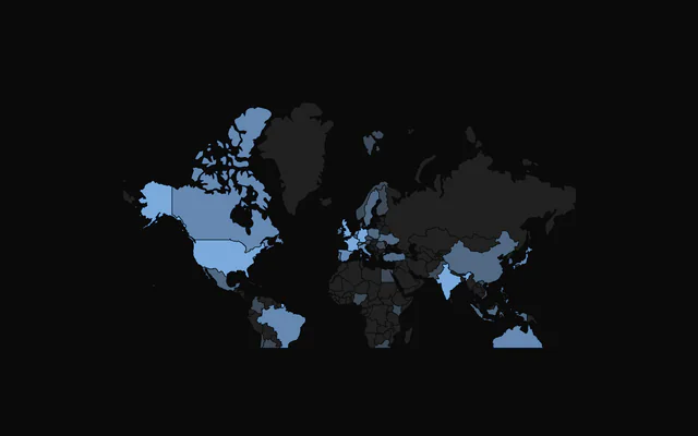
fill?string
Solid fill color for every feature. Takes precedence over getFeatureColor.
- Default
a cycle of the `--chart-scale-01` to `--chart-scale-05` variables, by feature index
stroke?string
Border color of the features.
- Default
"var(--bkm-background)"
strokeWidth?number
Border width of the features in pixels.
- Default
0.5
fadedOpacity?number
Opacity of the other features while one is hovered or focused.
- Default
0.4
getFeatureColor?(feature: ChoroplethFeature, index: number) => string
Returns a fill color per feature. Used when fill is not set.
- Type
(feature: ChoroplethFeature, index: number) => string
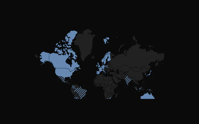
patterns?ReactNode
Pattern definitions (SVG <pattern> elements) that features can reference by id through getFeaturePattern.
getFeaturePattern?(feature: ChoroplethFeature, index: number) => string | null | undefined
Returns the id of a pattern to fill a feature with, or null/undefined to use the color. A pattern wins over fill and getFeatureColor.
- Type
(feature: ChoroplethFeature, index: number) => string | null | undefined
ChoroplethMarker
coordinates[number, number]
Where the marker sits, as [longitude, latitude].
labelstring
Name shown in the tooltip (and beside the marker with showLabel).
shape?ChoroplethMarkerShape
The marker's shape.
- Default
"circle"
size?number
Size in pixels; it stays this size while the map zooms.
- Default
9
color?string
Fill color.
- Default
"var(--foreground)"
stroke?string
Outline color; without it the marker has no outline.
strokeWidth?number
Outline width in pixels (with stroke).
- Default
1.5
pulse?ChoroplethMarkerPulse
The ripple ring: off, while hovered or focused, or always. Reduced motion turns it off.
- Default
"hover"
glow?number
Blur of a soft outer glow, in pixels; 0 turns it off.
- Default
0
showLabel?boolean
Always draw the label beside the marker.
- Default
false
className?string
Additional class name for the marker's group.
ChoroplethTooltip
content?(props: { feature: ChoroplethFeature; index: number }) => ReactNode
Custom tooltip content for a feature. Replaces the default name and value.
- Type
(props: { feature: ChoroplethFeature; index: number }) => ReactNode
formatValue?(value: number) => string
Formats the value in the default tooltip.
- Type
(value: number) => string- Default
integer formatting
getFeatureName?(feature: ChoroplethFeature, index: number) => string
Returns the tooltip title of a feature.
- Type
(feature: ChoroplethFeature, index: number) => string- Default
the feature's `properties.name`, or "Feature <index>"
getFeatureValue?(feature: ChoroplethFeature, index: number) => number | undefined
Returns the value shown for a feature. When it returns undefined the value row is hidden.
- Type
(feature: ChoroplethFeature, index: number) => number | undefined
valueLabel?string
Label of the value row.
- Default
"Value"
className?string
Additional class name for the tooltip panel.
panelStyle?CSSProperties
Inline styles for the tooltip panel, for example a blur or border.
backgroundColor?string
Background color of the tooltip panel (a CSS variable or a color).
hideDelay?number
Grace period in milliseconds before the tooltip hides when the pointer leaves a feature for the sea or a border gap: a move onto the next feature within it carries the panel over instead of fading it out and back in.
- Default
120