shadcn.io is an independent project built on shadcn/ui
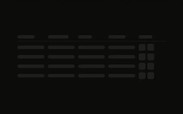
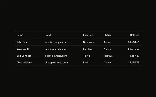
A header and five rows of four cells, then a footer: one bar for the page summary and five squares for the page buttons.
Use it so the pager holds its place before the rows arrive. When the pages are real, put Pagination under the table. In React, Base UI does not know how many pages there are.
Installation
Sign in to get your install command
Free with an account. It carries your token, so the CLI installs everything in one go.
Use email insteadNo credit card
Anatomy
Usage
<div className="flex w-full max-w-2xl flex-col gap-4">
  <div className="flex flex-col gap-3">
    <div className="grid grid-cols-4 gap-4 border-b pb-3">
      <Skeleton className="h-4 w-20" />
      <Skeleton className="h-4 w-24" />
      <Skeleton className="h-4 w-16" />
      <Skeleton className="h-4 w-20" />
    </div>
    {ROWS.map((row) => (
      <div className="grid grid-cols-4 gap-4" key={row}>
        <Skeleton className="h-4 w-full" />
        <Skeleton className="h-4 w-full" />
        <Skeleton className="h-4 w-full" />
        <Skeleton className="h-4 w-full" />
      </div>
    ))}
  </div>
  <div className="flex items-center justify-between border-t pt-3">
    <Skeleton className="h-4 w-32" />
    <div className="flex gap-2">
      <Skeleton className="size-8 rounded-md" />
      <Skeleton className="size-8 rounded-md" />
      <Skeleton className="size-8 rounded-md" />
      <Skeleton className="size-8 rounded-md" />
      <Skeleton className="size-8 rounded-md" />
    </div>
  </div>
</div>
FAQ
How is the table block built?
A max-w-2xl column with gap-4. Inside, header and rows use gap-3. Header and each row are grid grid-cols-4 gap-4, and the header adds border-b pb-3.
API Reference
Skeleton
No extra props in this demo. The rest is on the Skeleton page.