shadcn.io is an independent project built on shadcn/ui
Three profile controls, not connected to each other. Messages has a red badge with 8. Follow sits beside 2.4k followers. Following is filled and marked pressed, beside 2.4k. Pressing Follow does not become Following.
Use the badge for unread mail and the joined text for a follow control. A count that should cap, such as 99+, is still a Badge you format. In Solid, Ark UI does not switch Follow to Following.
Installation
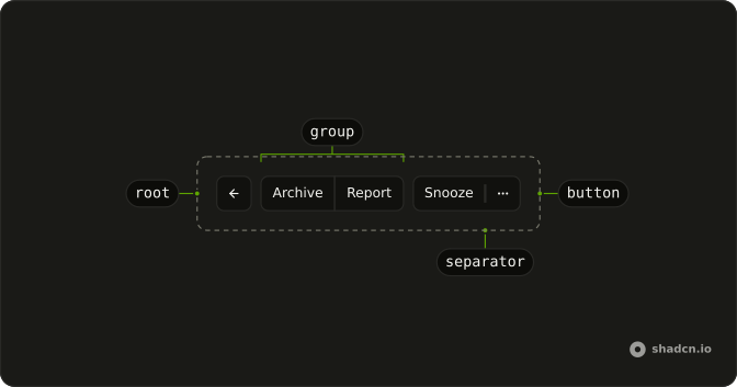
Anatomy
Usage
<div class="flex flex-col gap-4">
    <ButtonGroup aria-label="Messages">
      <Button class="relative" size="sm" variant="outline">
        <MailIcon aria-hidden="true" data-icon="inline-start" />
        Messages
        <Badge class="absolute -end-1 -top-1 text-xs" pill size="sm" variant="destructive">
          8
        </Badge>
      </Button>
    </ButtonGroup>
    <ButtonGroup aria-label="Followers">
      <Button size="sm" variant="outline">
        <UserPlusIcon aria-hidden="true" data-icon="inline-start" />
        Follow
      </Button>
      <ButtonGroupText>2.4k followers</ButtonGroupText>
    </ButtonGroup>
    <ButtonGroup aria-label="Followers">
      <Button aria-pressed="true" size="sm">
        <UserPlusIcon aria-hidden="true" data-icon="inline-start" />
        Following
      </Button>
      <ButtonGroupText>2.4k</ButtonGroupText>
    </ButtonGroup>
  </div>
FAQ
How is the unread badge placed?
The Button has relative, and the Badge has absolute -end-1 -top-1, pill, size="sm" and variant="destructive". The logical -end-1 keeps it on the trailing corner in either reading direction.
How does Following differ from Follow?
It uses the default variant instead of outline, the label Following, and aria-pressed. Its count text is 2.4k instead of 2.4k followers.
Does Follow switch to Following?
No. The two groups are static samples. Keep a following flag and switch the variant, label and aria-pressed from it.
How is the unread count announced?
The badge text is inside the button, so it is read as Messages and 8. Set an aria-label such as Messages, 8 unread when you want a full phrase.
What about a large unread count?
The badge widens with its text. Cap it before you pass it, such as 99+, as the Notifications Button example does.
API Reference
Button Group
Sets aria-label="Messages" and aria-label="Followers". The rest is on the Button Group page.
Button
Sets size="sm", variant="outline" and aria-pressed. The rest is on the Button page.
Badge
Sets pill, size="sm" and variant="destructive". The rest is on the Badge page.