shadcn.io is an independent project built on shadcn/ui
An outline icon button shows the current alignment, starting on the left. The menu checks one of Align Left, Align Center, Align Right, or Justify, and the icon follows.
Use it in an editor when the current alignment should stay visible on the button. If the choices should sit on the page, a Toggle Group fits. In Solid, Ark UI stores the value and does not restyle the text.
Installation
Anatomy
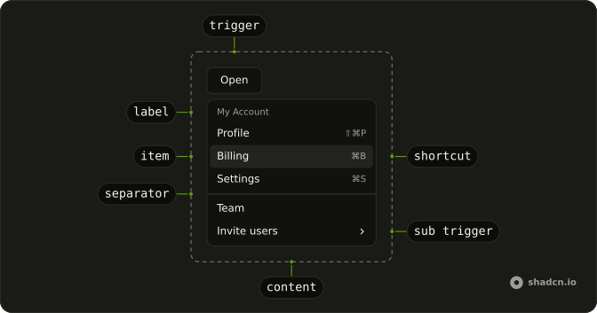
Usage
<DropdownMenu>
      <DropdownMenuTrigger asChild={props => <Button {...props()} aria-label="Text alignment" size="icon-md" variant="outline">
          {alignment() === "left" ? <AlignLeftIcon aria-hidden="true" /> : null}
          {alignment() === "center" ? <AlignCenterIcon aria-hidden="true" /> : null}
          {alignment() === "right" ? <AlignRightIcon aria-hidden="true" /> : null}
          {alignment() === "justify" ? <AlignJustifyIcon aria-hidden="true" /> : null}
        </Button>} />
      <DropdownMenuContent class="w-48">
        <DropdownMenuRadioGroup onValueChange={handleAlignmentChange} value={alignment()}>
          <DropdownMenuRadioItem value="left">
            <AlignLeftIcon aria-hidden="true" />
            Align Left
          </DropdownMenuRadioItem>
          <DropdownMenuRadioItem value="center">
            <AlignCenterIcon aria-hidden="true" />
            Align Center
          </DropdownMenuRadioItem>
          <DropdownMenuRadioItem value="right">
            <AlignRightIcon aria-hidden="true" />
            Align Right
          </DropdownMenuRadioItem>
          <DropdownMenuSeparator />
          <DropdownMenuRadioItem value="justify">
            <AlignJustifyIcon aria-hidden="true" />
            Justify
          </DropdownMenuRadioItem>
        </DropdownMenuRadioGroup>
      </DropdownMenuContent>
    </DropdownMenu>
FAQ
How does the alignment choice work?
Left starts selected. The values are left, center, right and justify, in one radio group, so picking one unchecks the others.
DropdownMenuRadioGroup takes value, and onValueChange receives details.value. Each DropdownMenuRadioItem has its value.
Why does the trigger icon change?
The button renders the left, center, right or justify icon depending on the current value, so it always shows the active alignment. Each row repeats the same icon before its label.
Why is Justify under a line?
A DropdownMenuSeparator sits inside the radio group, between Align Right and Justify, to set the full-width option apart. It doesn't split the group: Justify still unchecks the others.
How wide is the menu?
The menu is w-48. The trigger is an outline Button with size="icon-md" and aria-label set to Text alignment, since it has no visible text.
API Reference
Dropdown Menu
Sets asChild, props, onValueChange={handleAlignmentChange}, value={alignment()}, value="left" and value="center". The rest is on the Dropdown Menu page.
Button
Sets props, aria-label="Text alignment", size="icon-md" and variant="outline". The rest is on the Button page.