shadcn.io is an independent project built on shadcn/ui
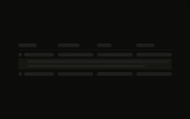
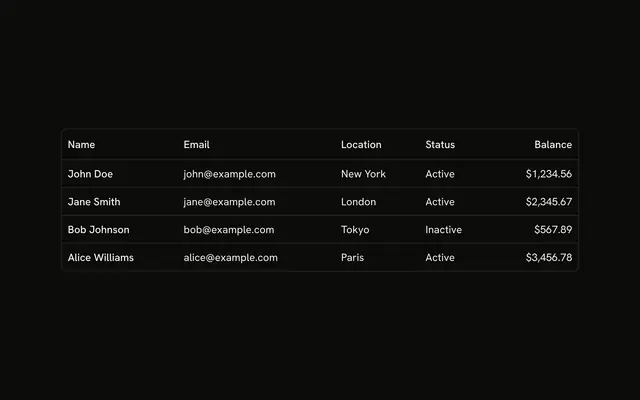
Each row starts with a small round avatar and a name bar, then three more cells. The rows are a four-column grid.
Use it for a user or customer table while the people load. If the query returned nobody, show Empty instead of blank rows. In Solid, Ark UI does not look up the accounts.
Installation
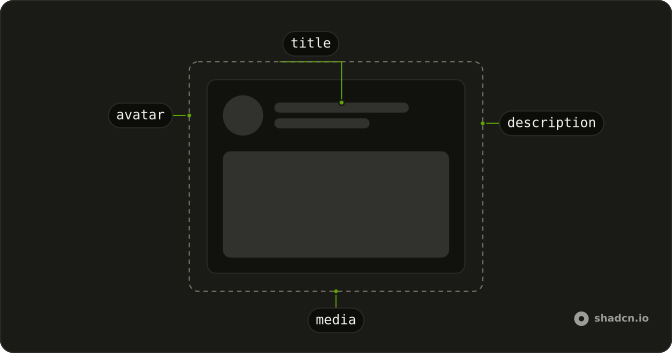
Anatomy
Usage
<div class="flex w-full max-w-2xl flex-col gap-3">
    <div class="grid grid-cols-4 gap-4 border-b pb-3">
      <Skeleton class="h-4 w-20" />
      <Skeleton class="h-4 w-16" />
      <Skeleton class="h-4 w-20" />
      <Skeleton class="h-4 w-16" />
    </div>
    {ROWS.map(() => <div class="grid grid-cols-4 items-center gap-4">
        <div class="flex items-center gap-3">
          <Skeleton class="size-8 shrink-0 rounded-full" />
          <Skeleton class="h-4 flex-1" />
        </div>
        <Skeleton class="h-4 w-full" />
        <Skeleton class="h-4 w-full" />
        <Skeleton class="h-4 w-full" />
      </div>)}
  </div>
FAQ
How is the table grid set up?
max-w-2xl with gap-3. The header and each row are grid grid-cols-4 gap-4. The header adds border-b pb-3. Rows add items-center.
What is in the first cell?
flex items-center gap-3: a size-8 shrink-0 rounded-full circle and an h-4 flex-1 bar. size-8 is the default Avatar size. The other three cells are h-4 w-full.
How many body rows are there?
Four, from ROWS. Each row repeats the circle and the three full-width bars.
API Reference
Skeleton
No extra props in this demo. The rest is on the Skeleton page.