shadcn.io is an independent project built on shadcn/ui
Installation
Usage
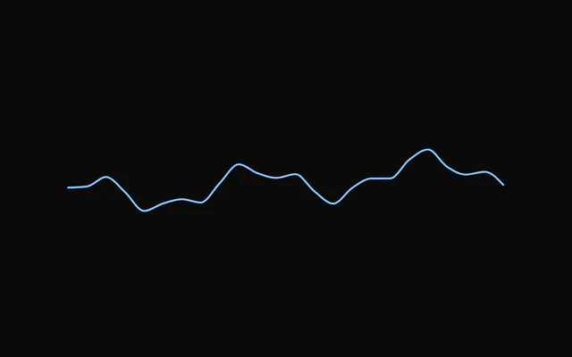
import { ChartSparklineDefault } from "@/components/charts/chart-sparkline-default";<ChartSparklineDefault />API Reference
AreaSparkline
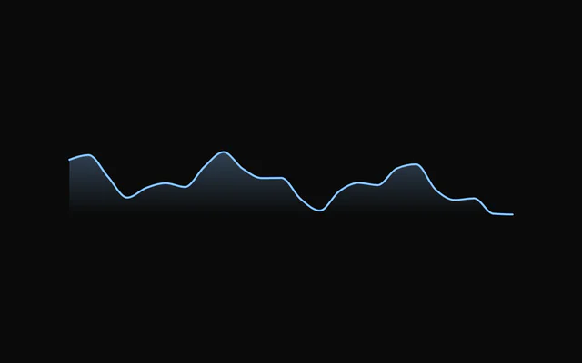
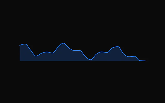
fill?"gradient" | "solid"
Fill style: a gradient fading to the baseline, or one flat colour.
- Type
"gradient" | "solid"- Default
"gradient"
fillOpacity?number
Opacity of the fill at its strongest point.
- Default
0.3
curve?SparklineCurve
How the points are joined.
- Default
"monotone"
strokeWidth?number
Line width in px.
- Default
1.5
endDot?boolean
Keep a dot on the last point when not hovering.
- Default
false
showHighlight?boolean
On hover, fade the series and re-stroke the segment around the hovered point at full strength: the main charts' highlight.
- Default
true
inactiveOpacity?number
Series opacity while hovering (with showHighlight).
- Default
0.5
datareadonly T[]
Rows to plot.
dataKeySparklineDataKey<T>
Field (or accessor) holding the numeric value.
- Type
SparklineDataKey<T>
width?number
Fixed width in px. Omit to fill the parent width.
height?number
Height in px.
- Default
32
color?string
Series colour.
- Default
"var(--chart-line-primary)"
padding?number | Partial<SparklinePadding>
Inner padding so strokes and the hover dot are not clipped: one number for every side, or some sides. Defaults to 4 (2 for bars).
- Type
number | Partial<SparklinePadding>
yDomain?readonly [number?, number?]
Override the value domain; undefined entries fall back to the data.
animate?boolean
Play the enter animation on mount. Respects prefers-reduced-motion.
- Default
true
animationDuration?number
Enter duration in ms.
- Default
900
animationEasing?string
Any CSS easing string.
- Default
"cubic-bezier(0.85, 0, 0.15, 1)"
dataTransitionDuration?number
Morph to new data instead of snapping, in ms. 0 snaps. Requires animate; snaps under prefers-reduced-motion.
- Default
500
crosshair?SparklineCrosshair
Hover guide line. Set false to hide.
- Default
"dashed"
dot?boolean
Show a dot on the hovered point.
- Default
true
hoverTransition?boolean
Spring the crosshair and dot between points, like the main charts' tooltip. Snaps under prefers-reduced-motion.
- Default
true
springConfig?Partial<SparklineSpringConfig>
Hover spring for the crosshair and dot. Defaults to the main charts' tooltip spring (300 / 30); pass only what you want to change, e.g. { damping: 40 }. Higher stiffness = snappier; lower damping = bouncier.
- Type
Partial<SparklineSpringConfig>
interactive?boolean
Track the pointer and the keyboard (←/→, Home/End, Esc) to show the hovered point. false: no hover state, no listeners, no tab stop.
- Default
true
hoverIndex?number | null
Controlled hovered index. Pass null for "not hovering".
- Type
number | null
onHoverChange?(index: number | null, datum: T | null) => void
Called when the hovered point changes (pointer or keyboard), with its index and row, or null and null on leave.
- Type
(index: number | null, datum: T | null) => void
aria-label?string
Accessible summary. Generated from the data when omitted.
ariaLabel?string
Accessible summary (the kit's other charts' name for aria-label).
className?string
Extra class name for the sparkline's element.
style?CSSProperties
Inline style for the sparkline's element.
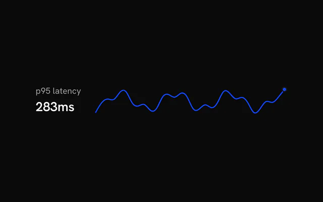
LineSparkline
curve?SparklineCurve
How the points are joined.
- Default
"monotone"
strokeWidth?number
Line width in px.
- Default
1.5
endDot?boolean
Keep a dot on the last point when not hovering.
- Default
false
showHighlight?boolean
On hover, fade the series and re-stroke the segment around the hovered point at full strength: the main charts' highlight.
- Default
true
inactiveOpacity?number
Series opacity while hovering (with showHighlight).
- Default
0.5
datareadonly T[]
Rows to plot.
dataKeySparklineDataKey<T>
Field (or accessor) holding the numeric value.
- Type
SparklineDataKey<T>
width?number
Fixed width in px. Omit to fill the parent width.
height?number
Height in px.
- Default
32
color?string
Series colour.
- Default
"var(--chart-line-primary)"
padding?number | Partial<SparklinePadding>
Inner padding so strokes and the hover dot are not clipped: one number for every side, or some sides. Defaults to 4 (2 for bars).
- Type
number | Partial<SparklinePadding>
yDomain?readonly [number?, number?]
Override the value domain; undefined entries fall back to the data.
animate?boolean
Play the enter animation on mount. Respects prefers-reduced-motion.
- Default
true
animationDuration?number
Enter duration in ms.
- Default
900
animationEasing?string
Any CSS easing string.
- Default
"cubic-bezier(0.85, 0, 0.15, 1)"
dataTransitionDuration?number
Morph to new data instead of snapping, in ms. 0 snaps. Requires animate; snaps under prefers-reduced-motion.
- Default
500
crosshair?SparklineCrosshair
Hover guide line. Set false to hide.
- Default
"dashed"
dot?boolean
Show a dot on the hovered point.
- Default
true
hoverTransition?boolean
Spring the crosshair and dot between points, like the main charts' tooltip. Snaps under prefers-reduced-motion.
- Default
true
springConfig?Partial<SparklineSpringConfig>
Hover spring for the crosshair and dot. Defaults to the main charts' tooltip spring (300 / 30); pass only what you want to change, e.g. { damping: 40 }. Higher stiffness = snappier; lower damping = bouncier.
- Type
Partial<SparklineSpringConfig>
interactive?boolean
Track the pointer and the keyboard (←/→, Home/End, Esc) to show the hovered point. false: no hover state, no listeners, no tab stop.
- Default
true
hoverIndex?number | null
Controlled hovered index. Pass null for "not hovering".
- Type
number | null
onHoverChange?(index: number | null, datum: T | null) => void
Called when the hovered point changes (pointer or keyboard), with its index and row, or null and null on leave.
- Type
(index: number | null, datum: T | null) => void
aria-label?string
Accessible summary. Generated from the data when omitted.
ariaLabel?string
Accessible summary (the kit's other charts' name for aria-label).
className?string
Extra class name for the sparkline's element.
style?CSSProperties
Inline style for the sparkline's element.
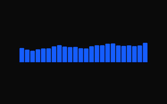
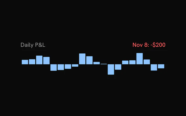
BarSparkline
barGap?number
Gap between bars in px.
- Default
2
barRadius?number
Corner radius away from the baseline, in px.
- Default
1
inactiveOpacity?number
Opacity of the other bars while hovering.
- Default
0.4
datareadonly T[]
Rows to plot.
dataKeySparklineDataKey<T>
Field (or accessor) holding the numeric value.
- Type
SparklineDataKey<T>
width?number
Fixed width in px. Omit to fill the parent width.
height?number
Height in px.
- Default
32
color?string
Series colour.
- Default
"var(--chart-line-primary)"
padding?number | Partial<SparklinePadding>
Inner padding so strokes and the hover dot are not clipped: one number for every side, or some sides. Defaults to 4 (2 for bars).
- Type
number | Partial<SparklinePadding>
yDomain?readonly [number?, number?]
Override the value domain; undefined entries fall back to the data.
animate?boolean
Play the enter animation on mount. Respects prefers-reduced-motion.
- Default
true
animationDuration?number
Enter duration in ms.
- Default
900
animationEasing?string
Any CSS easing string.
- Default
"cubic-bezier(0.85, 0, 0.15, 1)"
dataTransitionDuration?number
Morph to new data instead of snapping, in ms. 0 snaps. Requires animate; snaps under prefers-reduced-motion.
- Default
500
crosshair?SparklineCrosshair
Hover guide line. Set false to hide.
- Default
"dashed"
dot?boolean
Show a dot on the hovered point.
- Default
true
hoverTransition?boolean
Spring the crosshair and dot between points, like the main charts' tooltip. Snaps under prefers-reduced-motion.
- Default
true
springConfig?Partial<SparklineSpringConfig>
Hover spring for the crosshair and dot. Defaults to the main charts' tooltip spring (300 / 30); pass only what you want to change, e.g. { damping: 40 }. Higher stiffness = snappier; lower damping = bouncier.
- Type
Partial<SparklineSpringConfig>
interactive?boolean
Track the pointer and the keyboard (←/→, Home/End, Esc) to show the hovered point. false: no hover state, no listeners, no tab stop.
- Default
true
hoverIndex?number | null
Controlled hovered index. Pass null for "not hovering".
- Type
number | null
onHoverChange?(index: number | null, datum: T | null) => void
Called when the hovered point changes (pointer or keyboard), with its index and row, or null and null on leave.
- Type
(index: number | null, datum: T | null) => void
aria-label?string
Accessible summary. Generated from the data when omitted.
ariaLabel?string
Accessible summary (the kit's other charts' name for aria-label).
className?string
Extra class name for the sparkline's element.
style?CSSProperties
Inline style for the sparkline's element.