shadcn.io is an independent project built on shadcn/ui
Installation
Usage
import { ChartStreamLoading } from "@/components/charts/chart-stream-loading";<ChartStreamLoading />API Reference
StreamChart
datareadonly Record<string, unknown>[]
One row per x position: xDataKey holds a Date or a number, each Stream's dataKey a value.
- Type
readonly Record<string, unknown>[]
xDataKeystring
The key of each row's x value.
offset?"wiggle" | "silhouette" | "expand" | "none"
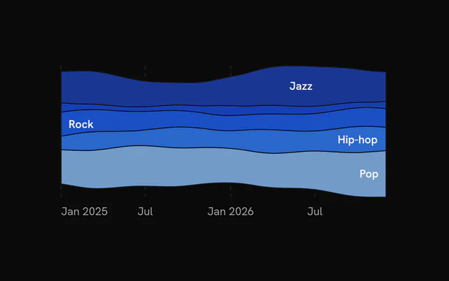
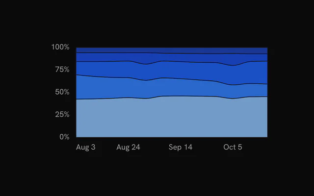
Where the stack sits: "wiggle" (a streamgraph: the baseline moves to calm the layers), "silhouette" (centred on zero), "expand" (every x normalised to 100%) or "none" (a stacked area from zero).
- Type
"wiggle" | "silhouette" | "expand" | "none"- Default
"wiggle"
order?"inside-out" | "ascending" | "descending" | "none"
Layer order: "inside-out" (the largest in the middle, as a streamgraph wants), "ascending", "descending" or "none" (the Stream order).
- Type
"inside-out" | "ascending" | "descending" | "none"- Default
"inside-out"
curve?"basis" | "natural" | "monotone" | "linear"
The layers' curve.
- Type
"basis" | "natural" | "monotone" | "linear"- Default
"basis"
formatValue?(value: number) => string
Formats a value in the tooltip and the y axis.
- Type
(value: number) => string
formatX?(value: unknown) => string
Formats an x value in the tooltip and the x axis (defaults: a date as "Jan 5", a number as is).
- Type
(value: unknown) => string
onHoverChange?(index: number | null) => void
Called with the hovered layer's index (its Stream's position), and null when the pointer leaves.
- Type
(index: number | null) => void
aspectRatio?string | number
Width over height: a number or a string such as "2 / 1".
- Type
string | number- Default
"2 / 1"
height?number
A fixed height in px instead of an aspect ratio.
animate?boolean
Play the entrance: the layers sweep in from the left.
- Default
true
status?ChartStatus
"loading" draws a shimmering skeleton (muted wavy bands) in place of the chart and ignores the pointer; switching to "ready" plays the entrance. Switching back to "loading" fades the chart out first.
- Default
"ready"
loadingLabel?string
Text shown centered over the plot, with a shimmer, while status is "loading". Nothing is shown when it is unset or empty.
ariaLabel?stringariaDescription?stringclassName?string
Extra class name for the chart's root element.
style?CSSProperties
Inline style for the chart's root element.
children?ReactNode
Carriers: ChartTooltip and the family's own.
Grid
horizontal?boolean
Show horizontal grid lines.
- Default
true
vertical?boolean
Show vertical grid lines.
- Default
false
numTicksRows?number
Number of horizontal grid lines. Ignored when rowTickValues is set.
- Default
5
numTicksColumns?number
Number of vertical grid lines.
- Default
10
rowTickValues?number[]
Explicit y values for the horizontal grid lines. Overrides numTicksRows.
stroke?string
Color of the grid lines.
- Default
"var(--chart-grid)"
loadingStroke?string
Grid color while the chart is loading. Falls back to stroke.
strokeOpacity?number
Opacity of the grid lines.
- Default
1
strokeWidth?number
Width of the grid lines in px.
- Default
1
strokeDasharray?string
Dash pattern of the grid lines.
- Default
"4,4"
highlightRowValues?number[]
Y values of horizontal lines drawn with the highlight styling, for example a zero baseline.
highlightRowStroke?string
Color of the highlighted rows.
- Default
"var(--chart-foreground-muted)"
highlightRowStrokeOpacity?number
Opacity of the highlighted rows.
- Default
1
highlightRowStrokeWidth?number
Width of the highlighted rows in px.
- Default
1
highlightRowStrokeDasharray?string
Dash pattern of the highlighted rows.
- Default
"0"
fadeHorizontal?boolean
Fade the horizontal lines toward transparent at the left and right edges.
- Default
true
fadeVertical?boolean
Fade the vertical lines toward transparent at the top and bottom edges.
- Default
false
hideHorizontalEdgeLines?boolean
Drop the first and last horizontal line (kept when two or fewer remain).
- Default
false
hideVerticalEdgeLines?boolean
Drop the first and last vertical line (kept when two or fewer remain).
- Default
false
yAxisId?string | number
Accepted for bklit-ui compatibility. It has no effect in bklit-tanstack-charts. The grid follows the primary (left) y scale.
- Type
string | number
shimmer?boolean
While the chart is loading, sweep a bright band across the grid.
- Default
false
shimmerStroke?string
Color of the shimmer band.
- Default
"color-mix(in oklch, var(--bkm-foreground) 68%, transparent)"
shimmerLength?number
Accepted for bklit-ui compatibility. It has no effect in bklit-tanstack-charts.
shimmerSpeed?number
Speed multiplier of the shimmer sweep. 2 is twice as fast.
- Default
1
shimmerSync?boolean
Accepted for bklit-ui compatibility. It has no effect in bklit-tanstack-charts.
Stream
dataKeystring
The key of its value in each row.
label?string
Its name in the tooltip, its label and the legend. Defaults to the dataKey.
fill?string
Its colour. Defaults to the palette's, by position.
StreamLabels
minThickness?number
Hide a label where its layer is thinner than this, in px.
- Default
18
XAxis
numTicks?number | ResponsiveChartLabelCount
Target number of tick labels along the x axis, or one per chart width: { base, sm, md, lg, xl } takes the count of the widest breakpoint the chart reaches (640, 768, 1024 and 1280 px).
- Type
number | ResponsiveChartLabelCount- Default
5
labels?readonly string[]
The tick text of each data row, in row order: it replaces the date formatting (pair it with ChartTooltip dateLabels).
tickerHalfWidth?number
Half-width in px of the zone around the date pill inside which tick labels are hidden. Line, area and composed charts widen it to the pill's half-width plus the widest tick label's, so no label sits half under the pill.
- Default
50
tickMode?"domain" | "data"
Where ticks fall: "data" places them on evenly spaced data rows, "domain" places them at evenly spaced time values across the x domain.
- Type
"domain" | "data"- Default
"data"
formatValue?(value: Readonly<Date>) => string
Formats a tick date into its label. Defaults to a short month and day such as "Jan 5".
- Type
(value: Readonly<Date>) => string
ChartTooltip
showDatePill?boolean
Show the date pill that rides along the bottom of the plot.
- Default
true
showCrosshair?boolean
Show the vertical crosshair line. Bar charts leave it off unless this is true (the dots and the category pill mark the bar).
- Default
true
showDots?boolean
Show a dot on every series at the hovered position.
- Default
true
dotVariant?"dot" | "ring"
Dot style: a filled "dot" or a transparent "ring" square. Read by BarChart only.
- Type
"dot" | "ring"- Default
"dot"
dotSize?number
Dot radius in px.
- Default
5
dotRadiusFraction?number
Corner radius of the "ring" variant as a fraction of its side (0 is square, 0.5 is a circle). Read by BarChart only.
- Default
0.25
dotScale?number
Multiplier applied to the dot or ring size. Read by BarChart and LiveLineChart.
- Default
1
dotStrokeWidth?number
Stroke width of the dots in px.
- Default
2
indicatorColor?string | ((point: Record<string, unknown>) => string)
Color of the crosshair. Only a string is applied; the function form that bklit-ui accepts is ignored and the default is used.
- Type
string | ((point: Record<string, unknown>) => string)- Default
"var(--chart-crosshair)"
content?(props: { point: Record<string, unknown>; index: number; pinned?: boolean; dismiss?: () => void }) => ReactNode
Replaces the default tooltip panel body. Receives the hovered data row and its index; with pinnable, also whether the panel is pinned and a dismiss that unpins it (for a close button in a pinned panel's detail).
- Type
(props: { point: Record<string, unknown>; index: number; pinned?: boolean; dismiss?: () => void }) => ReactNode
pinnable?boolean
A click (or Enter, or Space) on the chart pins the tooltip where it is: the panel takes the pointer, so its content can grow into detail and hold controls, until another click, Escape or dismiss lets it go.
- Default
false
rows?(point: Record<string, unknown>) => { readonly color: string; readonly label: string; readonly value: string | number }[]
Replaces the default rows (one per series) with your own list of { color, label, value }.
- Type
(point: Record<string, unknown>) => { readonly color: string; readonly label: string; readonly value: string | number }[]
dotColor?string | ((point: Record<string, unknown>, line: ChartLineConfig) => string)
Fill of the tooltip dots. A function receives the hovered row and the series config, and is called again each time the hovered row changes. Defaults to each series' color; a ProfitLossLine's dot takes the color of the hovered value's sign.
- Type
string | ((point: Record<string, unknown>, line: ChartLineConfig) => string)
children?ReactNode
Extra content rendered below the rows in the default panel, for example marker details. Without it, a chart with ChartMarkers lists the markers on the hovered date there.
className?string
Extra class name for the tooltip panel.
springConfig?SpringConfig
Spring for the floating panel when matchCrosshair is on. Defaults to the chart's tooltip spring.
matchCrosshair?boolean
Make the floating panel follow the pointer with the same spring as the crosshair instead of damping.
- Default
false
damping?number
Spring damping for the floating panel when matchCrosshair is off, on bklit's 0 to 100 scale: lower is bouncier, higher slower, 0 moves the panel instantly. The default, 20, is the snappy hover spring (stiffness 3600, damping 120); every other value is bklit's spring for it played six times faster.
- Default
20
indicatorDasharray?string
Dash pattern of the crosshair. Omit for a solid line.
indicatorFadeEdges?IndicatorFadeEdges
Vertical fade of the crosshair: both ends, the top, the bottom, or none (solid).
- Default
"both"
indicatorFadeLength?number
Size of the crosshair's fade, as a percentage of its height (2 to 40).
- Default
10
indicatorEndColor?string
Bottom colour of the crosshair: it ramps from indicatorColor at the top to this at the bottom (composes with the fade).
indicatorEnd?"plot" | "point"
How far down the crosshair reaches: the whole plot, or down to the hovered point of the first series.
- Type
"plot" | "point"- Default
"plot"
dotHaloBlur?number
Blur in px on the dots' halo, for a soft glow.
- Default
0
topOffset?number
Extra gap in px between the top of the plot and the tooltip panel.
- Default
0
dateLabels?readonly string[]
The date pill's text for each data row, in row order (pair it with XAxis labels).
boxSpringConfig?SpringConfig
Spring for the floating panel. Takes priority over matchCrosshair and damping.
panelStyle?CSSProperties
Accepted for bklit-ui compatibility. It has no effect in bklit-tanstack-charts. Style the panel with className or the --chart-tooltip-* CSS variables instead.
backgroundColor?string
Accepted for bklit-ui compatibility. It has no effect in bklit-tanstack-charts. Set --chart-tooltip-background instead.
indicatorWidth?IndicatorWidth
Thickness of the crosshair: a width in px, or "line" (1px), "thin" (2px), "medium" (4px) or "thick" (8px).
- Default
"line"
columnWidth?number
Accepted for bklit-ui compatibility. It has no effect in bklit-tanstack-charts.