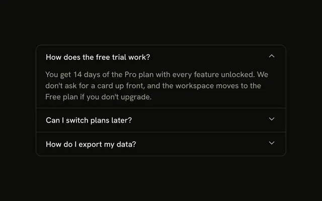
shadcn.io is an independent project built on shadcn/ui
A help icon leads What payment methods do you accept? in a bordered box. The border shifts on hover, and the answer is indented under the question.
Use it for one question on a help or checkout page. A stack that should open one at a time belongs in an Accordion. In Svelte, Ark UI toggles this box on its own.
Installation
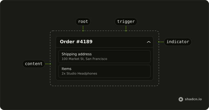
Anatomy
Usage
<Collapsible class="w-full max-w-lg rounded-lg border p-4 hover:border-primary/50"><h3><CollapsibleTrigger class="flex w-full items-start gap-3 text-start font-medium"><CircleHelpIcon aria-hidden="true" class="mt-0.5 size-5 shrink-0 text-muted-foreground" />What payment methods do you accept?</CollapsibleTrigger></h3><CollapsibleContent class="ms-8 pt-2 text-muted-foreground text-sm">We accept all major credit cards (Visa, Mastercard, American Express), PayPal, and bank transfers for enterprise customers.</CollapsibleContent></Collapsible>FAQ
What changes the border on hover?
hover:border-primary/50 on Collapsible, which also carries rounded-lg border p-4. The whole box reacts, not just the trigger.
How is the help icon placed?
It leads the trigger: CircleHelpIcon at size-5 in the muted color, nudged down with mt-0.5 to line up with the first line, then gap-3 before the question. It is aria-hidden, so the question alone names the button.
Why does the answer use ms-8?
It's the icon's size-5 plus the gap-3 after it, so the answer starts under the question text. ms follows the page direction.
How do I toggle it from the keyboard?
Tab reaches the trigger, a button named by the question, and Space or Enter toggles the answer.
How do I stack more questions like this?
Repeat the box in a flex flex-col gap-2 list. Each Collapsible opens on its own. When several sit in one list and only one should be open at a time, with arrow keys between the headers, use an Accordion.
API Reference
Collapsible
No extra props in this demo. The rest is on the Collapsible page.