shadcn.io is an independent project built on shadcn/ui
Show more information leads with a plus that turns into a cross. Two short paragraphs open under it, and the label underlines on hover.
Use it for a short aside in an article. If that text should interrupt the page, use a Dialog. In Svelte, Ark UI does not keep it open on the next visit.
Installation
Anatomy
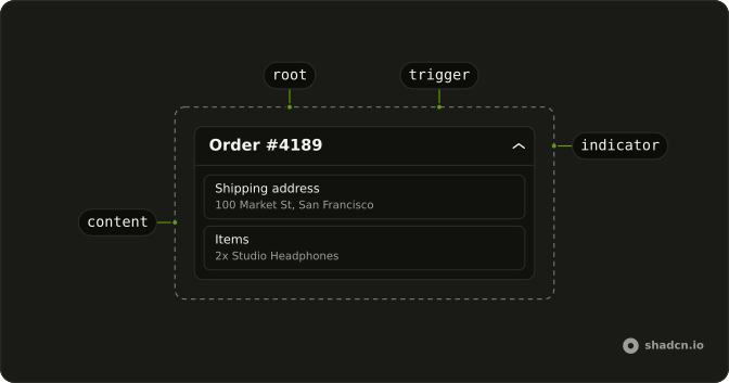
Usage
<Collapsible class="flex w-full max-w-lg flex-col gap-2"><CollapsibleTrigger class="group flex items-center gap-2 self-start font-medium text-sm hover:underline"><PlusIcon aria-hidden="true" class="size-4 transition-transform duration-200 group-aria-expanded:rotate-45" />Show more information</CollapsibleTrigger><CollapsibleContent class="flex flex-col gap-2 text-muted-foreground text-sm"><p>Additional details about this section can be found here.</p><p>This content was hidden by default but can be revealed by clicking the trigger.</p></CollapsibleContent></Collapsible>FAQ
How is Show more information built?
CollapsibleTrigger with flex items-center gap-2 font-medium text-sm, holding PlusIcon and the label. self-start keeps the trigger as wide as its text.
What spaces the trigger and the paragraphs?
Collapsible is a flex flex-col gap-2 column, which separates the trigger from the content. CollapsibleContent is a column with gap-2 too, which separates the two paragraphs.
Does Plus change when the text opens?
Yes, it turns 45 degrees into a cross. The trigger has the group class and sets aria-expanded while open, so group-aria-expanded:rotate-45 on PlusIcon turns it, eased by transition-transform duration-200.
API Reference
Collapsible
No extra props in this demo. The rest is on the Collapsible page.