shadcn.io is an independent project built on shadcn/ui
The button uses the small size and smaller text, and the options use that smaller text too. It is built to sit in a toolbar, a table row, or a filter bar.
Use it where a default field would crowd the row. The main choice on a page wants the large Combobox instead. In Svelte, Ark UI does not change the pick at this size.
Installation
Anatomy
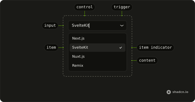
Usage
<Combobox collection={collection} onInputValueChange={handleInputValueChange} onValueChange={handleValueChange} positioning={{ getAnchorElement: () => triggerRef }} selectionBehavior="clear" value={value}><ComboboxTrigger class={cn(
          buttonVariants({ size: "sm", variant: "outline" }),
          "w-[150px] justify-between text-xs"
        )} bind:ref={triggerRef}>{#if selected}{selected.label}{:else}{"Select status..."}{/if}</ComboboxTrigger><ComboboxContent><ComboboxInput class="w-full" placeholder="Search status..." showTrigger={false} size="sm" /><ComboboxEmpty>No status found.</ComboboxEmpty><ComboboxList>{#each collection.items as item (item.value)}<ComboboxItem class="text-xs" item={item}>{item.label}</ComboboxItem>{/each}</ComboboxList></ComboboxContent></Combobox>
FAQ
What makes this one small?
size="sm" on the outline button, with text-xs and a fixed w-[150px].
The trigger takes them through buttonVariants.
What are the statuses?
To Do, In Progress, Done and Canceled. The search box says Search status..., and No status found. shows when nothing matches.
How wide is the list?
It opens at about the width of the button. For longer labels, widen the trigger rather than the popup, so the two stay aligned.
Is the small size fine on touch screens?
It's a smaller target, so keep it for dense desktop views. On touch-first screens use the default or the large size.
API Reference
Combobox
Sets collection={collection}, onInputValueChange={handleInputValueChange}, onValueChange={handleValueChange}, positioning, getAnchorElement and cn. The rest is on the Combobox page.