shadcn.io is an independent project built on shadcn/ui
One spinner is on screen, at 16px, with no extra size or color class. It uses the text color around it. Nothing in the file starts a request.
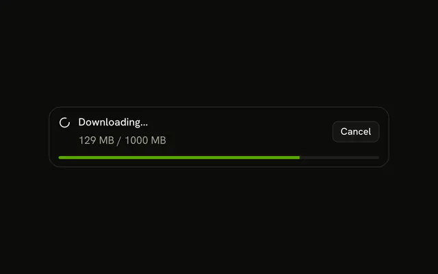
Use it for a short wait that should match the rest of the app. If you know how far along the work is, show a Progress bar. In Svelte, Ark UI sets role status and the label Loading unless you change it.
Installation
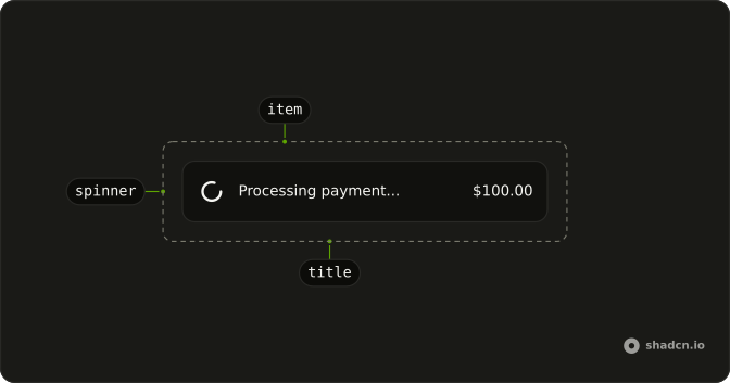
Anatomy
Usage
<Spinner />FAQ
When should I use default spinner versus customized variants?
Use the default for most loading states, so every wait in the app looks the same. Change the size when the spinner sits in dense text (size-3) or alone in an empty area (size-8), and the color when it should step back (text-muted-foreground) or carry the brand (text-primary).
What is the default spinner size and how does it compare to other sizes?
It is size-4, 16px, the same as the other icons in buttons and body text. size-3 (12px) fits small inline status, size-6 (24px) a card, and size-8 (32px) a page or panel. There is no size prop: pass the class.
What color is the default spinner and can I change it?
It draws with currentColor, so it takes the text color of its parent. Set a text class on it or on the parent, such as text-muted-foreground, text-primary or text-destructive.
How do I center a standalone spinner on the page?
Put it in a flex container with items-center and justify-center, sized to the area it covers: min-h-48 for a panel, or fixed inset-0 for a full-screen overlay. The spinner itself has no position.
API Reference
Spinner
No extra props in this demo. The rest is on the Spinner page.