shadcn.io is an independent project built on shadcn/ui
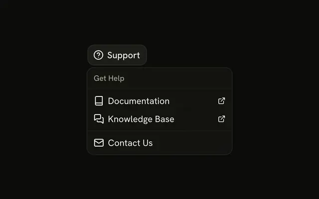
A question mark button opens Documentation, Video Tutorials, and FAQs, then Keyboard Shortcuts, then Chat with Support and Report a Bug. Documentation prints ⌘/ and Keyboard Shortcuts prints ⌘K.
Use it in a header when help should be one click away. Destinations that should stay visible belong in a Navigation Menu. In Svelte, Ark UI does not open the docs or bind the keys.
Installation
Anatomy
Usage
<DropdownMenu><DropdownMenuTrigger>{#snippet asChild(props)}<Button {...props({ "aria-label": "Help" })} size="icon-md" variant="ghost"><CircleHelpIcon aria-hidden="true" /></Button>{/snippet}</DropdownMenuTrigger><DropdownMenuContent class="w-56"><DropdownMenuItem value="documentation"><BookIcon aria-hidden="true" />Documentation<DropdownMenuShortcut>⌘/</DropdownMenuShortcut></DropdownMenuItem><DropdownMenuItem value="video-tutorials"><VideoIcon aria-hidden="true" />Video Tutorials</DropdownMenuItem><DropdownMenuItem value="faqs"><FileQuestionIcon aria-hidden="true" />FAQs</DropdownMenuItem><DropdownMenuSeparator /><DropdownMenuItem value="keyboard-shortcuts"><KeyboardIcon aria-hidden="true" />Keyboard Shortcuts<DropdownMenuShortcut>⌘K</DropdownMenuShortcut></DropdownMenuItem><DropdownMenuSeparator /><DropdownMenuItem value="chat-with-support"><MessageCircleIcon aria-hidden="true" />Chat with Support</DropdownMenuItem><DropdownMenuItem value="report-a-bug"><BugIcon aria-hidden="true" />Report a Bug</DropdownMenuItem></DropdownMenuContent></DropdownMenu>FAQ
What is in the help menu?
Three sections split by separators: Documentation, Video Tutorials and FAQs; Keyboard Shortcuts; Chat with Support and Report a Bug. The menu is w-56.
Which rows show a shortcut?
Documentation shows ⌘/ and Keyboard Shortcuts shows ⌘K, each in a DropdownMenuShortcut. They're hints; bind the keys on the page yourself.
Which icon leads each row?
A book, a video, a file with a question mark, a keyboard, a chat bubble and a bug, each aria-hidden before the label.
What does the trigger look like?
A ghost Button with size="icon-md", a question mark icon and aria-label set to Help.
API Reference
Dropdown Menu
Sets value="documentation", value="video-tutorials", value="faqs", value="keyboard-shortcuts", value="chat-with-support" and value="report-a-bug". The rest is on the Dropdown Menu page.
Button
Sets props, aria-label, Help, size="icon-md" and variant="ghost". The rest is on the Button page.