shadcn.io is an independent project built on shadcn/ui
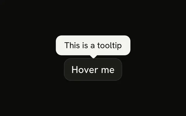
Two masked password fields. Each has an info button. The first tooltip says the password must be at least 8 characters. The second says to enter the same password as above. Nothing checks either rule.
Keep a short rule next to the field it covers. A hover note that does not need a portal is a Hint. In Svelte, Ark UI does not check the password against the tooltip.
Installation
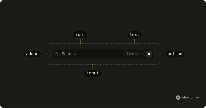
Anatomy
Usage
<div class="flex w-full max-w-sm flex-col gap-4"><InputGroup class="bg-background"><InputGroupInput aria-label="Password" placeholder="Enter password" type="password" /><InputGroupAddon align="inline-end"><Tooltip><TooltipTrigger>{#snippet asChild(props)}<InputGroupButton {...props({ "aria-label": "Password requirements" })} size="icon-xs" variant="ghost"><InfoIcon aria-hidden="true" /></InputGroupButton>{/snippet}</TooltipTrigger><TooltipContent><p>Password must be at least 8 characters</p></TooltipContent></Tooltip></InputGroupAddon></InputGroup><InputGroup class="bg-background"><InputGroupInput aria-label="Confirm password" placeholder="Confirm password" type="password" /><InputGroupAddon align="inline-end"><Tooltip><TooltipTrigger>{#snippet asChild(props)}<InputGroupButton {...props({ "aria-label": "Confirm password requirements" })} size="icon-xs" variant="ghost"><InfoIcon aria-hidden="true" /></InputGroupButton>{/snippet}</TooltipTrigger><TooltipContent><p>Enter the same password as above</p></TooltipContent></Tooltip></InputGroupAddon></InputGroup></div>FAQ
How is each info button tied to its tooltip?
TooltipTrigger takes an asChild snippet that renders the InputGroupButton.How are the two buttons told apart?
Their aria-labels, Password requirements and Confirm password requirements.
Should the rules be in a tooltip?
Only as a hint. Rules people must meet are better shown under the field, where touch users and screen readers find them without hovering.
Does the form check the rules?
No. Validate the length and that both fields match, and show an error under the field that fails.
API Reference
Input Group
Sets aria-label="Password", placeholder="Enter password", type="password", align="inline-end", props and aria-label. The rest is on the Input Group page.
Tooltip
No extra props in this demo. The rest is on the Tooltip page.