shadcn.io is an independent project built on shadcn/ui
The label reads Middle Name, with (optional) beside it in quieter text. The placeholder is Enter your middle name. Nothing marks the field as required.
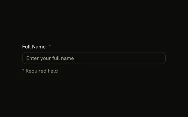
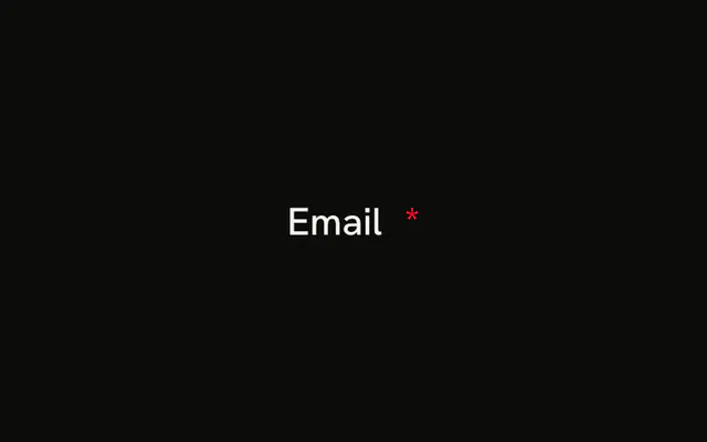
Use it for a value people may skip, and say so in the label. A field they must fill should say so too. A destructive asterisk on a Field marks those. In Svelte, Ark UI does not treat a blank optional value as an error.
Installation
Anatomy
Usage
<Field class="w-full max-w-sm"><FieldLabel>Middle Name<span class="font-normal text-muted-foreground text-xs">(optional)</span></FieldLabel><Input class="bg-background" placeholder="Enter your middle name" type="text" /></Field>FAQ
How is the optional note styled?
It's a span inside FieldLabel with text-xs, font-normal and text-muted-foreground, so it reads as secondary to the label. The label's own gap spaces it from Middle Name.
Do screen readers hear (optional)?
Yes. The note is part of the label's text, so the field is announced as Middle Name (optional).
Is the input itself marked optional?
No attribute is needed: a field without required is optional. The note only tells people so.
Should I mark optional or required fields?
Mark whichever is rarer. When most fields are required, label the optional ones, as here; when most are optional, mark the required ones with an asterisk, as in the Required Field example.
API Reference
Field
No extra props in this demo. The rest is on the Field page.
Input
Sets placeholder="Enter your middle name" and type="text". The rest is on the Input page.