shadcn.io is an independent project built on shadcn/ui
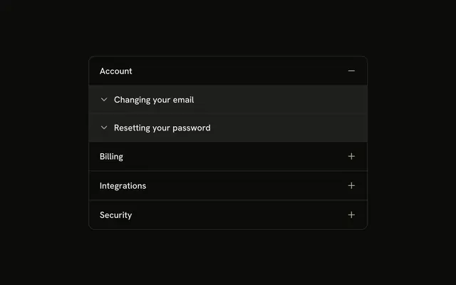
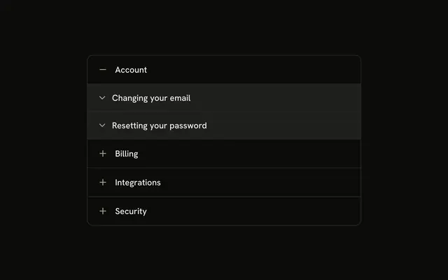
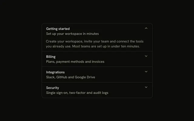
Documents, Projects, Workspace settings, and Team members, each led by an icon. Documents starts open and lists guides such as Uploading files. Each guide opens on its own.
Use it for docs grouped by category. If every guide should be one click apart, use Tabs. In Svelte, Ark UI does not open a guide when its section opens.
Installation
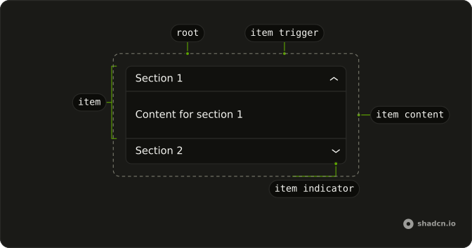
Anatomy
Usage
<Accordion class="w-full max-w-md -space-y-px" defaultValue={["documents"]}>{#each sections as section (section.value)}<AccordionItem class="overflow-hidden border bg-background first:rounded-t-lg last:rounded-b-lg" value={section.value}><AccordionTrigger class="px-4 py-3 hover:no-underline"><span class="flex items-center gap-2"><section.icon aria-hidden="true" class="size-4 shrink-0 text-muted-foreground" />{section.title}</span></AccordionTrigger><AccordionContent class="p-0">{#each section.guides as guide (guide.title)}<Collapsible class="border-t bg-accent px-4 py-3"><CollapsibleTrigger class="group flex gap-2 text-start font-medium"><ChevronDownIcon aria-hidden="true" class="mt-0.5 size-4 shrink-0 opacity-60 transition-transform duration-200 group-aria-expanded:rotate-180" />{guide.title}</CollapsibleTrigger><CollapsibleContent class="ps-6 pt-1 text-muted-foreground text-sm">{guide.content}</CollapsibleContent></Collapsible>{/each}</AccordionContent></AccordionItem>{/each}</Accordion>FAQ
Which icons are on the parent rows?
Documents uses FileTextIcon, Projects uses FolderIcon, Workspace settings uses SettingsIcon, and Team members uses UsersIcon. Each is size-4, text-muted-foreground and aria-hidden, in a gap-2 row on AccordionTrigger.
Do the nested guides get those icons too?
No. Each guide is a Collapsible with a ChevronDownIcon on CollapsibleTrigger. The icon uses group-aria-expanded:rotate-180 and duration-200.
How are the guide rows styled?
AccordionContent is p-0. Each Collapsible has border-t and bg-accent, and CollapsibleContent uses ps-6 with text-sm text-muted-foreground.
Why does Documents start open?
defaultValue={["documents"]} opens Documents on first render. The string matches that item's value.
API Reference
Accordion
Sets defaultValue={["documents"]} and value={section.value}. The rest is on the Accordion page.
Collapsible
No extra props in this demo. The rest is on the Collapsible page.