shadcn.io is an independent project built on shadcn/ui
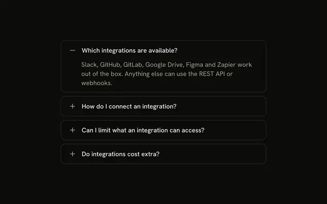
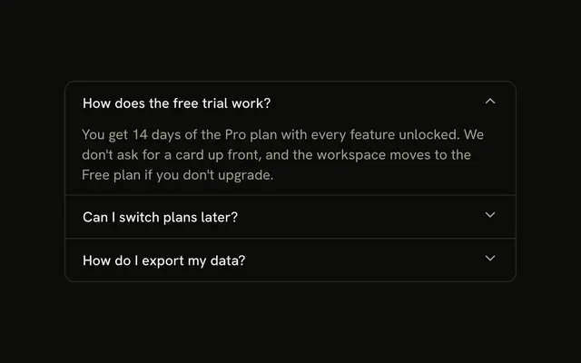
Four team questions, each a rounded card with a gap. A plus on the right turns into a minus, and How do I invite teammates? starts open.
Use it when each answer should stand alone. If inviting is the task, put it on a Button instead of inside an answer. In Svelte, Ark UI does not send the invite.
Installation
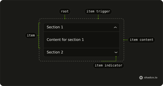
Anatomy
Usage
<Accordion class="flex w-full max-w-md flex-col gap-2" defaultValue={["invite"]}>{#each items as item (item.value)}<AccordionItem class="overflow-hidden rounded-lg border bg-background px-4" value={item.value}><AccordionTrigger class="hover:no-underline **:data-[slot=accordion-trigger-icon]:hidden"><span class="flex w-full items-center justify-between gap-3"><span class="text-start">{item.title}</span><span class="relative size-4 shrink-0"><PlusIcon aria-hidden="true" class="absolute inset-0 size-4 text-muted-foreground transition-opacity duration-200 group-aria-expanded/accordion-trigger:opacity-0" /><MinusIcon aria-hidden="true" class="absolute inset-0 size-4 text-muted-foreground opacity-0 transition-opacity duration-200 group-aria-expanded/accordion-trigger:opacity-100" /></span></span></AccordionTrigger><AccordionContent><p class="text-muted-foreground">{item.content}</p></AccordionContent></AccordionItem>{/each}</Accordion>FAQ
How are the sections separated?
Accordion is flex flex-col gap-2. Each AccordionItem has its own rounded-lg border and px-4.
How does the plus turn into a minus?
**:data-[slot=accordion-trigger-icon]:hidden on AccordionTrigger hides the built-in chevron. PlusIcon and MinusIcon share one relative size-4 box, and group-aria-expanded/accordion-trigger fades the plus out and the minus in over duration-200. Both icons are aria-hidden and text-muted-foreground.
Where does the answer sit?
AccordionContent adds no padding class of its own. The item px-4 insets the paragraph with the title, and justify-between keeps the plus and minus at the end of the trigger.
Why does the invite question start open?
defaultValue={["invite"]} opens the invite question on first render. The string matches that item's value.
API Reference
Accordion
Sets defaultValue={["invite"]} and value={item.value}. The rest is on the Accordion page.