shadcn.io is an independent project built on shadcn/ui
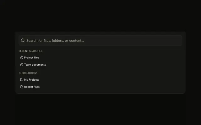
Command Bar drops from the top with a search field. Create new project, Open file, Search everywhere, and Settings each show a shortcut.
Use it for a few commands at the top of a phone layout. A full command menu belongs in Command. In React, Base UI does not run the command.
Installation
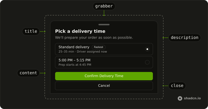
Anatomy
Usage
<Drawer swipeDirection="up">
  <DrawerTrigger render={<Button variant="outline" />}>
    <CommandIcon aria-hidden="true" data-icon="inline-start" />
    Command Bar
  </DrawerTrigger>
  <DrawerContent>
    <DrawerTitle className="sr-only">Command Bar</DrawerTitle>
    <div className="flex flex-col gap-4 p-4">
      <InputGroup className="h-12">
        <InputGroupInput
          aria-label="Command"
          className="text-base"
          placeholder="Type a command or search..."
          type="search"
        />
        <InputGroupAddon>
          <CommandIcon aria-hidden="true" className="size-5" />
        </InputGroupAddon>
      </InputGroup>
      <div className="flex flex-col gap-1">
        {COMMANDS.map((command) => (
          <Button
            className="justify-between"
            key={command.label}
            size="sm"
            variant="ghost"
          >
            {command.label}
            <Kbd>{command.shortcut}</Kbd>
          </Button>
        ))}
{/* The rest of the file is under Installation. */}
FAQ
How is the command field built?
An Input Group, h-12, with an InputGroupInput of type="search" and aria-label="Command", and an InputGroupAddon holding the command icon after the input in the markup.
How are the commands listed?
From a static array of four: Create new project, Open file, Search everywhere and Settings. Each is a ghost Button with its label at the start and its shortcut in a Kbd at the end.
Does typing filter the commands?
Not in this demo: the field is uncontrolled. For a filterable list with arrow-key navigation, use a Command menu inside the drawer.
Do the shortcuts work?
No, the Kbds only show them. Register the key handlers yourself, and open the drawer from ⌘K if that's the shortcut you show.
API Reference
Drawer
Sets swipeDirection="up". The rest is on the Drawer page.
Button
Sets variant="outline", size="sm" and variant="ghost". The rest is on the Button page.
Input Group
Sets aria-label="Command", placeholder="Type a command or search..." and type="search". The rest is on the Input Group page.
Kbd
No extra props in this demo. The rest is on the Kbd page.