shadcn.io is an independent project built on shadcn/ui
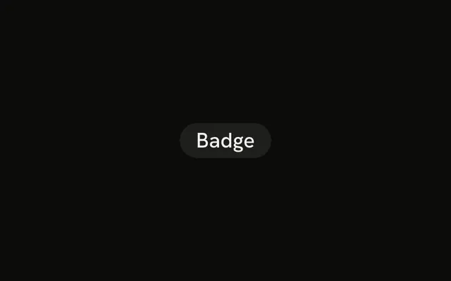
The word Badge comes first, then a star, on a muted fill. The star is decorative and does not compete with the label.
Save it for footnotes such as Reviewed, where the icon finishes the word. A full warning belongs in an Alert. In Vue, Ark UI reads the label with the surrounding text.
Installation
Anatomy
Usage
<Badge variant="secondary">
  Badge<StarIcon aria-hidden="true" data-icon="inline-end" />
</Badge>
FAQ
How does the star sit after the label in Vue?
The icon comes after the word, with data-icon="inline-end" and aria-hidden="true". The badge styles use that attribute to tighten the padding on the icon's side.
Does the star need its own color?
No. Lucide icons paint with currentColor, so the star uses the badge's text color and follows the variant, including in dark mode.
What does variant secondary change?
variant="secondary" uses the secondary background and secondary-foreground text. The star stays after the word, with the same icon attributes as in this file.
API Reference
Badge
Sets variant="secondary". The rest is on the Badge page.