shadcn.io is an independent project built on shadcn/ui
An icon tile with a plus, the title Additional Information, and a muted Click to expand line. The plus turns into a cross as the card opens onto one short paragraph.
Use it for optional help under a title. If the details should always show, use a Card and leave it open. In Vue, Ark UI only toggles this one region.
Installation
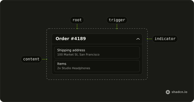
Anatomy
Usage
<Collapsible class="w-full max-w-lg rounded-lg border bg-card text-card-foreground shadow-sm">
  <CollapsibleTrigger class="group flex w-full items-center gap-3 p-4">
    <span class="flex size-8 shrink-0 items-center justify-center rounded-md bg-primary/10">
      <PlusIcon
        aria-hidden="true"
        class="size-4 text-primary transition-transform duration-200 group-aria-expanded:rotate-45"
      />
    </span>
    <span class="flex flex-1 flex-col text-start">
      <span class="font-medium">Additional Information</span>
      <span class="text-muted-foreground text-sm">Click to expand</span>
    </span>
  </CollapsibleTrigger>
  <CollapsibleContent class="border-t px-4 py-3 text-muted-foreground text-sm">
    Here you can find additional details and information about this section.
  </CollapsibleContent>
</Collapsible>
FAQ
How is the header laid out?
The trigger is flex items-center gap-3 p-4. First comes a size-8 tile with rounded-md bg-primary/10 holding the plus, then a flex-1 column with the title and the hint line.
What does the trigger announce?
Its text: Additional Information Click to expand. The plus is aria-hidden, so it adds nothing.
Why does the icon box sit in the middle of the two lines?
items-center on the trigger centers the tile against the two-line text block. Use items-start to line it up with the title instead.
How do I swap the plus icon?
Replace PlusIcon with another Lucide icon and keep size-4 text-primary. Drop group-aria-expanded:rotate-45 if the new icon shouldn't turn when the card opens.
API Reference
Collapsible
No extra props in this demo. The rest is on the Collapsible page.