shadcn.io is an independent project built on shadcn/ui
An Email label, the placeholder you@example.com, and a line under the field: We'll never share your email with anyone else. The note stays while someone types.
Use it for a privacy note or a format hint that should remain visible. Put a rule they must read first above the field. Errors replace this line via Field. In Vue, Ark UI does not write the helper text.
Installation
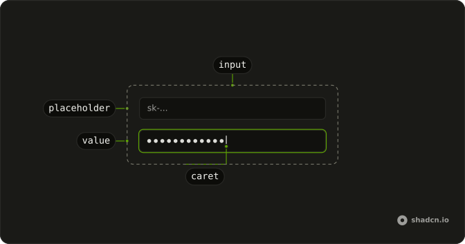
Anatomy
Usage
<Field class="w-full max-w-sm">
  <FieldLabel>Email</FieldLabel>
  <Input class="bg-background" placeholder="you@example.com" type="email" />
  <FieldDescription>We’ll never share your email with anyone else.</FieldDescription>
</Field>
FAQ
What is the line under the field?
A FieldDescription after the input, in smaller, muted text. Placed after the input, it reads as a note on what was typed rather than an instruction.
Why type email?
The browser checks the address format when the form is submitted, and mobile keyboards show the @ key. The placeholder you@example.com shows the expected shape.
When should the text go above the field instead?
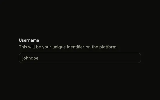
When it changes what people will enter, such as what a username is for. The Description example puts it between the label and the input.
What about errors?
Keep the helper text for guidance and show problems in FieldError when the field is invalid, as the Error State example does.
API Reference
Field
No extra props in this demo. The rest is on the Field page.
Input
Sets placeholder="you@example.com" and type="email". The rest is on the Input page.