Skip to content

shadcn.io is an independent project built on shadcn/ui

Free

Primary Color Spinner for Vue

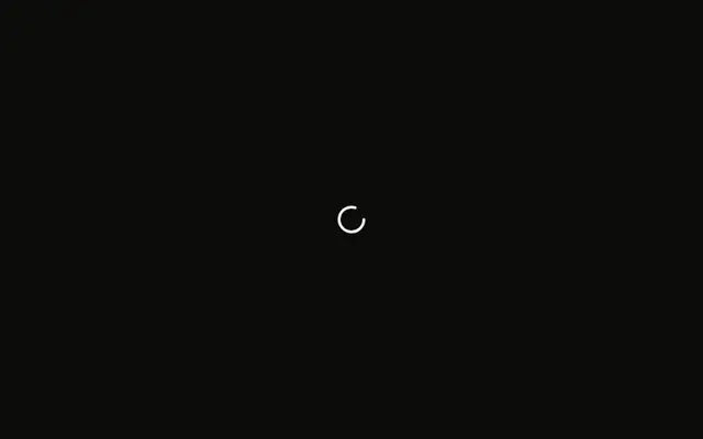
A 16px spinner in the primary color, named Loading, which follows the theme. No request is running.

UI library: Ark UI

One spinner is on screen at 16px, in the primary color. It is not the default text color. The file does not start a request.

Use the primary color when the wait is the main thing on screen and should carry the brand. Quiet background work should stay muted. A measured wait fits Progress. In Vue, Ark UI names it Loading.

Preview

Preview width

Installation

MCP · Pro
Make your AI a shadcn expert
Your agent installs components, builds pages and restyles your app from one prompt, in Claude Code, Cursor or VS Code.
Part of Pro

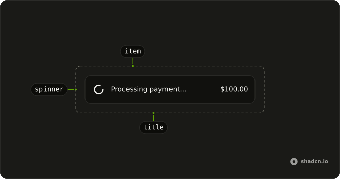
Anatomy

Spinner anatomy: item, spinner, title

Usage

<Spinner class="text-primary" />

FAQ

How does this spinner use the primary color?

Pass text-primary on Spinner. The icon draws with currentColor, so the text class paints the stroke. This file sets that class and nothing else.

Does text-primary follow the theme?

Yes. text-primary reads the same token as primary text elsewhere, including in light and dark mode. Change the token and this spinner follows.

What size is the primary spinner?

It stays at the default size-4 (16px). Add size-3, size-6, or size-8 on the same element to resize it. The color class stays put.

How do I use this color inside a button?

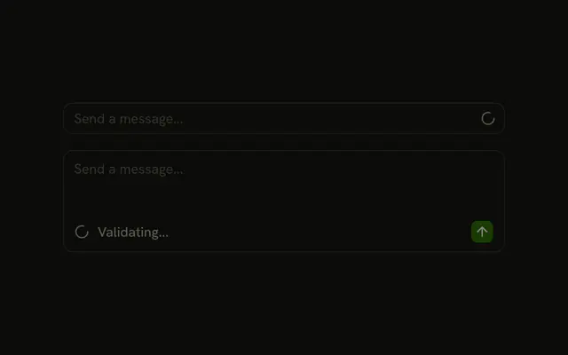
Put the Spinner in the Button with data-icon set to inline-start, and disable the button while the work runs. A filled button already sets its own text color, so the spinner picks that up through currentColor. Add text-primary when the spinner sits outside a button, as this file does.

Does the primary color change the announcement?

No. The spinner still has role="status" and an aria-label of Loading. Pass your own aria-label to name the work, and keep a visible label when the wheel is the only cue.

How do I stop the spin for reduced motion?

The spin is animate-spin. Add motion-reduce:animate-none beside text-primary and the icon stays still. The status role and the label stay.

API Reference

Spinner

No extra props in this demo. The rest is on the Spinner page.