shadcn.io is an independent project built on shadcn/ui
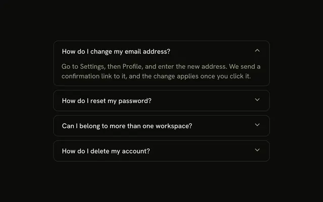
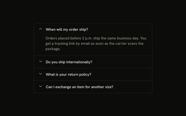
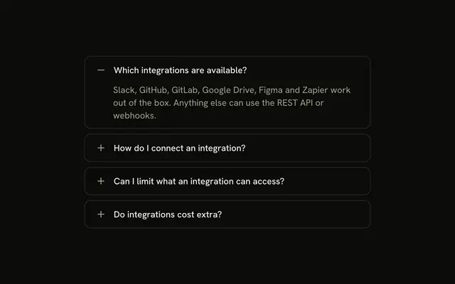
Four security questions, each a rounded card. The chevron sits before the title, and Do you support single sign-on? starts open.
Use it when the toggle should lead and each topic is its own card. A single security note can be an Alert. In Vue, Ark UI does not remember which card was open.
Installation
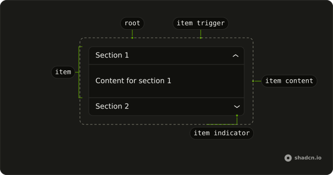
Anatomy
Usage
<Accordion class="flex w-full max-w-md flex-col gap-2" :defaultValue='["sso"]'>
  <AccordionItem
    v-for="item in items"
    class="overflow-hidden rounded-lg border bg-background"
    :key="item.value"
    :value="item.value"
  >
    <AccordionTrigger class="flex-row-reverse gap-3 px-4 py-3 hover:no-underline">
      <span class="flex-1 text-start">{{ item.title }}</span>
    </AccordionTrigger>
    <AccordionContent class="px-4 ps-11 pb-4">
      <p class="text-muted-foreground">{{ item.content }}</p>
    </AccordionContent>
  </AccordionItem>
</Accordion>
FAQ
How are the sections separated?
Accordion is flex flex-col gap-2. Each AccordionItem has its own rounded-lg border, with no horizontal padding on the item.
How does the chevron move to the start of the card?
flex-row-reverse on AccordionTrigger places the built-in chevron before the title, with gap-3 between them. The trigger sets px-4 py-3 and hover:no-underline, and the title is flex-1 text-start.
Why does the answer use ps-11?
ps-11 lines the answer up under the title: the trigger padding, the chevron, and gap-3. The content also sets px-4 and pb-4.
Why does the single sign-on question start open?
defaultValue={["sso"]} opens the single sign-on question on first render. The string matches that item's value.
API Reference
Accordion
Sets defaultValue="[sso]", v-for="item in items", key="item.value" and value="item.value". The rest is on the Accordion page.