shadcn.io is an independent project built on shadcn/ui
An interactive map you can pan, zoom and turn, with your own markers and popups on it and routes, shapes, arcs and clusters drawn in it.
Use it when where things are is the point: the stores near someone, a delivery on its way, where your customers are. The markers and popups are Svelte components that the map keeps on their places as it moves, and the controls are your own buttons, so all of them take your classes and your theme. Routes and data layers are drawn by MapLibre GL (opens in a new tab), and their colors can be theme variables too. The basemap is CARTO's Positron, or Dark Matter in dark mode, with no API key, drawn in your theme's own colors. For numbers that have no place in them, use a chart.
The parts follow mapcn (opens in a new tab) by Anmoldeep Singh (MIT), redesigned; the FAQ lists what changed.
Installation
Anatomy
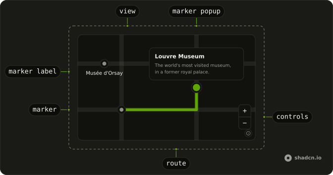
MapView
├── MapMarker
│   ├── MapMarkerContent
│   ├── MapMarkerTooltip
│   ├── MapMarkerLabel
│   └── MapMarkerPopup
├── MapPopup
├── MapControls
│   └── MapControlGroup
│       ├── MapZoomIn
│       ├── MapZoomOut
│       ├── MapCompass
│       ├── MapLocate
│       └── MapFullscreen
├── MapRoute
│   ├── MapRouteProgress
│   └── MapRouteMarker
│       └── MapMarkerContent
├── MapGeoJSON
├── MapArc
├── MapClusterLayer
├── MapHeatmap
└── MapCamera
Usage
<script lang="ts">
import {
  MapControls, MapMarker, MapMarkerContent, MapMarkerPopup,
  MapMarkerTooltip, MapView,
} from "@/components/ui/map";
</script>
Demos
Markers
MapMarkerContent shows whatever you put in it, or a dot in the primary color when it's empty, and the map keeps it on its coordinate as the camera moves. The two pins set anchor="bottom", so the pin's tip sits on the place instead of its middle, and offset moves a marker by a few pixels. The prices are text in a pill with a MapMarkerTooltip for the listing's name, the café and the market are icons in a circle, and the friends are avatars. MapMarkerLabel writes a name under a marker, or over it with position="top", haloed in the background color so it reads on any basemap. rotation turns a marker's content round its anchor, in degrees clockwise, for a heading or the way a vehicle faces; with rotationAlignment="map" it turns with the map as it rotates. A marker's label is its name for screen readers: give every marker one.
Popups
A MapMarkerPopup opens from its marker on a click, or on Enter or Space once the marker has focus, and focus moves into it. It closes on Escape, which hands focus back to the marker, on a click on the map, and on its close button (closeButton). It opens above the marker unless side says otherwise, flips to the side with room near an edge, and shifts to stay inside the map. One starts open (defaultOpen); open and onOpenChange on MapMarker control it. A popup is your own markup, Save button included. MapPopup is a popup on a coordinate of its own: a click on the map drops a pin and opens one there with the point's coordinates, through MapView's onMapClick, which hears a click on the map itself (not on a marker or a popup) with where it landed. The demo holds it open with open, and closeOnClick={false} lets the next click move it instead of closing it.
Controls
MapControls puts buttons in a corner: bottom-end unless position says top-end, top-start or bottom-start, at the end or the start of the line. Each MapControlGroup stacks its buttons as one, and an empty MapControls shows zoom in and out. MapZoomIn and MapZoomOut turn off at the map's zoom limits. MapCompass turns and tilts with the camera, and a click turns the map back to north and looks straight down; this map starts turned and tilted. MapLocate asks for the device's position, flies there and calls onLocate with it, which the demo uses to drop a marker; onLocateError hears a refusal, or no position within 10 seconds. MapFullscreen fills the screen with the map, markers and controls included, and isn't shown where the browser can't.
Draggable Marker
draggable lets a pointer drag the marker, and the arrow keys move it once it has focus: 10 pixels a press, 40 with Shift. onPositionChange reports each step of a drag and onPositionChangeEnd where it ends, and an arrow key reports both. The demo keeps the position in state and shows it in the card. The marker stays where it's dropped without the position passed back, and moves when latitude or longitude change, as the reset button does. While a pointer drags it, the marker has data-dragging, which lifts the pin.
Controlled Viewport
A viewport is a center ([longitude, latitude]), a zoom, a bearing and a pitch. defaultViewport only sets where the camera starts; pass viewport with onViewportChange to keep the camera in your state. The map reports every frame of a move, whether a hand or MapLibre's flyTo makes it, and jumps to viewport when you change it while the map is at rest. The city buttons fly the camera through useMap(), and the readout under the map follows along. onViewportChangeEnd reports where a move comes to rest.
Camera
MapCamera aims the camera from your state. bounds frames two corners, [[west, south], [east, north]], and center with zoom sets a point and how close; bearing and pitch turn and tilt it. It aims at once as it mounts and flies to each new aim after, over duration milliseconds (1200 unless you say), at once where reduced motion is set. Between aims, the visitor's own pans and zooms stay. padding keeps room round what it frames, one number or one per side: the list here covers the bottom of the map, above its credits, so bottom: 136 frames the viewpoints above it, and a single viewpoint lands in the middle of the room that's left. maxZoom caps how close bounds come, which also matters when they hold a single point. A map laid out after it's made, in a tab or a dialog, gets its aim once it has a size. The rows and the markers pick a viewpoint, and All viewpoints frames them all again.
Route
MapRoute draws a line through coordinates, [longitude, latitude] pairs from any routing service. progress, from 0 to 1, says how much of it is done: MapRouteProgress draws that part over the route, here in the primary color over a dotted line (dashArray), and a MapRouteMarker at="progress" rides at its tip. Other route markers sit at="start", at="end" or at a fraction of the way along; each one is a MapMarker, with its own content, label and tooltip. The demo moves progress on every frame, and holds it still when reduced motion is set.
Alternative Routes
Three ways across Berlin, one of them active: it's drawn with activeColor, activeWidth and activeOpacity (and activeDashArray, when you give one) in place of its own, and raised above the others. interactive gives a route a pointer cursor, onRouteClick and onHoverChange, so a click on a route makes it the active one. A route on the map answers only the pointer, so the rows in the card do the same from the keyboard.
GeoJSON
MapGeoJSON draws any GeoJSON: polygons filled and outlined, lines, and points as dots. data is the GeoJSON itself or a URL to fetch it from, here Natural Earth's countries. The map is blank: no tiles, only the countries on the box's own background. fillPaint takes MapLibre's paint, expressions included, merged over a light tint of the primary color, and any color in it can be a theme variable: a step expression shades each country by GDP per person, from var(--chart-1) to var(--chart-5). fillHoverPaint paints the country under the pointer, which needs every feature to have an id: promoteId names the property that holds it. onFeatureHover reports the feature under the pointer, or null once it leaves them all, and the readout follows it.
Arcs
MapArc draws curved lines between pairs of points, here flights out of Dubai. Each arc in data has a unique id, a from and a to, and can carry fields of its own for paint expressions to read. curvature sets how far the arcs bow, 0.2 by default: 0 draws them straight, and a negative value, as here, bows them the other way. An arc crosses the 180th meridian the short way. hoverPaint paints the arc under the pointer, found on a wider line than the one drawn so a thin arc is easy to point at, and onArcHover reports it, or null when the pointer leaves; the card and the markers follow it.
Clusters
MapClusterLayer groups points into circles with a count on them, which split as you zoom in: here a month of earthquakes, which MapLibre fetches from the file's URL. A click on a cluster zooms into it, unless you pass onClusterClick. clusterThresholds sets the counts where a cluster turns medium and large, 50 and 300 here, and clusterColors the three colors, mixes of the primary color made with color-mix(). onPointClick gets a single earthquake's feature and coordinates, and the demo opens a MapPopup there, which its close button or a click on the map closes.
Heatmap
MapHeatmap draws many points as heat that grows hotter where they crowd. data is a FeatureCollection of points or the URL of one: here about 500 bike-share stations round Barcelona, made by a seeded generator. weightProperty names the property each point is weighed by, from 0 up to weightMax, here each station's rides, up to 500, so a busy station counts for more; without it, as Stations shows, every point counts the same. radius is each point's reach in pixels at zoom 10, intensity how hot the heat runs and opacity how much of the map shows through. Its colors are the theme's chart colors, --chart-1 to --chart-5, the end nearest the background where points are fewest, so the hottest part stands out in light and dark alike; colors takes your own, from fewest to most. Past maxZoom the heat fades and each point shows as a dot.
Globe
projection="globe" draws the world as a sphere, which flattens into the usual map as you zoom in close. Markers on the far side are hidden, and come back as the globe turns them into view. The demo turns the globe with MapLibre's map from onReady until someone grabs, scrolls or touches it, and leaves it still when reduced motion is set.
Themed Basemap
The basemap is drawn in your theme's colors (basemap="theme", the default). The land takes --background and --muted, the labels --muted-foreground and --foreground, and roads, water, buildings and borders fall between them, each as light or as dark against the land as the basemap drew it, so the map reads as it did, in your theme's tint. Water keeps a trace of its blue so it doesn't read as buildings. The colors are read on the map's box and again when the theme or the preset changes, in place, with no tiles loaded again; a switch between light and dark loads the other basemap, as it does without basemap. It repaints a styles basemap of your own the same way. basemap="original" keeps CARTO's own colors: switch between the two here, then change your theme.
Custom Layer
For what the parts don't cover, useMap() gives MapLibre's map to any component inside MapView. This one raises the basemap's buildings into 3D: once ready is true, it adds a fill-extrusion layer that reads each building's height from CARTO's tiles, in the basemap's own building color and under its labels. Switching the theme loads the other basemap, which drops the layer, and turns ready false and then true again, so the same effect adds it back. Its button is a control of your own: any Button in a MapControlGroup sits with the others.
FAQ
Which basemap does the Map use, and how do I change it?
CARTO's Positron in light mode and Dark Matter in dark: vector tiles built on OpenStreetMap data, with no API key. They're free under CARTO's basemap terms, which set usage limits and ask for the credit the map shows in its bottom corner (it folds into an ⓘ button once the map is dragged). Keep that credit, or give it elsewhere before you turn it off with options={{ attributionControl: false }}. To lift it over a panel or a sheet of your own, set --map-credits-bottom (or --map-credits-top) on the map, as className="[--map-credits-bottom:5rem]". For a busy app in production, or another look, pass styles a MapLibre style URL or style object for each theme, from OpenFreeMap, MapTiler, Stadia Maps, Protomaps or your own server: styles={{ dark: "…", light: "…" }}. A theme you leave out stays on CARTO's. Whichever basemap you use is drawn in your theme's colors, unless you set basemap="original". blank draws no tiles at all, for a map of only your own layers, and styles wins over it.
How tall is the Map, and does it render on the server in Svelte?
MapView is h-96 and as wide as its container until you size it: pass a className such as h-[480px], or h-full inside a parent with a height. On the server, and until the map has first drawn, it renders that box with a spinner, so the page doesn't move when the map arrives. MapLibre is loaded with the first map on the page, and the markers, popups, controls and layers render once the map exists. It needs WebGL2: where MapLibre can't start, the box says so instead of staying blank.
How does the Map follow dark mode and my theme's colors?
The basemap follows the map's own box: it reads the box's --background and draws Dark Matter when that color is dark, Positron when it's light. So a .dark class or data-theme anywhere above the map works, and so does the system setting. It checks again when a class, data-theme or data-mode changes on the map's box or any element around it, and when the system's color scheme does; theme="light" or theme="dark" sets it yourself. Every color the parts take can be any CSS color, theme variables included: color="var(--chart-2)" on a route, "var(--primary)" inside a paint expression on MapGeoJSON. They're read on the map's box and read again when the theme changes, and your routes and layers stay through the basemap swap. The basemap is drawn in your background, muted and foreground colors and follows a preset's tint too; basemap="original" keeps CARTO's own grays.
How many markers can a Map show?
Each MapMarker is an element the map moves on every frame of the camera, which suits the tens of places a person picks between: stores, stops, friends. For hundreds or thousands of points, draw them in the map instead: MapClusterLayer groups them into counted circles that split as you zoom in, and MapGeoJSON draws points as dots, sized and colored by circlePaint. Both take the URL of a file, so MapLibre fetches a large one instead of your state holding it, and so does MapHeatmap, which shows where thousands of points crowd as heat. To show a point's details, open a MapPopup at its coordinates on click, as the Clusters demo does.
Can people use the Map with a keyboard and a screen reader?
Yes. The map is a focusable region named "Map", which options={{ locale: { "Map.Title": "Store map" } }} renames: the arrow keys pan it, + and − zoom, and Shift with an arrow turns or tilts it. A marker with a popup is a button: Tab reaches it, Enter or Space opens the popup and moves focus into it, and Escape closes it and returns focus to the marker. A draggable marker moves with the arrow keys. Give each marker a label: it names the button, or the marker as an image when it neither opens nor moves. A tooltip shows while its marker is hovered or has keyboard focus, but MapMarkerContent only takes focus when the marker has a popup or is draggable, so say what the tooltip says in label too. The controls are labeled buttons. Routes, shapes, arcs and clusters are drawn in the canvas and aren't read out: list what they show beside the map.
I used mapcn. What changed?
The root is MapView, since Map would hide JavaScript's own Map. Its camera starts from defaultViewport={{ center, zoom }}, or follows viewport with onViewportChange; MapLibre's other options go in options, and onReady or useMap() gives you MapLibre's map in place of a ref. Every part's name starts with Map: MapMarkerContent, MapMarkerPopup, MapMarkerTooltip, MapMarkerLabel, MapRouteProgress and MapRouteMarker. MapControls takes its buttons as children, in MapControlGroups, instead of show… props: MapZoomIn, MapZoomOut, MapCompass, MapLocate and MapFullscreen. Its position follows the line, bottom-end where mapcn says bottom-right. Popups open and close with open, defaultOpen and onOpenChange on MapMarker and MapPopup. A drag reports { latitude, longitude } to onPositionChange and onPositionChangeEnd. projection="globe" is enough for a globe, and useMap() returns map, ready, theme and controller. MapMarker's rotation and rotationAlignment work as MapLibre's do. MapCamera, MapHeatmap, onMapClick and basemap="theme" are new.
How do I use MapLibre directly inside the Map?
Call useMap() in a component inside MapView. It returns map, MapLibre's own map once it exists (null before), ready, true once the basemap has drawn, theme, and controller, the engine the parts are drawn with, whose resolveColor("var(--primary)") gives a theme color MapLibre can paint. With map you can do anything MapLibre does: flyTo, fitBounds, map.on for its events. Add your own sources and layers in an effect that runs when ready turns true. A theme change loads the other basemap, which drops the sources and layers you added and turns ready false until it has drawn, so the same effect puts yours back; the Map's own routes and layers come back by themselves. onReady on MapView also hands you the map, once it has first drawn.
How do I install the Map in Svelte?
Run the command in the Installation section above. It adds the Map's parts to your ui folder and its engine, map-runtime.ts, to your lib folder, with maplibre-gl and the Button, Button Group and Spinner that its controls and loading state use. You don't need MapLibre's stylesheet: the map adds the few rules it uses, in your theme's colors. MapLibre parses tiles in a worker it loads from unpkg at your installed version; to serve it yourself, call MapLibre's setWorkerUrl before the first map.
The command uses the shadcn-svelte CLI.
API Reference
MapView
viewport?Partial<MapViewport>
The camera, held where you say (with onViewportChange).
- Type
Partial<MapViewport>
defaultViewport?Partial<MapViewport>
Where the camera starts, when viewport isn't given.
- Type
Partial<MapViewport>
onViewportChange?(viewport: MapViewport) → void
Called on every frame the camera moves.
- Parameters
viewport– MapViewport- Returns
void
basemap?MapBasemap
theme draws the basemap in your theme's colors (land, water, roads and labels from its background, muted and foreground tokens), through dark mode and preset changes; original keeps the style's own colors. @default "theme".
- Default
"theme"
blank?boolean
A clear basemap with no tiles, for your own layers on the page's ground. @default false.
- Default
false
loading?boolean
Shows the loading indicator over the map, as while it first draws. @default false.
- Default
false
onMapClick?(position: MapLngLat) → void
Called on a click on the map itself (not on a marker or a popup), with where.
- Parameters
position– MapLngLat- Returns
void
onReady?(map: MapInstance) → void
Called once the map has drawn, with MapLibre's map.
- Parameters
map– MapInstance- Returns
void
onViewportChangeEnd?(viewport: MapViewport) → void
Called when the camera comes to rest.
- Parameters
viewport– MapViewport- Returns
void
options?MapEngineOptions
MapLibre's own options, such as minZoom, maxBounds or cooperativeGestures.
projection?MapProjection
mercator (flat) or globe. @default "mercator".
styles?MapStyles
The basemap for each theme, a style URL or object. CARTO Positron and Dark Matter by default.
theme?MapTheme
The basemap's theme; followed from the page when not given.
class?string
Merged with the part's classes.
MapMarker
open?boolean
Whether its popup is open.
defaultOpen?boolean
Whether its popup starts open. @default false.
- Default
false
onOpenChange?(open: boolean) → void
Called when its popup opens or closes.
- Parameters
open– boolean- Returns
void
latitudenumber
Where it stands: degrees north (negative for south).
longitudenumber
Where it stands: degrees east (negative for west).
anchor?MapAnchor
Which point of the marker sits on its coordinate. @default "center".
- Default
"center"
draggable?boolean
Drag it with a pointer, or move it with the arrow keys once focused. @default false.
- Default
false
label?string
Its name for assistive tech, such as the place it marks.
offset?[number, number]
Pixels from the anchor, [x, y].
onPositionChange?(position: MapLngLat) → void
Called as a drag moves it.
- Parameters
position– MapLngLat- Returns
void
onPositionChangeEnd?(position: MapLngLat) → void
Called where a drag (or an arrow key) leaves it.
- Parameters
position– MapLngLat- Returns
void
rotation?number
Turns its content, in degrees clockwise, round its anchor: a heading, the way a vehicle faces.
rotationAlignment?"map" | "viewport"
map turns it with the map, as a heading on the ground does; viewport keeps it as it is on the screen. @default "viewport".
- Type
"map" | "viewport"- Default
"viewport"
class?string
Merged with the part's classes.
MapMarkerContent
<div> data-slot="map-marker-content"
class?string
Merged with the part's classes.
--map-marker-originstring--map-marker-rotationstring--map-offsetstringMapMarkerTooltip
<div> data-slot="map-marker-tooltip"
side?MapSide
The side of the marker it shows on. @default "top".
- Default
"top"
sideOffset?number
Pixels between the marker and the tooltip. @default 8.
- Default
8
class?string
Merged with the part's classes.
data-side?string
Mirrors side.
MapMarkerLabel
<div> data-slot="map-marker-label"
position?"bottom" | "top"
Under the marker or over it. @default "bottom".
- Type
"bottom" | "top"- Default
"bottom"
class?string
Merged with the part's classes.
data-position?string
Mirrors position.
--backgroundstringMapMarkerPopup
<span> data-slot="map-marker"
closeButton?boolean
Shows a close button in the corner. @default false.
- Default
false
side?MapSide
The side it opens on when there's room; it flips when there isn't. @default "top".
- Default
"top"
sideOffset?number
Pixels between the marker and the popup. @default 12.
- Default
12
class?string
Merged with the part's classes.
data-open""
- Default
""
data-side?string
Mirrors side.
data-state"closed"
- Default
"closed"
MapPopup
<div> data-slot="map-popup-anchor"
open?boolean
Whether it's open.
defaultOpen?boolean
Whether it starts open. @default true.
- Default
true
onOpenChange?(open: boolean) → void
Called when it opens or closes.
- Parameters
open– boolean- Returns
void
latitudenumber
Where it points: degrees north (negative for south).
longitudenumber
Where it points: degrees east (negative for west).
closeButton?boolean
Shows a close button in the corner. @default false.
- Default
false
closeOnClick?boolean
Closes on a click on the map. @default true.
- Default
true
label?string
Its name for assistive tech.
side?MapSide
The side it opens on when there's room; it flips when there isn't. @default "top".
- Default
"top"
sideOffset?number
Pixels between the point and the popup. @default 8.
- Default
8
class?string
Merged with the part's classes.
data-open""
- Default
""
data-side?string
Mirrors side.
data-state"open"
- Default
"open"
MapControls
<div> data-slot="map-controls"
position?keyof typeof CONTROLS_POSITION
The corner, at the end of the line or its start. @default "bottom-end".
- Default
"bottom-end"
class?string
Merged with the part's classes.
data-position?string
Mirrors position.
MapControlGroup
data-slot="map-control-group"
orientation?"horizontal" | "vertical"
Lays the buttons out in a row (horizontal) or a column (vertical),
their touching corners squared and borders shared. Ark default: horizontal.
- Type
"horizontal" | "vertical"- Default
vertical
asChild?Snippet<[PropsFn]>
Render your own element: a snippet that gets the part's props to spread on it.
- Type
Snippet<[PropsFn]>
class?string
Merged with the part's classes.
MapZoomIn
clickEffect?boolean
Apply a click effect to the button.
- Default
true
isLoading?boolean
Show a loading indicator.
- Default
false
pill?boolean
Fully rounded corners.
- Default
false
size?"default" | "icon" | "icon-lg" | "icon-md" | "icon-sm" | "icon-xl" | "icon-xs" | "lg" | "md" | "sm" | "xl" | "xs"
The size.
- Type
"default" | "icon" | "icon-lg" | "icon-md" | "icon-sm" | "icon-xl" | "icon-xs" | "lg" | "md" | "sm" | "xl" | "xs"- Default
"md"
variant?"default" | "destructive" | "ghost" | "link" | "outline" | "secondary"
The visual style.
- Type
"default" | "destructive" | "ghost" | "link" | "outline" | "secondary"- Default
"default"
asChild?Snippet<[PropsFn]>
Render your own element: a snippet that gets the part's props to spread on it.
- Type
Snippet<[PropsFn]>
MapZoomOut
clickEffect?boolean
Apply a click effect to the button.
- Default
true
isLoading?boolean
Show a loading indicator.
- Default
false
pill?boolean
Fully rounded corners.
- Default
false
size?"default" | "icon" | "icon-lg" | "icon-md" | "icon-sm" | "icon-xl" | "icon-xs" | "lg" | "md" | "sm" | "xl" | "xs"
The size.
- Type
"default" | "icon" | "icon-lg" | "icon-md" | "icon-sm" | "icon-xl" | "icon-xs" | "lg" | "md" | "sm" | "xl" | "xs"- Default
"md"
variant?"default" | "destructive" | "ghost" | "link" | "outline" | "secondary"
The visual style.
- Type
"default" | "destructive" | "ghost" | "link" | "outline" | "secondary"- Default
"default"
asChild?Snippet<[PropsFn]>
Render your own element: a snippet that gets the part's props to spread on it.
- Type
Snippet<[PropsFn]>
MapCompass
data-slot="map-compass"
clickEffect?boolean
Apply a click effect to the button.
- Default
true
isLoading?boolean
Show a loading indicator.
- Default
false
pill?boolean
Fully rounded corners.
- Default
false
size?"default" | "icon" | "icon-lg" | "icon-md" | "icon-sm" | "icon-xl" | "icon-xs" | "lg" | "md" | "sm" | "xl" | "xs"
The size.
- Type
"default" | "icon" | "icon-lg" | "icon-md" | "icon-sm" | "icon-xl" | "icon-xs" | "lg" | "md" | "sm" | "xl" | "xs"- Default
"md"
variant?"default" | "destructive" | "ghost" | "link" | "outline" | "secondary"
The visual style.
- Type
"default" | "destructive" | "ghost" | "link" | "outline" | "secondary"- Default
"default"
asChild?Snippet<[PropsFn]>
Render your own element: a snippet that gets the part's props to spread on it.
- Type
Snippet<[PropsFn]>
class?string
Merged with the part's classes.
MapLocate
data-slot="map-locate"
clickEffect?boolean
Apply a click effect to the button.
- Default
true
isLoading?boolean
Show a loading indicator.
- Default
false
onLocate?(position: MapLngLat) → void
Called with the device's position once the map flies there.
- Parameters
position– MapLngLat- Returns
void
onLocateError?(error: unknown) → void
Called when there's no position: permission refused, or no fix in 10 seconds.
- Parameters
error– unknown- Returns
void
pill?boolean
Fully rounded corners.
- Default
false
size?"default" | "icon" | "icon-lg" | "icon-md" | "icon-sm" | "icon-xl" | "icon-xs" | "lg" | "md" | "sm" | "xl" | "xs"
Ark default: md.
- Type
"default" | "icon" | "icon-lg" | "icon-md" | "icon-sm" | "icon-xl" | "icon-xs" | "lg" | "md" | "sm" | "xl" | "xs"- Default
icon-md
variant?"default" | "destructive" | "ghost" | "link" | "outline" | "secondary"
Ark default: default.
- Type
"default" | "destructive" | "ghost" | "link" | "outline" | "secondary"- Default
outline
zoom?number
The zoom it flies to, unless the map is closer already. @default 14.
- Default
14
asChild?Snippet<[PropsFn]>
Render your own element: a snippet that gets the part's props to spread on it.
- Type
Snippet<[PropsFn]>
class?string
Merged with the part's classes.
MapFullscreen
data-slot="map-fullscreen"
clickEffect?boolean
Apply a click effect to the button.
- Default
true
isLoading?boolean
Show a loading indicator.
- Default
false
pill?boolean
Fully rounded corners.
- Default
false
size?"default" | "icon" | "icon-lg" | "icon-md" | "icon-sm" | "icon-xl" | "icon-xs" | "lg" | "md" | "sm" | "xl" | "xs"
The size.
- Type
"default" | "icon" | "icon-lg" | "icon-md" | "icon-sm" | "icon-xl" | "icon-xs" | "lg" | "md" | "sm" | "xl" | "xs"- Default
"md"
variant?"default" | "destructive" | "ghost" | "link" | "outline" | "secondary"
The visual style.
- Type
"default" | "destructive" | "ghost" | "link" | "outline" | "secondary"- Default
"default"
asChild?Snippet<[PropsFn]>
Render your own element: a snippet that gets the part's props to spread on it.
- Type
Snippet<[PropsFn]>
class?string
Merged with the part's classes.
MapRoute
coordinatesMapCoordinate[]
The route, as [longitude, latitude] pairs, from any routing service.
active?boolean
Raises the route over its siblings and draws it with the active* styles. @default false.
- Default
false
activeColor?string
The color while active; color when not given.
activeDashArray?[number, number]
The dashes while active; dashArray when not given.
activeOpacity?number
The opacity while active; opacity when not given.
activeWidth?number
The width while active, in pixels; width when not given.
beforeId?string
A MapLibre layer to draw under, such as the basemap's labels.
children?Snippet
Its progress line and markers.
color?string
Any CSS color, theme variables included. @default "var(--primary)".
- Default
"var(--primary)"
dashArray?[number, number]
[dash, gap], in line widths.
interactive?boolean
Answers the pointer: a pointer cursor, onRouteClick and onHoverChange. @default false.
- Default
false
onHoverChange?(hovered: boolean) → void
Called with true as the pointer comes onto the line, false as it leaves (with interactive).
- Parameters
hovered– boolean- Returns
void
onRouteClick?() → void
Called on a click on the line (with interactive).
- Returns
void
opacity?number
The line's opacity, from 0 to 1. @default 1.
- Default
1
progress?number
How much of the route is done, from 0 to 1: drives MapRouteProgress and the progress marker.
width?number
In pixels. @default 4.
- Default
4
--primarystringMapRouteProgress
<span> data-slot="map-route-progress"
color?string
The covered part's color, any CSS color. @default the route's color.
dashArray?[number, number]
[dash, gap] for the covered part, in line widths; solid when not given.
opacity?number
The covered part's opacity, from 0 to 1. @default the route's opacity.
width?number
The covered part's width, in pixels. @default the route's width.
MapRouteMarker
open?boolean
Whether its popup is open.
defaultOpen?boolean
Whether its popup starts open. @default false.
onOpenChange?(open: boolean) → void
Called when its popup opens or closes.
- Parameters
open– boolean- Returns
void
atMapRouteAnchor
Where on the route: start, end, progress, or a fraction from 0 to 1.
anchor?MapAnchor
Which point of the marker sits on its coordinate. @default "center".
draggable?boolean
Drag it with a pointer, or move it with the arrow keys once focused. @default false.
label?string
Its name for assistive tech, such as the place it marks.
offset?[number, number]
Pixels from the anchor, [x, y].
onPositionChange?(position: MapLngLat) → void
Called as a drag moves it.
- Parameters
position– MapLngLat- Returns
void
onPositionChangeEnd?(position: MapLngLat) → void
Called where a drag (or an arrow key) leaves it.
- Parameters
position– MapLngLat- Returns
void
rotation?number
Turns its content, in degrees clockwise, round its anchor: a heading, the way a vehicle faces.
rotationAlignment?"map" | "viewport"
map turns it with the map, as a heading on the ground does; viewport keeps it as it is on the screen. @default "viewport".
- Type
"map" | "viewport"
MapGeoJSON
<span> data-slot="map-geojson"
dataMapGeoJSONData
A FeatureCollection, a Feature, a Geometry, or a URL to fetch one from.
beforeId?string
A MapLibre layer to draw under.
circleHoverPaint?MapCirclePaint
Paint for the point under the pointer (needs feature ids).
circlePaint?MapCirclePaint | false
Points' paint, merged over a primary dot; false draws no points.
- Type
MapCirclePaint | false
fillHoverPaint?MapFillPaint
Paint for the polygon under the pointer (needs feature ids).
fillPaint?MapFillPaint | false
Polygons' paint, merged over a light primary tint; false draws no fill.
- Type
MapFillPaint | false
interactive?boolean
Answers the pointer. @default true with onFeatureClick or onFeatureHover.
lineHoverPaint?MapLinePaint
Paint for the line or the outline under the pointer (needs feature ids).
linePaint?MapLinePaint | false
Lines' and outlines' paint, merged over a primary hairline; false draws none.
- Type
MapLinePaint | false
onFeatureClick?(event: MapFeatureEvent) → void
Called with the feature clicked, and where.
- Parameters
event– MapFeatureEvent- Returns
void
onFeatureHover?(event: MapFeatureEvent | null) → void
Called as the feature under the pointer changes; null when it leaves them.
- Type
(event: MapFeatureEvent | null) → void- Parameters
event– MapFeatureEvent | null- Returns
void
promoteId?string
The property that is each feature's id, for hover and stable events.
MapArc
<span> data-slot="map-arc"
dataMapArcDatum[]
The arcs, each with a unique id, from and to.
beforeId?string
A MapLibre layer to draw under.
curvature?number
How far each arc bows: 0 is straight, negative bows the other way. @default 0.2.
- Default
0.2
hoverPaint?MapLinePaint
Paint for the arc under the pointer.
interactive?boolean
Answers the pointer: hover, clicks and a pointer cursor. @default true.
- Default
true
layout?MapLineLayout
MapLibre line layout, merged over round joins and caps.
onArcClick?(event: MapArcEvent) → void
Called with the arc clicked, and where.
- Parameters
event– MapArcEvent- Returns
void
onArcHover?(event: MapArcEvent | null) → void
Called as the arc under the pointer changes; null when it leaves them.
- Type
(event: MapArcEvent | null) → void- Parameters
event– MapArcEvent | null- Returns
void
paint?MapLinePaint
Paint merged over a primary line; expressions can read each arc's fields.
samples?number
Points along each curve. @default 64.
- Default
64
MapClusterLayer
<span> data-slot="map-cluster-layer"
dataMapGeoJSONFeatureCollection<MapGeoJSONPoint> | string
Points, as a FeatureCollection or a URL to fetch one from.
- Type
MapGeoJSONFeatureCollection<MapGeoJSONPoint> | string
clusterColors?[string, string, string]
Colors for small, medium and large clusters. @default the primary color for all three.
- Default
["var(--primary)"
clusterMaxZoom?number
The zoom past which points stop clustering. @default 14.
- Default
14
clusterRadius?number
How near points cluster, in pixels. @default 50.
- Default
50
clusterThresholds?[number, number]
Point counts where a cluster turns medium, then large. @default [100, 750].
- Default
[100
onClusterClick?( clusterId: number, coordinates: MapCoordinate, pointCount: number ) → void
Called on a cluster; without it, a click zooms into the cluster.
- Type
( clusterId: number, coordinates: MapCoordinate, pointCount: number ) → void- Parameters
clusterId– numbercoordinates– MapCoordinatepointCount– number- Returns
void
onPointClick?( feature: MapGeoJSONFeature<MapGeoJSONPoint>, coordinates: MapCoordinate ) → void
Called on a single point.
- Type
( feature: MapGeoJSONFeature<MapGeoJSONPoint>, coordinates: MapCoordinate ) → void- Parameters
feature– MapGeoJSONFeature<MapGeoJSONPoint>coordinates– MapCoordinate- Returns
void
pointColor?string
The color of a point on its own, out of every cluster. @default "var(--primary)".
- Default
"var(--primary)"
textColor?string
The counts' color. @default "var(--primary-foreground)".
- Default
"var(--primary-foreground)"
--primarystring--primary-foregroundstringMapHeatmap
<span> data-slot="map-heatmap"
dataMapGeoJSONFeatureCollection<MapGeoJSONPoint> | string
Points, as a FeatureCollection or a URL to fetch one from.
- Type
MapGeoJSONFeatureCollection<MapGeoJSONPoint> | string
beforeId?string
A MapLibre layer to draw under, such as the basemap's labels.
colors?string[]
From the least density to the most, any CSS colors. @default the theme's chart colors, hottest away from the background.
intensity?number
How hot the heat runs: 2 is twice as hot. @default 1.
- Default
1
maxZoom?number
Past this zoom the heat fades out and each point shows instead; heat at every zoom when not given.
opacity?number
The heat's opacity, from 0 to 1. @default 0.85.
- Default
0.85
radius?number
Each point's reach in pixels at zoom 10; half at zoom 5, twice at 15. @default 24.
- Default
24
weightMax?number
The highest weight: a point weighing this counts fully. @default 1.
- Default
1
weightProperty?string
The property each point is weighted by, from 0 to weightMax; every point counts the same when not given.
MapCamera
<span> data-slot="map-camera"
bearing?number
Rotation, in degrees clockwise from north.
bounds?[MapCoordinate, MapCoordinate]
Frames these corners, [[west, south], [east, north]], instead of center and zoom.
center?MapCoordinate
Where it looks, as [longitude, latitude].
duration?number
How long a flight to a new aim takes, in ms; none where motion is reduced. @default 1200.
- Default
1200
maxZoom?number
The closest it comes when framing bounds, and how close it looks at bounds round a single point.
padding?MapPadding
Room round what it frames, in pixels: a number, or one per side (for a panel over the map), with start and end following the direction (RTL) or left and right. @default 48.
- Default
48
pitch?number
Tilt, in degrees from looking straight down.
revision?number | string
Change it to fly to the same aim again, as when the place already chosen is pressed after the map was moved.
- Type
number | string
zoom?number
How close it is.