carouselcn
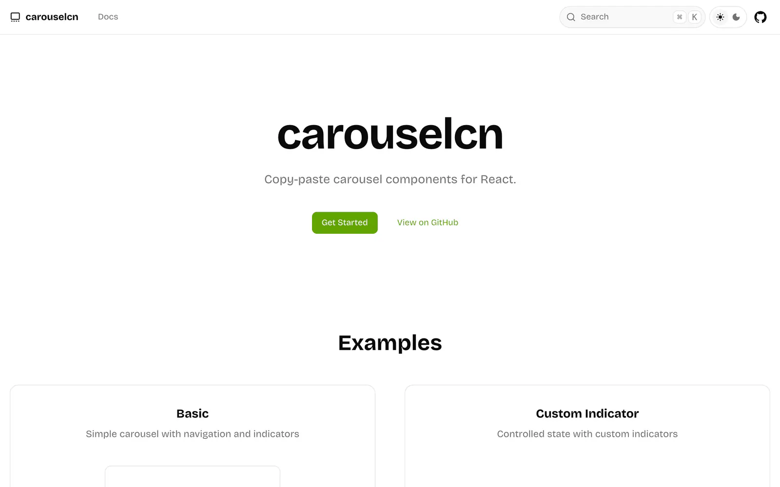
Copy-paste carousel components for React with swipe, loop, autoplay and vertical modes.
- Category
- Libraries & Components
- Added
- GitHub stars
- 9
- License
- MIT
- Price
- Free
About
About carouselcn
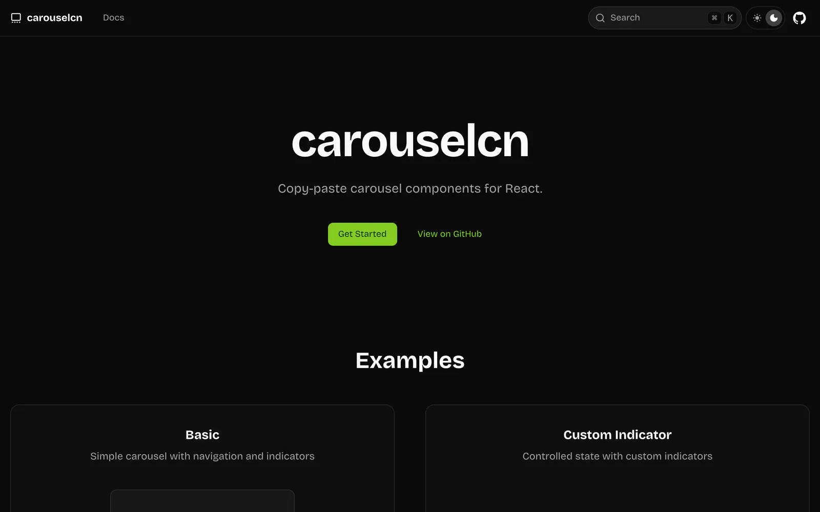
carouselcn is a set of carousel components for React that you copy into your project, in the spirit of shadcn/ui. Transitions are plain CSS, so no animation library is needed. The docs demo a basic carousel with navigation and indicators, custom indicators with controlled state, looping, vertical orientation, multiple items with custom spacing, and autoplay with play and pause controls. Touch and mouse drag are supported.
Add the carousel with the shadcn CLI, using the carousel.json registry URL, or copy registry/components/ui/carousel.tsx by hand. Then compose Carousel, CarouselContent, CarouselItem, CarouselNavigation and CarouselIndicator. It supports controlled and uncontrolled modes and dark mode, and is MIT licensed. It suits galleries, onboarding slides and testimonial rows.
carouselcn features
6 features
- CSS-based transitions with no animation library
- Drag and swipe on touch and mouse
- Loop navigation
- Controlled and uncontrolled modes
- Custom indicators and navigation
- Vertical and autoplay examples
Install carouselcn
1 command
Terminal
$ npx shadcn@latest add https://carouselcn.dev/r/carousel.jsonWhat you can build with carouselcn
3 use cases
- Building a testimonial slider for a landing page
- Adding a swipeable image gallery to a product page
- Creating a vertical onboarding carousel with indicators
Libraries & Components
Similar to carouselcn
More libraries & components like carouselcn: the closest by what they do, then the most starred.
 Kibo UILibraryKibo UI is a free, open source registry of composable, accessible components for shadcn/ui, including Color Picker, QR Code, Image Zoom and Code Block.
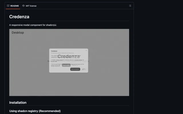
 CredenzaLibraryCredenza is a responsive modal for shadcn/ui that combines the dialog and drawer parts, so one component works on desktop and mobile. Install via the CLI.
 ComponentryLibraryComponentry is an MIT-licensed set of animated React components built with Tailwind CSS, TypeScript and Motion. Add them with the shadcn CLI or MCP.
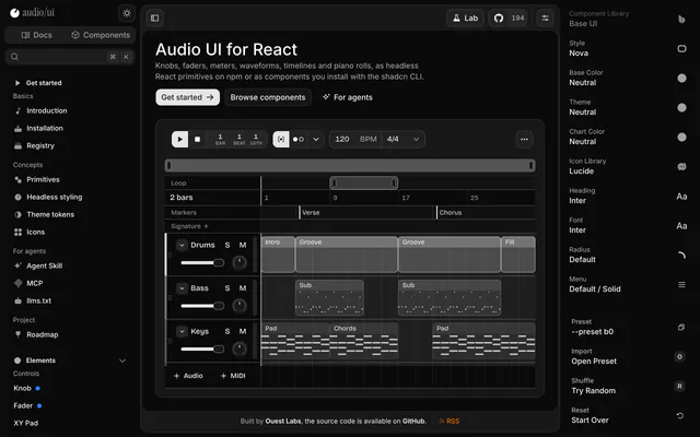
 audio/uiLibraryaudio/ui is a React library of knobs, faders, meters, waveforms and piano rolls, as headless npm primitives or shadcn registry components.
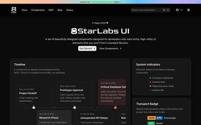
 8StarLabs UILibrary8StarLabs UI adds niche components to shadcn/ui, including a timeline, status indicator, transport badge and flip clock. Install them with the CLI.
 scificn-uiLibraryRetro sci-fi component library for React in a Cassette Futurism style. Built on Radix UI and Tailwind CSS v4, installed through the shadcn CLI.

Pricing
Ship it with Pro
The directory is free. Pro adds 6,000+ blocks, 14 premium templates and the MCP server, so your AI editor installs them for you.
4.9/5 out of 5 · 150+ reviewsfrom 150+ founders and developers.
- Secure checkout via Stripe
- Code lives in your repo
- Keep what you've shipped if you cancel
- License terms
FAQ
Frequently asked questions
What carouselcn is, how to install it, its license and its alternatives.
No. The README says it uses lightweight CSS-based transitions, so no animation library is required.
Copy-paste carousel components for React with swipe, loop, autoplay and vertical modes.
carouselcn lists CSS-based transitions with no animation library, Drag and swipe on touch and mouse, Loop navigation, Controlled and uncontrolled modes, Custom indicators and navigation and Vertical and autoplay examples.
The directory lists these uses for carouselcn: Building a testimonial slider for a landing page, Adding a swipeable image gallery to a product page and Creating a vertical onboarding carousel with indicators.
carouselcn is made by mnove, at https://github.com/mnove. Its site is https://github.com/mnove/carouselcn.
carouselcn was added to the directory on January 27, 2026.
carouselcn is in Libraries & Components. Component libraries and standalone components built on shadcn/ui, covering the data tables, pickers, editors and charts the core set leaves out.
Components, Copy and paste, Registry, shadcn CLI, React, Tailwind CSS, Accessible, Dark mode and MIT. Each tag has a page listing the other resources that carry it.
Yes. carouselcn's page has a Live tab beside the screenshot that loads its site in a frame.
Run npx shadcn@latest add with the carousel.json URL from the README, or copy carousel.tsx from the registry folder into your project by hand.
carouselcn lists this command: `npx shadcn@latest add https://carouselcn.dev/r/carousel.json`.
Yes, according to its listing: carouselcn installs with `npx shadcn@latest add https://carouselcn.dev/r/carousel.json`.
carouselcn's repository is https://github.com/mnove/carouselcn.
The directory links no separate docs for carouselcn; start from its site at https://github.com/mnove/carouselcn.
GitHub lists carouselcn under the MIT license. Read the license file in its repository for the terms.
The directory records no price for carouselcn. Its site, https://github.com/mnove/carouselcn, is where its pricing, if any, is stated.
No. carouselcn is made by mnove and listed here as a link. A shadcn.io Pro plan covers shadcn.io's own blocks, templates and tools.
Other resources in Libraries & Components, newest first: Kibo UI, Credenza, Componentry and audio/ui. Their pages are linked under Similar to carouselcn.
Open its category, Libraries & Components, or one of its tags (Components, Copy and paste and Registry): each page lists the resources that share it.
4.9 out of 5 from 150+ developers


Found your stack? Ship it.
6,000+ blocks, premium templates and MCP in every Pro plan. The directory stays free.
Get Pro