Clerk Elements
Docs examples for composing Clerk Elements with shadcn/ui into custom sign-in and sign-up flows.
- Category
- Libraries & Components
- Added
About
About Clerk Elements
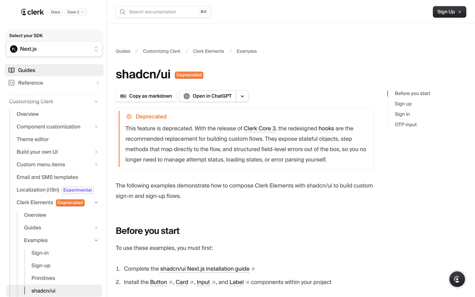
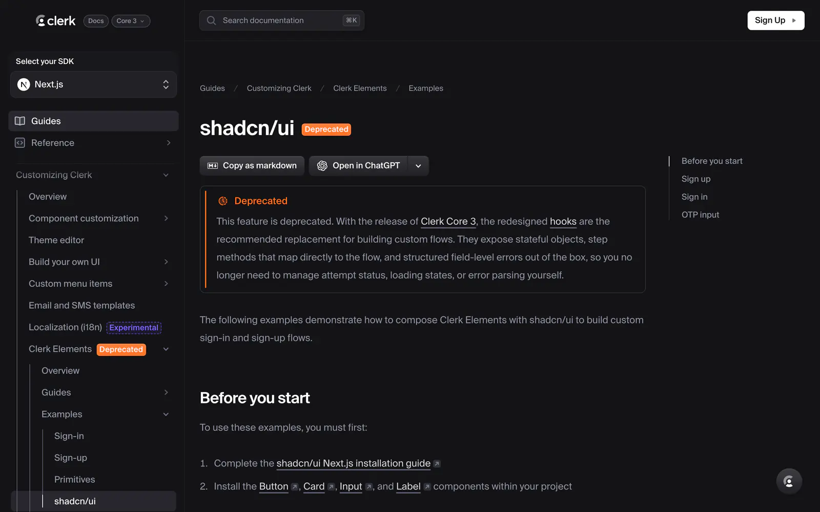
Clerk Elements is a set of composable components for building custom authentication screens on top of Clerk's APIs. It points to Clerk's docs page of examples that combine them with shadcn/ui, covering sign-up, sign-in and an OTP input. The examples use shadcn/ui Button, Card, Input and Label components and add a few animations to the Tailwind config.
The page marks the feature as deprecated. With Clerk Core 3, the redesigned hooks are the recommended replacement, exposing stateful objects, step methods and field-level errors so you do not manage attempt status or loading yourself. Use these examples only to maintain an existing integration, and read the hooks guide for new work. It suits teams already running Clerk in a Next.js app with shadcn/ui.
Clerk Elements features
5 features
- Sign-up flow example
- Sign-in flow example
- OTP input example
- Built with shadcn/ui Button, Card, Input and Label
- Composable Clerk Elements components
What you can build with Clerk Elements
3 use cases
- Maintaining an existing Clerk Elements sign-in page
- Reading how a custom OTP input was composed
- Planning a migration from Elements to Clerk hooks
Links
1 link
Libraries & Components
Similar to Clerk Elements
More libraries & components like Clerk Elements: the closest by what they do, then the most starred.
 SolanAuthLibrarySolanAuth is a responsive wallet authentication and account modal for Solana apps, wired to NextAuth and styled with shadcn/ui components.
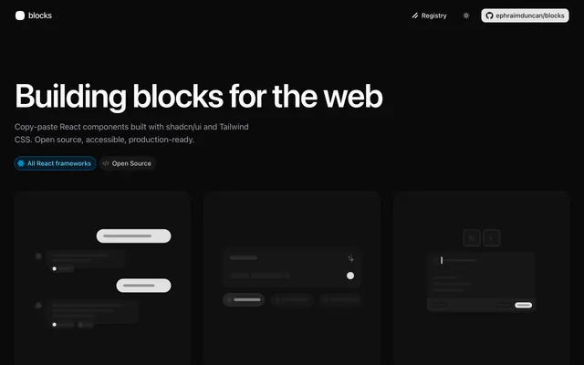
 blocks.soLibraryblocks.so is a free, open-source registry of 60+ shadcn/ui blocks built with React and Tailwind CSS, from login forms and stats to AI chat and tables.
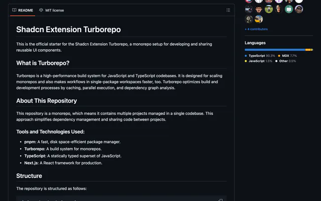
 shadcn-extensionLibraryshadcn-extension is an MIT-licensed collection of React components that extends shadcn/ui, developed in a Turborepo monorepo with Next.js docs.
 Shadcn Admin KitLibraryShadcn Admin Kit from Marmelab gives React apps CRUD pages, data tables, forms and auth hooks, on shadcn/ui, Base UI and TanStack Query.
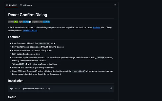
 React Confirm DialogLibraryReact Confirm Dialog is a customizable confirm dialog for React with a useConfirm hook, built on Radix UI Alert Dialog and styled with Tailwind CSS v4.
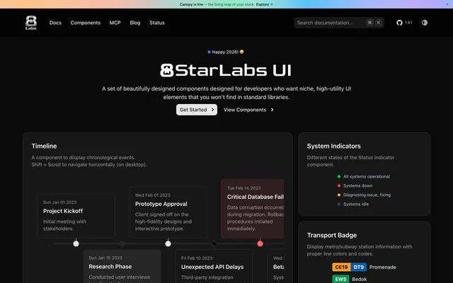
 8StarLabs UILibrary8StarLabs UI adds niche components to shadcn/ui, including a timeline, status indicator, transport badge and flip clock. Install them with the CLI.
Pricing
Ship it with Pro
The directory is free. Pro adds 6,000+ blocks, 14 premium templates and the MCP server, so your AI editor installs them for you.
4.9/5 out of 5 · 150+ reviewsfrom 150+ founders and developers.
- Secure checkout via Stripe
- Code lives in your repo
- Keep what you've shipped if you cancel
- License terms
FAQ
Frequently asked questions
What Clerk Elements is, how to install it, its license and its alternatives.
No. The docs mark it deprecated and recommend the redesigned hooks released with Clerk Core 3.
Complete the shadcn/ui Next.js installation, install the Button, Card, Input and Label components, and add the icons file and Tailwind animations listed on the page.
Docs examples for composing Clerk Elements with shadcn/ui into custom sign-in and sign-up flows.
Clerk Elements lists Sign-up flow example, Sign-in flow example, OTP input example, Built with shadcn/ui Button, Card, Input and Label and Composable Clerk Elements components.
The directory lists these uses for Clerk Elements: Maintaining an existing Clerk Elements sign-in page, Reading how a custom OTP input was composed and Planning a migration from Elements to Clerk hooks.
The directory does not name a maker for Clerk Elements. Its site is https://clerk.com/docs/elements/examples/shadcn-ui.
Clerk Elements was added to the directory on December 27, 2024.
Clerk Elements is in Libraries & Components. Component libraries and standalone components built on shadcn/ui, covering the data tables, pickers, editors and charts the core set leaves out.
Authentication, Clerk, Components, React, Next.js, Tailwind CSS and Documentation. Each tag has a page listing the other resources that carry it.
No. Clerk Elements's site cannot be framed, so its page shows screenshots of it and a link to the site.
The directory lists no install command for Clerk Elements. Follow its docs at https://clerk.com/docs/elements/examples/shadcn-ui.
The directory lists no shadcn CLI command for Clerk Elements. Check its docs at https://clerk.com/docs/elements/examples/shadcn-ui for how to add it.
The directory links no repository for Clerk Elements. Its site is https://clerk.com/docs/elements/examples/shadcn-ui.
Clerk Elements's docs are at https://clerk.com/docs/elements/examples/shadcn-ui.
The directory records no license for Clerk Elements. Check its repository or site before you use it.
The directory records no price for Clerk Elements. Its site, https://clerk.com/docs/elements/examples/shadcn-ui, is where its pricing, if any, is stated.
No. Clerk Elements is made by its own maker and listed here as a link. A shadcn.io Pro plan covers shadcn.io's own blocks, templates and tools.
Other resources in Libraries & Components, newest first: SolanAuth, blocks.so, shadcn-extension and Shadcn Admin Kit. Their pages are linked under Similar to Clerk Elements.
Open its category, Libraries & Components, or one of its tags (Authentication, Clerk and Components): each page lists the resources that share it.
4.9 out of 5 from 150+ developers


Found your stack? Ship it.
6,000+ blocks, premium templates and MCP in every Pro plan. The directory stays free.
Get Pro