Date Time Range Picker
A registry of date, time and date-time range pickers with presets, themes and keyboard navigation.
- Category
- Libraries & Components
- Added
About
About Date Time Range Picker
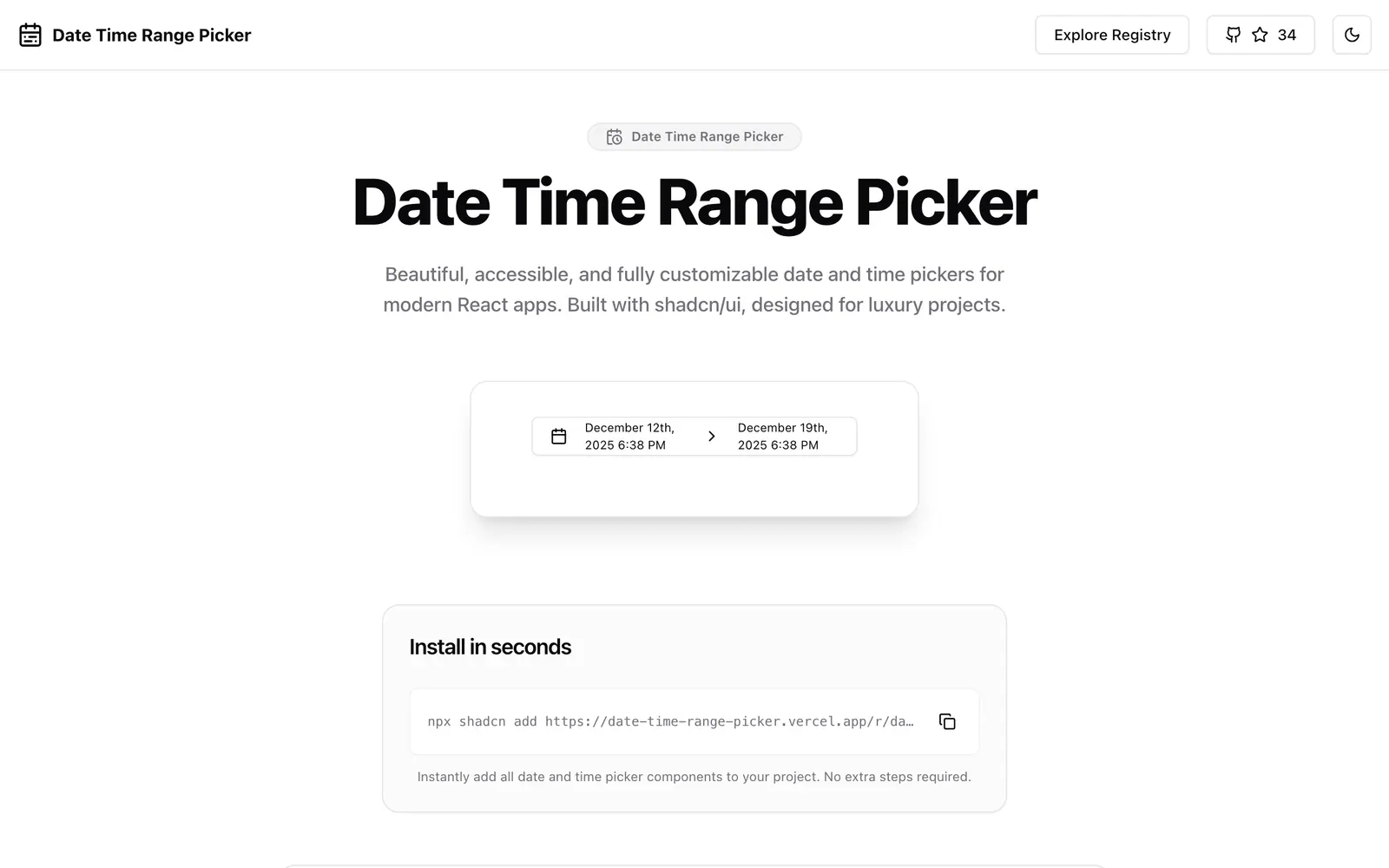
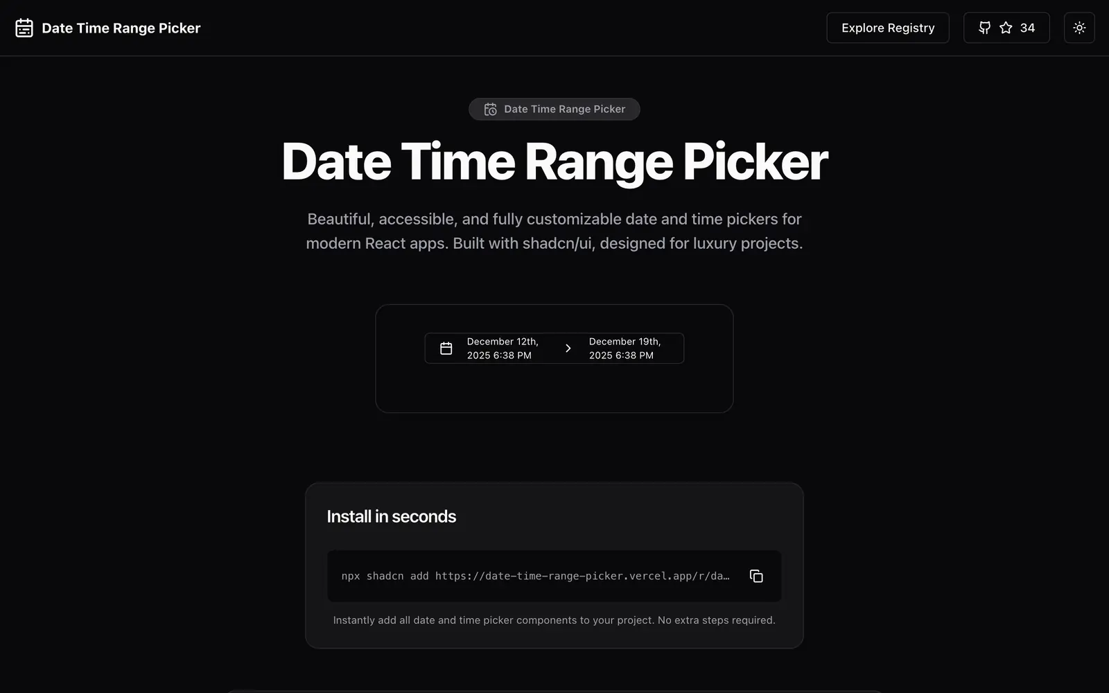
Date Time Range Picker is a collection of components for dates and times, built with shadcn/ui. The gallery shows a date input with separate fields, a time input with hours, minutes and AM/PM, a combined date-time input, a date range picker with presets, and a date-time range picker. The site names date range selection, time selection, light and dark mode, keyboard navigation, accessibility and composable parts among the features, and it also mentions timezone support and multi-month views.
One command installs the whole set from the site's registry: npx shadcn add with the date-time-range-picker.json URL. Source is on GitHub. It suits reporting filters, scheduling tools and booking flows where users must pick an exact span with start and end times, and you want the pieces modular enough to use on their own.
Date Time Range Picker features
6 features
- Date input with separate fields
- Time input with AM/PM
- Combined date-time input
- Date range picker with presets
- Date-time range picker
- Keyboard navigation and dark mode
Install Date Time Range Picker
1 command
Terminal
$ npx shadcn add https://date-time-range-picker.vercel.app/r/date-time-range-picker.jsonWhat you can build with Date Time Range Picker
3 use cases
- Filtering logs by an exact start and end time
- Scheduling an event with a start and end datetime
- Adding preset ranges like last week to a report
Libraries & Components
Similar to Date Time Range Picker
More libraries & components like Date Time Range Picker: the closest by what they do, then the most starred.
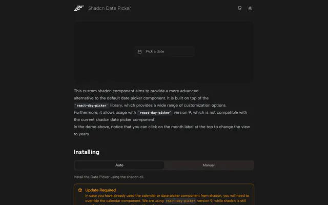
 Shadcn Date PickerLibraryShadcn Date Picker is a custom component with range selection and quick month and year switching, built on react-day-picker v9 and added by CLI.
 shadcn/ui expansionsLibraryshadcn/ui expansions adds components the base set lacks: autosize textarea, datetime picker, multiple selector and infinite scroll. Copy and paste them.
 Date Range PickerLibraryDate Range Picker for shadcn offers multi-month views, typed dates, preset ranges and range comparison, built on Radix UI and Tailwind CSS. MIT licensed.
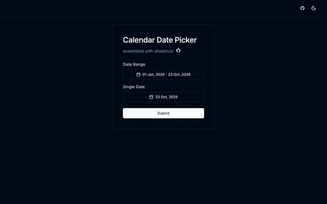
 Calendar Date PickerLibraryCalendar Date Picker is an MIT-licensed Next.js component that combines the shadcn/ui calendar, popover and select with react-day-picker and date-fns.
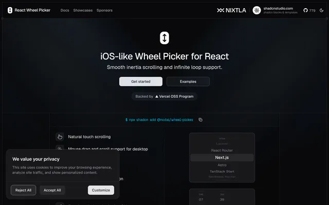
 React Wheel PickerLibraryReact Wheel Picker brings iOS-style scrolling pickers to the web, with touch and mouse drag, infinite loop, keyboard type-ahead and a shadcn CLI install.
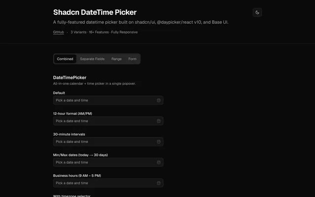
 Shadcn DateTime PickerLibraryShadcn DateTime Picker combines a calendar and time picker in one popover, with 12-hour format, time intervals, min and max dates and a timezone selector.
Pricing
Ship it with Pro
The directory is free. Pro adds 6,000+ blocks, 14 premium templates and the MCP server, so your AI editor installs them for you.
4.9/5 out of 5 · 150+ reviewsfrom 150+ founders and developers.
- Secure checkout via Stripe
- Code lives in your repo
- Keep what you've shipped if you cancel
- License terms
FAQ
Frequently asked questions
What Date Time Range Picker is, how to install it, its license and its alternatives.
The site lists keyboard navigation and full accessibility among its features, along with light and dark modes.
A registry of date, time and date-time range pickers with presets, themes and keyboard navigation.
Date Time Range Picker lists Date input with separate fields, Time input with AM/PM, Combined date-time input, Date range picker with presets, Date-time range picker and Keyboard navigation and dark mode.
The directory lists these uses for Date Time Range Picker: Filtering logs by an exact start and end time, Scheduling an event with a start and end datetime and Adding preset ranges like last week to a report.
The directory does not name a maker for Date Time Range Picker. Its site is https://date-time-range-picker.vercel.app/.
Date Time Range Picker was added to the directory on March 8, 2025.
Date Time Range Picker is in Libraries & Components. Component libraries and standalone components built on shadcn/ui, covering the data tables, pickers, editors and charts the core set leaves out.
Date and time, Calendar, Inputs, Components, Registry, shadcn CLI, Accessible, Dark mode and Customizable. Each tag has a page listing the other resources that carry it.
Yes. Date Time Range Picker's page has a Live tab beside the screenshot that loads its site in a frame.
Run npx shadcn add with the date-time-range-picker.json URL from the site to add all the components at once.
Date Time Range Picker lists this command: `npx shadcn add https://date-time-range-picker.vercel.app/r/date-time-range-picker.json`.
Yes, according to its listing: Date Time Range Picker installs with `npx shadcn add https://date-time-range-picker.vercel.app/r/date-time-range-picker.json`.
The directory links no repository for Date Time Range Picker. Its site is https://date-time-range-picker.vercel.app/.
The directory links no separate docs for Date Time Range Picker; start from its site at https://date-time-range-picker.vercel.app/.
The directory records no license for Date Time Range Picker. Check its repository or site before you use it.
The directory records no price for Date Time Range Picker. Its site, https://date-time-range-picker.vercel.app/, is where its pricing, if any, is stated.
No. Date Time Range Picker is made by its own maker and listed here as a link. A shadcn.io Pro plan covers shadcn.io's own blocks, templates and tools.
Other resources in Libraries & Components, newest first: Shadcn Date Picker, shadcn/ui expansions, Date Range Picker and Calendar Date Picker. Their pages are linked under Similar to Date Time Range Picker.
Open its category, Libraries & Components, or one of its tags (Date and time, Calendar and Inputs): each page lists the resources that share it.
4.9 out of 5 from 150+ developers


Found your stack? Ship it.
6,000+ blocks, premium templates and MCP in every Pro plan. The directory stays free.
Get Pro