Indie UI
A free set of React and Tailwind CSS components with variants, dark mode and TypeScript types.
- Category
- Libraries & Components
- Added
- GitHub stars
- 707
- License
- MIT
- Price
- Free
About
About Indie UI
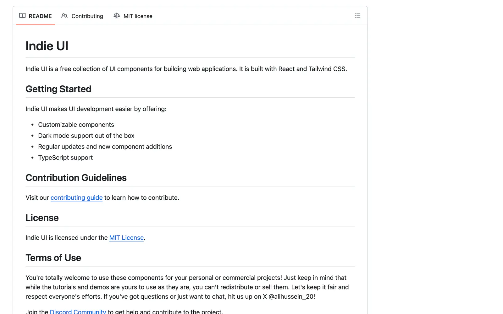
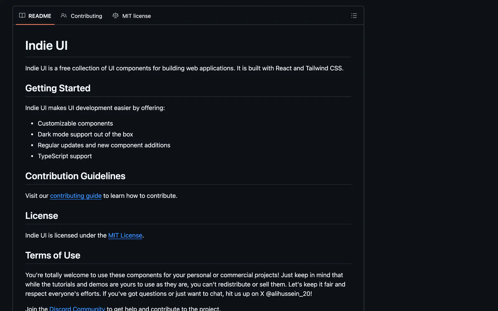
Indie UI is a collection of UI components for web applications, built with React and Tailwind CSS. The README lists customizable components, dark mode support out of the box, regular additions and TypeScript support. The repository topics mention Next.js 16 and shadcn, and the demo site lives on the Indie Starter domain.
The project is MIT licensed. Its terms say you can use the components in personal or commercial projects, but you cannot redistribute or sell the tutorials and demos. A contributing guide and a Discord community are linked. It suits indie hackers and small teams who want free building blocks that match a shadcn/ui-style stack.
Indie UI features
5 features
- Components with variants
- Dark mode out of the box
- TypeScript support
- Customizable styling
- Regular component additions
What you can build with Indie UI
3 use cases
- Assembling a SaaS landing page as a solo founder
- Adding variant-rich buttons and cards to a Next.js app
- Using free components in a commercial product
Libraries & Components
Similar to Indie UI
More libraries & components like Indie UI: the closest by what they do, then the most starred.
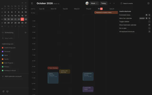
 CalendarCNLibraryCalendarCN is an MIT-licensed React calendar built with shadcn/ui and Tailwind CSS, with a week view, event colors, dark mode and keyboard shortcuts.
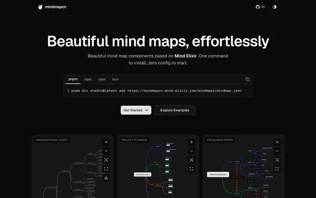
 mindmapcnLibrarymindmapcn adds theme-aware mind map components to your app. Install one registry file with the shadcn CLI, and get zoom, fit and export controls.
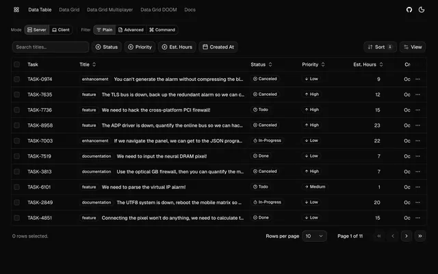
 tablecnLibrarytablecn is an open-source data table and grid built on shadcn/ui, with sorting, filtering, pagination, infinite scroll and live collaboration.
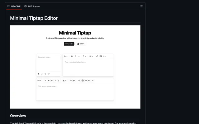
 Minimal TiptapLibraryMinimal Tiptap is a customizable rich text editor for shadcn/ui projects, with image upload, code blocks, tables and HTML, JSON or Markdown output.
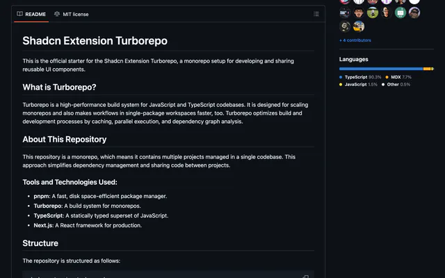
 shadcn-extensionLibraryshadcn-extension is an MIT-licensed collection of React components that extends shadcn/ui, developed in a Turborepo monorepo with Next.js docs.
 enhanced-buttonLibraryenhanced-button extends the shadcn/ui Button with an effect variant, including shine, ring hover, gooey fills and underline. No extra components needed.
Pricing
Ship it with Pro
The directory is free. Pro adds 6,000+ blocks, 14 premium templates and the MCP server, so your AI editor installs them for you.
4.9/5 out of 5 · 150+ reviewsfrom 150+ founders and developers.
- Secure checkout via Stripe
- Code lives in your repo
- Keep what you've shipped if you cancel
- License terms
FAQ
Frequently asked questions
What Indie UI is, how to install it, its license and its alternatives.
A free set of React and Tailwind CSS components with variants, dark mode and TypeScript types.
Indie UI lists Components with variants, Dark mode out of the box, TypeScript support, Customizable styling and Regular component additions.
The directory lists these uses for Indie UI: Assembling a SaaS landing page as a solo founder, Adding variant-rich buttons and cards to a Next.js app and Using free components in a commercial product.
Indie UI is made by alibey-10, at https://github.com/alibey-10. Its site is https://github.com/alibey-10/indie-ui.
Indie UI was added to the directory on December 27, 2024.
Indie UI is in Libraries & Components. Component libraries and standalone components built on shadcn/ui, covering the data tables, pickers, editors and charts the core set leaves out.
Components, Tailwind CSS, React, TypeScript, Dark mode, Customizable, Open source, MIT and Free. Each tag has a page listing the other resources that carry it.
No. Indie UI's site cannot be framed, so its page shows screenshots of it and a link to the site.
The directory lists no install command for Indie UI. Follow the instructions on its site at https://github.com/alibey-10/indie-ui.
The directory lists no shadcn CLI command for Indie UI. Check its docs at https://github.com/alibey-10/indie-ui for how to add it.
Indie UI's repository is https://github.com/alibey-10/indie-ui.
The directory links no separate docs for Indie UI; start from its site at https://github.com/alibey-10/indie-ui.
Yes. The terms welcome personal and commercial use, but you cannot redistribute or sell the tutorials and demos.
MIT, as stated in the repository.
GitHub lists Indie UI under the MIT license. Read the license file in its repository for the terms.
The directory records no price for Indie UI. Its site, https://github.com/alibey-10/indie-ui, is where its pricing, if any, is stated.
No. Indie UI is made by alibey-10 and listed here as a link. A shadcn.io Pro plan covers shadcn.io's own blocks, templates and tools.
Other resources in Libraries & Components, newest first: CalendarCN, mindmapcn, tablecn and Minimal Tiptap. Their pages are linked under Similar to Indie UI.
Open its category, Libraries & Components, or one of its tags (Components, Tailwind CSS and React): each page lists the resources that share it.
4.9 out of 5 from 150+ developers


Found your stack? Ship it.
6,000+ blocks, premium templates and MCP in every Pro plan. The directory stays free.
Get Pro