Launch UI
Hand-built landing page blocks and templates for React, shadcn/ui and Tailwind CSS, with eight color themes.
- Category
- Libraries & Components
- Added
About
About Launch UI
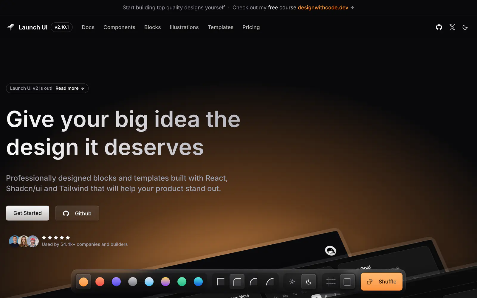
Launch UI is a set of blocks, components and templates for product landing pages, made with React, shadcn/ui and Tailwind CSS. The site's own preview switches among eight color themes (ember, fire, ultraviolet, titanium, ice, holo, emerald and electro), four border radii, light and dark appearance, and a lines toggle. It says each block is crafted by hand, not generated by AI, and Figma is listed among its tools.
Version 2 is out, and the page lists React 19, TypeScript 6, shadcn/ui 4 and Tailwind CSS 4 in its stack. You start from the Get Started link and a GitHub repository, then take the blocks you want. It suits founders and designers who want a landing page that does not look like a stock shadcn/ui block.
Launch UI features
6 features
- Landing page blocks and templates
- 8 color themes
- Border radius presets
- Light and dark appearance
- Figma in the toolchain
- React, TypeScript and Tailwind CSS 4
What you can build with Launch UI
3 use cases
- Launching a SaaS marketing site quickly
- Trying themes and radii before committing to a look
- Keeping designers and developers on the same blocks
Libraries & Components
Similar to Launch UI
More libraries & components like Launch UI: the closest by what they do, then the most starred.
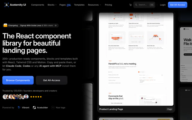
 Aceternity UILibraryAceternity UI offers 200+ copy-paste React components, blocks and templates built with Tailwind CSS and Motion, with a free tier and an All-Access Pass.
 Magic UILibraryMagic UI is a free, open-source library of 150+ animated React components and effects built with Tailwind CSS and Motion, made for landing pages.
 MVPBlocksLibraryMVPBlocks is a free library of copy-paste blocks, sections and templates built with Next.js, Tailwind CSS and Framer Motion, v0 compatible.
 PaidShadcnblocksLibraryShadcnblocks is a premium library of thousands of extra blocks and components for shadcn/ui, React and Tailwind, installable by copy-paste or the CLI.
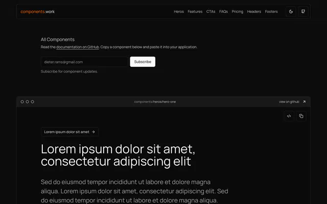
 components.workLibrarycomponents.work, by Bridger Tower, is a collection of TypeScript React components for Next.js marketing sites, copied straight from the page.
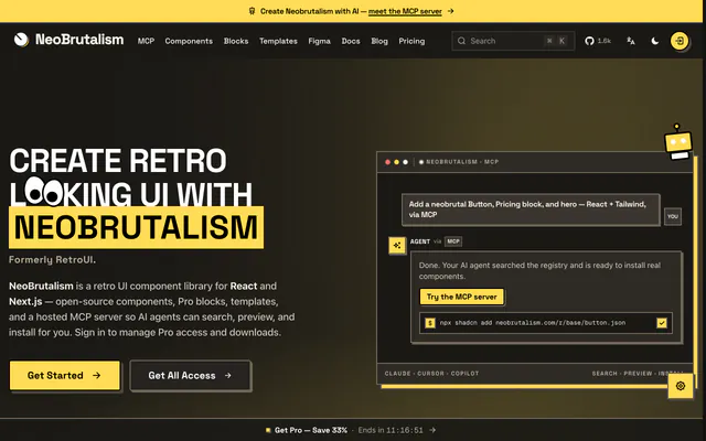
 NeoBrutalismLibraryNeoBrutalism (formerly RetroUI) is an MIT-licensed React and Tailwind component library with Pro blocks, templates, a Figma kit and an MCP server.
Pricing
Ship it with Pro
The directory is free. Pro adds 6,000+ blocks, 14 premium templates and the MCP server, so your AI editor installs them for you.
4.9/5 out of 5 · 150+ reviewsfrom 150+ founders and developers.
- Secure checkout via Stripe
- Code lives in your repo
- Keep what you've shipped if you cancel
- License terms
FAQ
Frequently asked questions
What Launch UI is, how to install it, its license and its alternatives.
React, TypeScript, shadcn/ui and Tailwind CSS 4, according to the site.
Yes. The preview switches between light and dark appearance, and it offers eight color themes.
Hand-built landing page blocks and templates for React, shadcn/ui and Tailwind CSS, with eight color themes.
Launch UI lists Landing page blocks and templates, 8 color themes, Border radius presets, Light and dark appearance, Figma in the toolchain and React, TypeScript and Tailwind CSS 4.
The directory lists these uses for Launch UI: Launching a SaaS marketing site quickly, Trying themes and radii before committing to a look and Keeping designers and developers on the same blocks.
The directory does not name a maker for Launch UI. Its site is https://www.launchuicomponents.com/.
Launch UI was added to the directory on December 27, 2024.
Launch UI is in Libraries & Components. Component libraries and standalone components built on shadcn/ui, covering the data tables, pickers, editors and charts the core set leaves out.
Landing page, Blocks, Templates, Themes, Dark mode, Figma, React, TypeScript and Tailwind CSS. Each tag has a page listing the other resources that carry it.
Yes. Launch UI's page has a Live tab beside the screenshot that loads its site in a frame.
The directory lists no install command for Launch UI. Follow the instructions on its site at https://www.launchuicomponents.com/.
The directory lists no shadcn CLI command for Launch UI. Check its docs at https://www.launchuicomponents.com/ for how to add it.
The directory links no repository for Launch UI. Its site is https://www.launchuicomponents.com/.
The directory links no separate docs for Launch UI; start from its site at https://www.launchuicomponents.com/.
The directory records no license for Launch UI. Check its repository or site before you use it.
The directory records no price for Launch UI. Its site, https://www.launchuicomponents.com/, is where its pricing, if any, is stated.
No. Launch UI is made by its own maker and listed here as a link. A shadcn.io Pro plan covers shadcn.io's own blocks, templates and tools.
Other resources in Libraries & Components, newest first: Aceternity UI, Magic UI, MVPBlocks and Shadcnblocks. Their pages are linked under Similar to Launch UI.
Open its category, Libraries & Components, or one of its tags (Landing page, Blocks and Templates): each page lists the resources that share it.
4.9 out of 5 from 150+ developers


Found your stack? Ship it.
6,000+ blocks, premium templates and MCP in every Pro plan. The directory stays free.
Get Pro