Loading UI
A curated collection of spinners, loaders and loading-state animations in CSS and React.
- Category
- Animations
- Added
- Price
- Free
About
About Loading UI
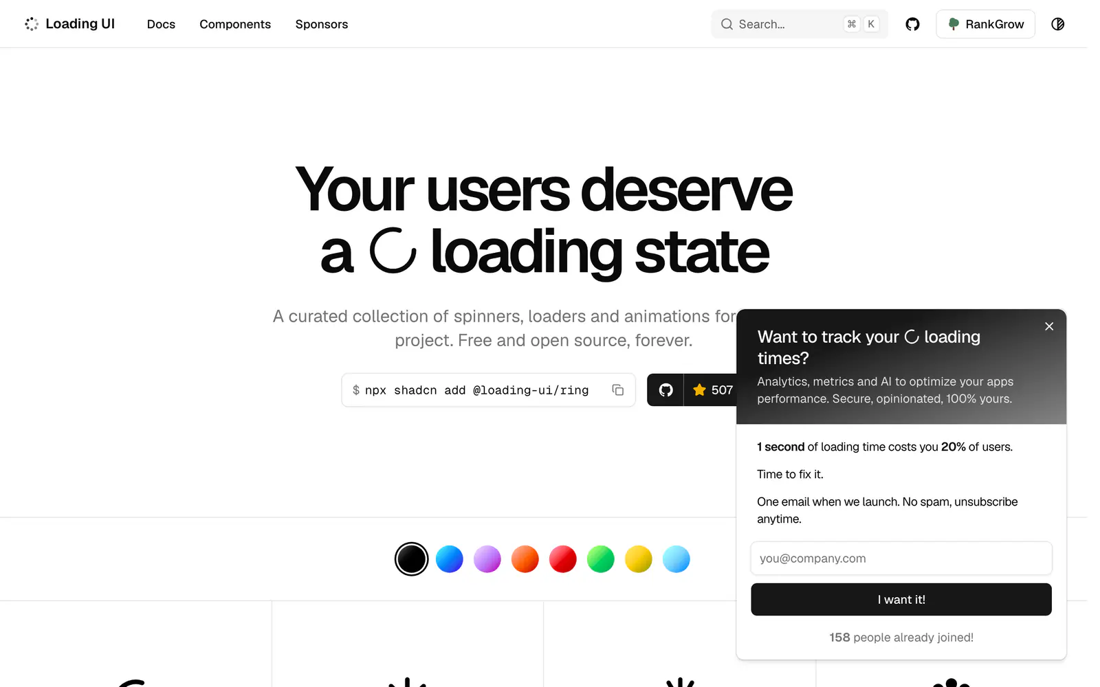
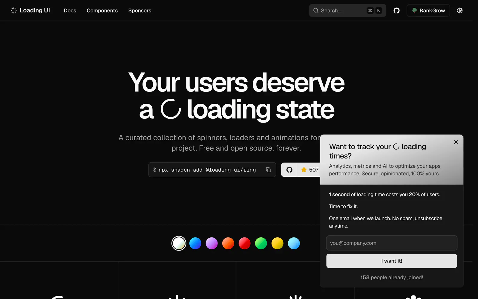
Loading UI is a collection of loading indicators written in CSS and React. The gallery runs from ring, spokes, arc and spiral spinners to bouncing dots, a comet spinner, ripple and pulse effects, text loaders such as text-shimmer and text-dots, a skeleton and a terminal loader, and character-based loaders drawn from block glyphs. Each entry has a copy button for the component.
There is nothing to install: you pick an animation, copy it and paste it into your project. The site aims at accessible loading states and describes the collection as free and open source. A form lets visitors request a missing loader. It suits developers who want a distinctive spinner for buttons, AI thinking states or full-page loading without pulling in another dependency.
Loading UI features
5 features
- Ring, arc, spiral and spokes spinners
- Bouncing and pulsating dot loaders
- Text loaders such as shimmer and typing dots
- Skeleton and terminal loaders
- Copy button on every component
What you can build with Loading UI
3 use cases
- Showing a thinking state in an AI chat window
- Replacing a default spinner on a submit button
- Adding a loading skeleton to a card list
Animations
Similar to Loading UI
More animations like Loading UI: the closest by what they do, then the most starred.
 AnimataAnimationAnimata offers 156+ free, open-source animated React components built with Tailwind CSS. Copy a file into your repo and own it, with theme-aware styling.
 crafteruiAnimationcrafterui is an open-source set of motion and interaction components for React and Tailwind CSS. Copy the source or install it with the shadcn CLI.
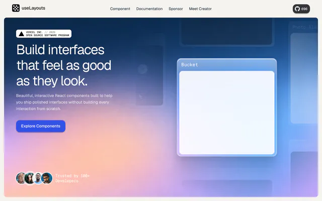
 useLayoutsAnimationuseLayouts is a free library of interactive React components such as 3D books, theme toggles and photo stacks, built with Framer Motion and Tailwind CSS.
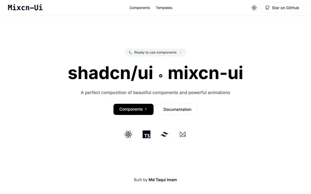 Mixcn-UIAnimationMixcn-UI is a React and TypeScript component library with Framer Motion animations for Next.js, built to sit beside shadcn/ui and Tailwind CSS.
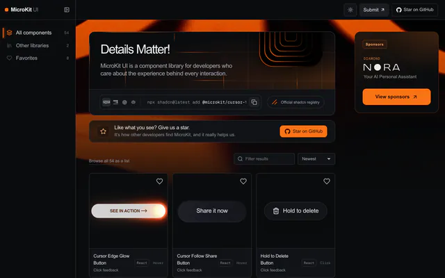
 MicroKit UIAnimationMicroKit UI is an MIT-licensed set of 54 microinteractions in React, CSS and Tailwind, with live previews and shadcn CLI install from its own registry.
 beUIAnimationbeUI ships 145 animated React components and 71 React Native ones, from morphing modals to toast stacks. Install through the shadcn CLI or copy the source.

Pricing
Ship it with Pro
The directory is free. Pro adds 6,000+ blocks, 14 premium templates and the MCP server, so your AI editor installs them for you.
4.9/5 out of 5 · 150+ reviewsfrom 150+ founders and developers.
- Secure checkout via Stripe
- Code lives in your repo
- Keep what you've shipped if you cancel
- License terms
FAQ
Frequently asked questions
What Loading UI is, how to install it, its license and its alternatives.
The collection includes both CSS and React loaders, and each one has a copy button.
A curated collection of spinners, loaders and loading-state animations in CSS and React.
Loading UI lists Ring, arc, spiral and spokes spinners, Bouncing and pulsating dot loaders, Text loaders such as shimmer and typing dots, Skeleton and terminal loaders and Copy button on every component.
The directory lists these uses for Loading UI: Showing a thinking state in an AI chat window, Replacing a default spinner on a submit button and Adding a loading skeleton to a card list.
The directory does not name a maker for Loading UI. Its site is https://loading-ui.com/.
Loading UI was added to the directory on April 25, 2026.
Loading UI is in Animations. Motion libraries and animated components that bring transitions, text effects and interactive backgrounds to shadcn/ui projects.
Components, Animation, React, Copy and paste, Accessible, Open source and Free. Each tag has a page listing the other resources that carry it.
Yes. Loading UI's page has a Live tab beside the screenshot that loads its site in a frame.
The directory lists no install command for Loading UI. Follow the instructions on its site at https://loading-ui.com/.
The directory lists no shadcn CLI command for Loading UI. Check its docs at https://loading-ui.com/ for how to add it.
The directory links no repository for Loading UI. Its site is https://loading-ui.com/.
The directory links no separate docs for Loading UI; start from its site at https://loading-ui.com/.
Yes. The site describes the collection as free and open source.
The directory records no license for Loading UI. Check its repository or site before you use it.
The directory records no price for Loading UI. Its site, https://loading-ui.com/, is where its pricing, if any, is stated.
No. Loading UI is made by its own maker and listed here as a link. A shadcn.io Pro plan covers shadcn.io's own blocks, templates and tools.
Other resources in Animations, newest first: Animata, crafterui, useLayouts and Mixcn-UI. Their pages are linked under Similar to Loading UI.
Open its category, Animations, or one of its tags (Components, Animation and React): each page lists the resources that share it.
4.9 out of 5 from 150+ developers


Found your stack? Ship it.
6,000+ blocks, premium templates and MCP in every Pro plan. The directory stays free.
Get Pro